HOME | DD
 TimberClipse — Paths to Strength

Published: 2013-07-12 23:42:49 +0000 UTC; Views: 908; Favourites: 20; Downloads: 0
Redirect to original
Description
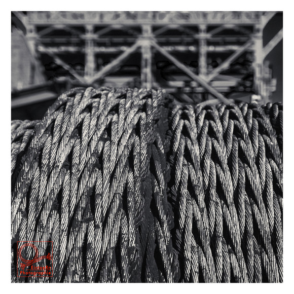
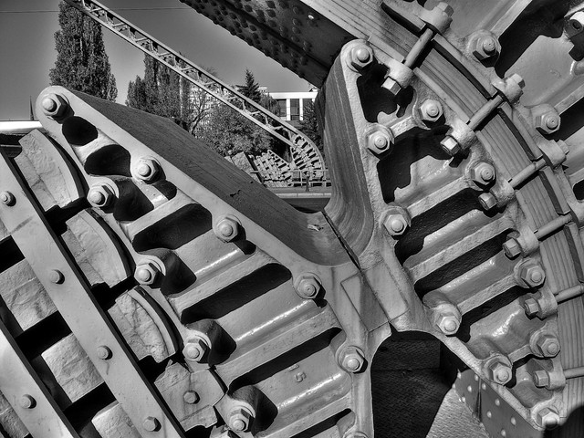
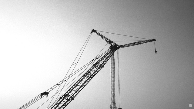
Paths to Strength`TimberClipse | @zevimages | Web | facebook | IMDb | TumblrI had the opportunity to return to Newport, RI today and got to photograph at The Breakers Mansion. Although I had some shots come out nicely, my favorite was this one... A simple shot of a crane. The detail, depth, and clarity really made me fall in love with the piece. I hope you will enjoy it as well.
Related content
Comments: 14

Makes for an interesting shot! Neat perspective here.
👍: 0 ⏩: 0

Maybe portrait would've been better than landscape format, because all my focus now goes to the cabin, while I can see you tried to lead our eyes with the cables. I think that might've been accomplished if the cabin was (partially) cut out of the shot.
I don't think it would've made a big difference if it would've been in color, like `miontre explained.
It's always good trying something new though! Keep it up
👍: 0 ⏩: 1


👍: 0 ⏩: 1

I like it, though I think it would look nicer if only the wires were in focus.
👍: 0 ⏩: 1

That seems to be the general consensus, definitely something I will keep in mind next time. I appreciate your suggestion
👍: 0 ⏩: 1

Well I look forward to seeing more!
👍: 0 ⏩: 0

Today's Daily Deviation from A&S is another great example:
👍: 0 ⏩: 0

It's nice! 
I do agree with ~iWarblood though. The photo is quite busy, I don't quite know what to focus my eye on. Black and white is not as simple as a lot of people would think, you've got to get the tones to work so that there's contrast between what is to be focused on and what isn't to be. At the moment, there are a lot of different tones across your entire photo. While there is, in general, some contrast between the machinery and the trees in the background, there still are quite a lot of areas where they share similar tones, which makes it a bit confusing.
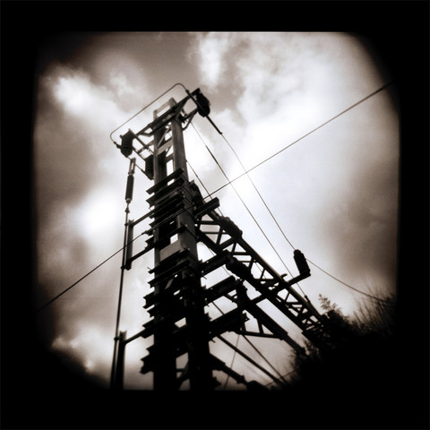
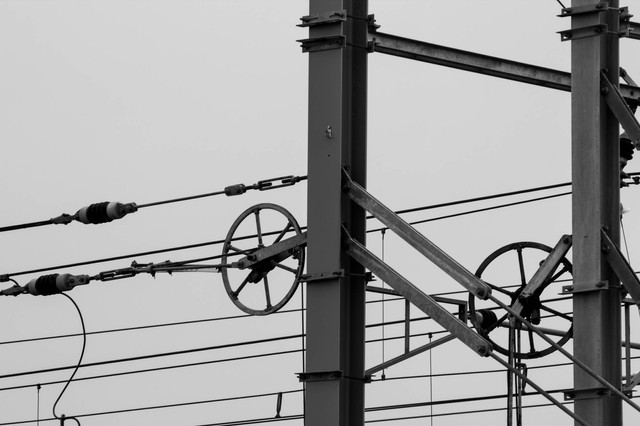
For example, look at these three photos by *Azenoire :
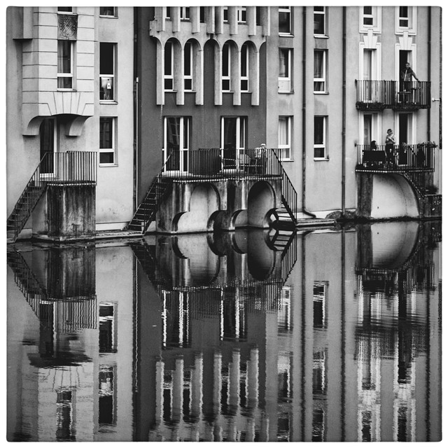
Now, I know this may not be the exact style you're trying to work for, but I think they make really good examples of how important contrast between tones is. In every photo, you know exactly what the subject is meant to be, and the background sort of compliments it rather than becoming a distraction. This is because the different tones separate out the different objects in the photo. Notice they are also quite simple and there's nothing there that doesn't need to be there.
Good luck in going down this path in photography, and I hope this helps to get you started a bit!
👍: 0 ⏩: 1

I really appreciate you taking the time to write this and give me the feedback. You have some excellent points that I will definitely keep in mind.
Do you think that if the photo was in color it would have worked any better, in my opinion, it was not a photo that color helped in the least. What do you think?
Thanks!
👍: 0 ⏩: 1

No worries at all!
I think the black and white was definitely a good decision! The different colours would have made it more confusing, the black and white definitely helps to sort things out a little
👍: 0 ⏩: 1

Could i critic just little bit? :3
It looks great, but in my mind there are to many details.
I would have looked awesome if the wires where in color, it would grasp more attention :3
but its only my opinion
👍: 0 ⏩: 0
