HOME | DD
 TimPhillips — Hyperborea - Phae and Ruby - Hmmm

Published: 2017-06-26 19:17:43 +0000 UTC; Views: 1671; Favourites: 25; Downloads: 0
Redirect to original
Description
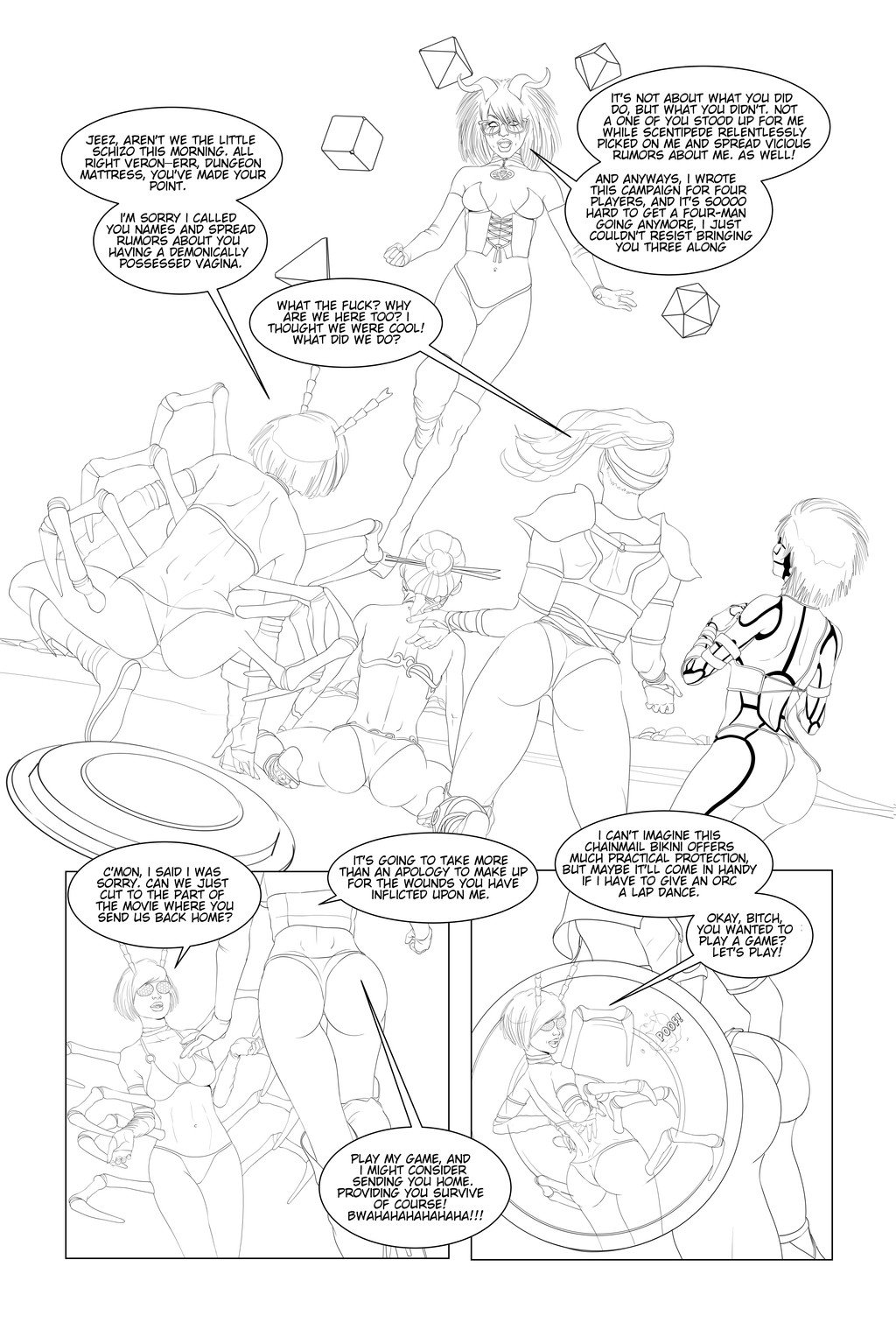
HyperBoreaPhae and Ruby - Dash
Penciled by Tim Phillips
Inked and colored by
8-21-16
Related content


Comments: 8
 (Wink)")

Thanks! Which parts specifically? Humor me.
👍: 0 ⏩: 1

Well all looks good and proportional except of course the slightly enlarged eyes as per anime convention but I was referring to the breasts.
👍: 0 ⏩: 1
Don't tell that. He'll lord it over my head saying, "I told you so". We get into disagreements about anatomy. He likes very natural and realism. I like cartoon-like ubsurdity and exagerated proportions, but not inflated. At the end of the day however, we both are pretty vigilant about making things look right.
👍: 0 ⏩: 2

Told y... nah, I just have always pushed you to continue to improve as I would expect of myself. Stylized/realistic, it's all good so long as the foundation is solid. The main thing was these characters land in a reasonably 80s aesthetic (taking into account it's all a modern cheat) while having their own look as well. I still feel we landed there overall with these.
👍: 0 ⏩: 0
I agree with you to an extent. I don't like absurdly exaggerated proportions, but it seems to me that one of the joys of artwork is that it is more than a photograph or an architect's render. So I think pinched waists and extended lower legs and other stylistic choices in the attempt to trick the eye make perfect sense. I think most comic readers already have eyes trained or at least used to expecting more idealized proportions than might perhaps be humanly possible.
👍: 0 ⏩: 1
And don't forget...STYLE! Everybody draws different or at least they should. To many clones makes for a boring field of artists and saturate the landscape with everybody aping the flavor of the week. I would say, if you can separate from the stock and stick to your guns, you'll either stand out or everyone will hate you. It's a flip of the coin. I find the imperfections in someones draftsmanship sometimes a breath of fresh air. On the other hand, some sometimes it just looks like crap.
👍: 0 ⏩: 1
Style. Yes, absolutely. I forgot to mention that. And as long as the style is relatively consistent unto itself the reader's eye adapts to it, even if it might be somewhat wild or different. Obviously people will have preferences but many different styles can work well given consistency so the reader isn't jarred from panel to panel.
👍: 0 ⏩: 0