HOME | DD
 timtilley — Clowning Around
Published: 2009-08-22 00:36:21 +0000 UTC; Views: 1803; Favourites: 28; Downloads: 39
Redirect to original
Description
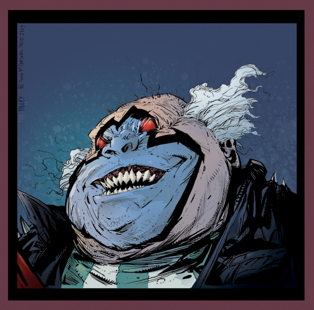
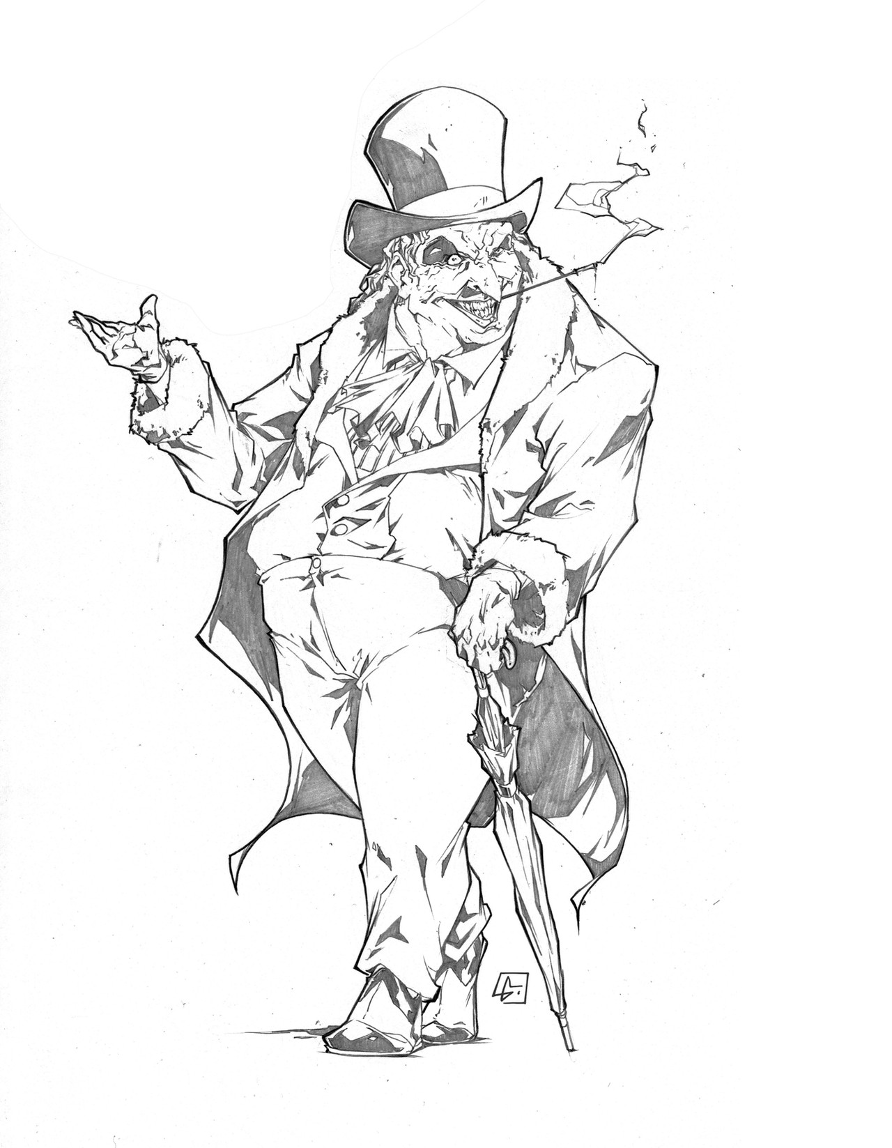
A close up of a single panel from SPAWN #193 that Greg Capullo & Todd McFarlane did. Colors by myself.Related content


Comments: 7

Overall


Vision
Originality
Technique
Impact
I don't know much about the scene, but here's my opinion and comments.
First off you've got a nice cold background. but much of his face is cold, pushing him back and making him look flatter. Your color choices though not random look like you just head the idea of there's a warm source to the left and a cool to the back. But with the blue you don't seem like you're getting warmer but rather losing saturation. What I would do, is think of what time of day you're doing this at, and then choose a palette using reference. This kind of piece is begging for more contrast which is a great start with your hard shadows, but I don't think you chose a dramatic enough contrast to really make him pop. Your values are very close to each other and it looks like it's either all highlights or mid tones.
Also, watch your glow layer, if you're going to make a dude's eyes glow, that glow projects onto the surrounding area. giving you some nice ambient light that you can cast onto his nose.
And you should up the contrast on his jacket, it's kinda muddling into the shadows, which takes away from the line art.
Hope this was helpful.
Good job, work on your color values and contrast.
A good idea is to check out the channels palette and look at them individually, it helps to see where you are in the value situation..
👍: 0 ⏩: 1

I didn't know much about the scene when I colored this either. The reasoning for my color and value choices where more or less based on the earlier Spawn comics.
I was always inspired by the coloring works of both Brian Haberlin and Dan Kemp.
Especially during the days when both Danny Miki and McFarlane himself inked the books on Greg Capullo's art. Based on the coloring style of the newest batch of books, I technically over rendered/colored this panel.
The reason it was colored the way I did it, was because I was trying to mimic the coloring styles of the past. While at the time of coloring it I had no idea what the setting was, I basically knew that he was in an alley. Why an alley? Because where there is the Clown, there is Spawn and where there's Spawn there is an alley. Alleys are usually colored with cool hues to set a darker mood, and while the clown's face is blue, you still often see that typical setting in previous Spawn comics. Simply put having a warm background would not have worked.
As for the effects layer and the glow over his eye's, I didn't want to overpower either the scene or the coloring on Clown himself by having too strong of a glow. Which is why I just gave it a slight glow, rather than an intense one. This is the reason there is no cast off or reflected light elsewhere in his face.
The same can be said about the contrast on his jacket, I did not want to overpower the scene. This is a comparison to the scene. The only omission is that of a panel with Spawn's face, which is located where my panel is. [link]
All that said, I'll try to re-work it a bit and see what I can do to improve the panel.
[link]
👍: 0 ⏩: 1
I like your rendering better than the published work, however, His contrast works a bit better. however your background would be better.
His clown pops forward though his background is wel wel too warm for the environment. especially considering in the following panel the background is a blue.
There wasn't a lot of thought about color theory in the dark ages of comics. Especially stuff from image. With a few exceptions.
If you want I can do a paint over sometime and give you an idea how to push the rendering a little more.
👍: 0 ⏩: 1
Like I said, I agree. I do intend to
go back and work on that contrast issue.
my main problem is my set up, my video
card is for HD set up, so I'm using an
HDMI connection on an LCD monitor, and
that can sometimes mess me up by giving
me false values.
I won't have time this week to work on
it this week, but if I can squeeze
it in afterall, I'll see what I can do
to fix the problem.
I do appreciate the help by the way, so
Thank you very much.
👍: 0 ⏩: 0

Wow !!!! ... i always Loved this FELLA !!! ...AWESOME MASTERPIECE !!! GREAT WORK ...
👍: 0 ⏩: 1
Thank you, thank you, so much. He was one of my favorites as well. I do miss seeing the Violator these days.
👍: 0 ⏩: 1