HOME | DD
 TimTownsend — Gambit

Published: 2007-11-17 14:28:55 +0000 UTC; Views: 11874; Favourites: 166; Downloads: 511
Redirect to original
Description
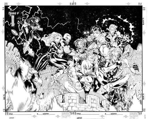
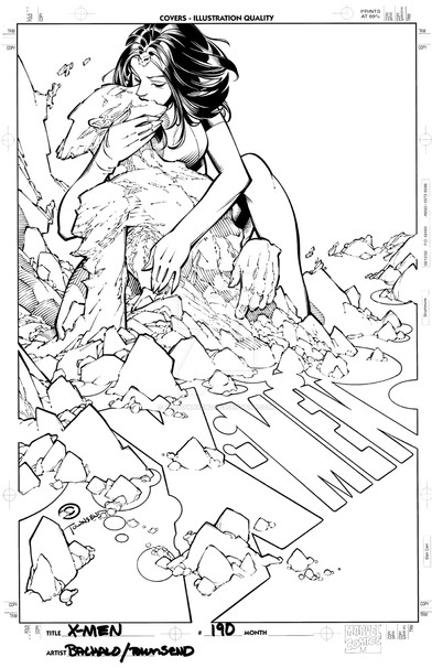
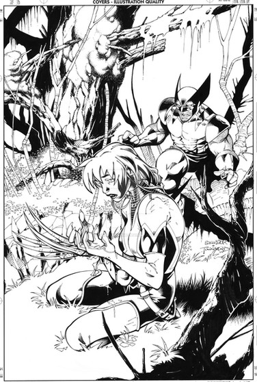
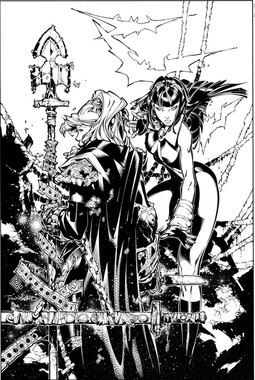
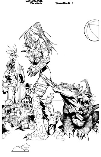
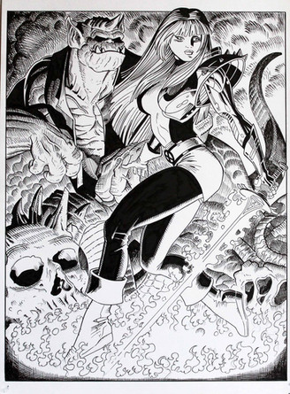
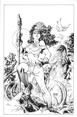
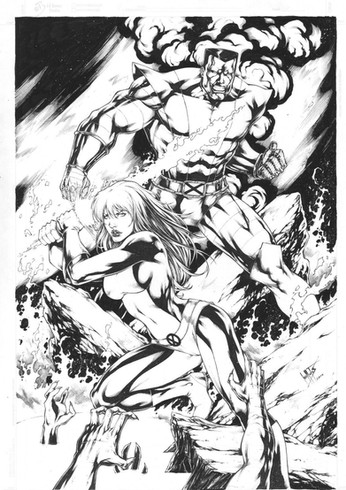
This was a random page from mine and Joe Mad's Uncanny X-Men run. This was one of the issues I got to do full finishes on. I remember having a lot of fun with it.Related content
Comments: 30

It looks like she's floating over him rather than standing on top of him.
👍: 0 ⏩: 1

Well, it's good other than that, that's just one little thing about the picture that irks me.
Just trying to give a little criticism.
I don't think that I could do better myself.
👍: 0 ⏩: 0

I couldn't agree more with your take on inking. I am still learning and find that inkers do have some control on the editing process. Rather than trace, you get the chance improve the penciler's artwork and make it your own. As for the whole tracer thing, I've become so numb to people saying that inkers are tracers. The only time it doesn't bother me is when I know people are referencing "Chasing Amy" and not just being a flat-out jerk. Course, that got old rather quick.
Awesome work! Hope to be in your caliber one day.
👍: 0 ⏩: 0

Nice! I am going to have to go find me a copy of this one
👍: 0 ⏩: 0

Amazing work, Tim! I was just admiring this page few minutes ago, just terrific! She looks a lot like Ayla [link] from Chrono Trigger, doesn't she?
👍: 1 ⏩: 0

The line weights separating the spear from the background are beautiful. This was one of my favorites issues you guys worked on.
M!
👍: 0 ⏩: 0

Ahhh! I remember this issue! I believe it was Uncanny X-Men #346, where we first meet Spat and Grovel! (Spat being the one on top of Remy with a spear/pole arm) Wow... this brings back so many memories, and I enjoyed the inks from this issue, because they were just perfect. (Trust me, I've seen a few bad ink jobs in X-Men) 
-Nicole Wagner: The Deadly Gambit
👍: 0 ⏩: 0

This is a cool one. The little girl is kind of Joe's precursor to the Gully character in Battle Chasers.
Great work!!!
👍: 0 ⏩: 0

What a memories... I have this book, somewere... Im shure... somewere.. but I have it!!!
👍: 0 ⏩: 0

very nice work love all the details in this piece.
👍: 0 ⏩: 0

sometimes i get my inks wrong and try to correct it doing thicker lines and most of the times the result comes very good! i read the comment up there and really i prefer the traditional inking! computers are handy... but there are things they can't do indeed! Its amazing how the details of her clothes were the lines are thiner ans the weapons lines really thick lines work very weel doing a really huge contrast... doesen't need to make sense but it actually looks great1
👍: 0 ⏩: 0

it looks good and i like it - the only think i couldn't understand - why did you thicker outlines on the weapon??
👍: 0 ⏩: 1

oh man - sorry - horrible english - i mean - why are the outlines from the weapon so thick - makes no sense for me
👍: 0 ⏩: 1

The short answer is that I did it because I felt like it and that not everything has to make sense. The long answer is this. Basically, I started out by using it on figures that were featured outside of panel boarders. I found that the actual panel boarders tended to complete with the contour lines on these figures for importance. I decided to try and make the contour lines around these figures actual panel boarders, thick with no line variation. It was just an experiment but Joe and I both really liked it. Soon after I started playing around with the idea in other areas...just to see what was what. For some reason, even though it makes NO sense whatsoever, it seemed to look cool when used on inanimate objects such as weapons or larger foreground objects....so I stuck with it. I still use it to this day. Its one of my little trademarks and something my fans and pencilers over the years have seem to love.
👍: 0 ⏩: 3

Right, Tim. A lot of things in comics aren’t done because they’re necessarily “logical” or make sense. They’re done for style and effect, personality, etc… (I mean, for example, the characters themselves will be drawn like 8 ½ heads high!)
To be honest, I didn’t even notice that thick outline until somebody pointed it out! I guess I’m just too use to American comic art and intuitively brushed it out (in my mind)!
👍: 0 ⏩: 1

Actually, the fact that you didnt notice the thick outline means it worked! Glad to hear it!! And thank you.
👍: 0 ⏩: 0

Oh! I have to confess: I bought a big lot of comics inked by you! 
👍: 0 ⏩: 0

thanks for explaining - that what i thought - that your "feeling" made the lines 

👍: 0 ⏩: 1

Exactly! Dont be a tracer. There are digital programs that can do that. In my opinioin, its every inkers job to not only make the pencils look as good as possible but, in each and every page, prove why a computer program can NOT do what we do. There are too many people out there who dont truly understand what inking is. It doesnt surprise me that these people think that digital inking is the same thing. Ignorance is bliss....and all that.
👍: 0 ⏩: 1

Inspiring words, Tim. In Japan there's a big digital ink trend, everything done by younger artists looks the same and lame. I'm not sure why this is happening (to speed up the production? laziness to learn to ink?), but it's really sad to see traditional inks dying little by little - at least on the mainstream. Some people say it's evolution... As you said, "ignorance is bliss".
👍: 0 ⏩: 1

Very sad. These people will churn out a ton of homoganized work and wonder why theyre not more popular. In the meantime, their heroes, the artists they look up to, will be producing work that stands out and the status quo assembly liners wont even realize why this is.
👍: 0 ⏩: 0

I love the girl - she is so cute! ^_^ And wears all furry clothes. ahh, lovely. 
👍: 0 ⏩: 0

Loved that issue and Love the fat outline on her weapon.
👍: 0 ⏩: 0

There's so much detail in this... so crisp...! I remember this issue too.
👍: 0 ⏩: 0

