HOME | DD
 Tiny-Brain — Graphics Comparison

Published: 2012-10-31 23:03:05 +0000 UTC; Views: 511; Favourites: 13; Downloads: 6
Redirect to original
Description
About 8 years ago or so (I forget exactly how long ago it was) I had finished, and after a brief period of "non-public release" issues, I finally released my fifth Wolfnstein Mod: Spongebobstein, which has been remembered very fondly by those who've played it as a "fun" set (Mods usually being distinguished as fun sets, Wolf-based, or Doom sets in the majority).Spongebobstein was different from my other sets in that it was really the first mod where I had made all of the changes to the graphics by myself, making almost everything entirely original though some of the levels, music, etc. were borrowed.
Now, 8 years later after its public release, I've decided to remake Spongebobstein while utilizing the skills I've gathered over those long 8 years.
Anyway, Onto the artwork itself:
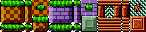
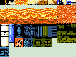
Above you'll see two columns of three rows of wall textures (save for the 2nd column 1st row, which is actually a floor texture). The left column shows how the graphics of the original were, and how the new graohics, that I'm currently making, will appear. As you can tell, there's quite a large gap in quality, the left row looking like a child drew it (Well, I was 13~14 at the time, so that's close enough) and the right tile looking much more professional-looking. As you might notice, the tiles on the left have a vague resemblence of the background scenery depicted on Spongebob, as well as a door which looks nothing like anything found on Spongebob at all, and finally a pattern that vaguely remembles a Pineapple.
Looking from left to right, you'll notice how these two artworks clash in comparison with each other. The sand on the ground looks much more like the wavey and speck-strewn sand found on Spongebob, the Door actually resembles Spongebob's front door (albeit square), and the Pineapple looks like it's supposed to as far as the television program is concerned.
The right column is how the current rendition shall appear in quality as far as the wall, ceiling, floor, and door textures are concerned, the rest of the graphics, such as the characters themselves, will be much more cartoon-like in appearance, thus keeping in tone with the actual appearance of the cartoon (detailed backgrounds but cartoonish foregrounds and characters).
Please, tell me what you think, and if you like, I can post more of my work in coming weeks.
Spongebob Squarepants and all related characters and themes belong to Stephen Hillenburg and Nickelodeon.
Related content


Comments: 5

Well that's certainly a nice improvement.  (Smile)")
👍: 0 ⏩: 1

Yeah, perhaps, though I want to keep the image to just 8 colors (from the same color set ala the palette I made). But this is why I posted it, so that I'd get some input. I'll take your suggestion into consideration.
👍: 0 ⏩: 0
