HOME | DD
 TinyMoonbyul — Tatum the Tree Snek

Published: 2017-08-20 17:52:55 +0000 UTC; Views: 548; Favourites: 23; Downloads: 0
Redirect to original
Description
h i s sRelated content


Comments: 7

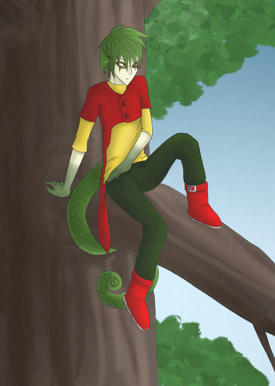
I love the color scheme in this! The yellow pops really nicely against the night sky, and the blues and greens are rich and beautiful. You picked a good shade for the eye - the light brown complements the skin and hair, while still standing out in a striking, eye-catching way.
The sky is really dazzling and chaotic - it looks like a lot of work and care went into making it bright and star-filled, while avoiding the accidental and unnatural symmetry that some people *coughmecough* are prone to.
The hair looks gorgeous - the colors are warm and rich, and the texture is very well-done and convincing. Speaking of convincing textures, great job on those belly scales - they look very real, and I like how they follow the curve of Tatum's body.
There are a few areas that have room for improvement, so I'll offer some observations and suggestions that I hope you'll find helpful.
1. When you use outlines, it's good to keep them consistent, at least in the foreground objects and people. There are a few places on Tatum's tail where the outline looks greyed out, half-erased, or almost gone.
2. Speaking of the tail, the shape doesn't seem very consistent. There are places, like where the dangling back end meets the branch, where it looks kind of flattened. If the tail is supposed to be squishy and to flatten when pressed against something, then it makes sense for it to be a bit flat there, but there's also a bit of a lump near the tip of the tail, and the coils around the tree look narrower than the dangling part at the back, which makes me think it was more accidental than a deliberate aspect of Tatum's anatomy.
3. I think the break in the line of the mouth is a bit too big and pronounced. Personally, I'm not a fan of the whole "broken line for a mouth" style to begin with, so I'm a bit biased, but in this case, the break dominates the mouth to such a degree that it looks more like an upside-down mustache than a mouth.
4. The shirt is off to a good start, and I like the contrast that a mundane, normal-looking sweater on a snake person creates. But the shading on it looks a bit blobby and inconsistent, and it's hard to tell where the light is coming from. For example, the spot where the left arm meets the body has an almost perfectly round shadow, which doesn't make sense given the shape casting the shadow. When you're doing shading, it's important to pick a direction from which the light is coming and stick with it.
5. When you're doing folds and wrinkles in the clothing, it looks better if the outline follows the curve of the wrinkle into the fabric, instead of just tracing the outer edge of the fabric. There are a few places where you did that, so it looks like you know the concept; I just suggest being more consistent with it, for best results.
That's it for the constructive criticism - now back to complimenting your art.
The pose and facial expression go together very well. The whole thing gives an "exotic, seductive, maybe slightly mischievous showoff inviting you to a world of fantasy where snake people are real" feeling - the kind of thing where it almost feels like the premise of a book, encapsulated in a picture. It's a subtle feeling that's hard to clearly define, but I love it when a picture inspires that feeling, and you did so here.
Great work, and I hope my comments help you to do even better in the future.
👍: 0 ⏩: 0
The ground ought to be at an angle, otherwise it looks like he's floating in space (although he probably is, assuming it's not night time).
Your shading technique really needs some work too. It looks like you just plopped on different patches of light and dark on Tatum's body, which makes it impossible to know where the light is coming from.
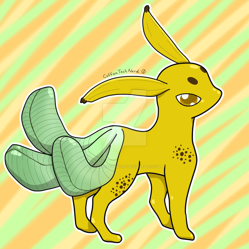
The colour pallet is probably the best part about this. The orange in his eyes, the yellow of his snake-half and the whites in the stars are bright and eye-catching without being distracting and the dark greens, browns and blues add a well needed amount of contrast without being dull.
2/5.
I'm just giving you my constructive feed back, so don't throw a hissy fit.
👍: 0 ⏩: 0
you TRY to modulate & shade but you dont. You have to pu more love into your shading phase during creation!
👍: 0 ⏩: 0

Hey what's up guys Scarce here
👍: 0 ⏩: 1

I was referencing Leafy, because you had H I S S in the desc
👍: 0 ⏩: 0
