HOME | DD
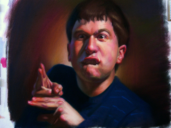
 TinyPEN15 — Wild portrait number 5

Published: 2006-05-16 21:16:46 +0000 UTC; Views: 2761; Favourites: 47; Downloads: 68
Redirect to original
Description
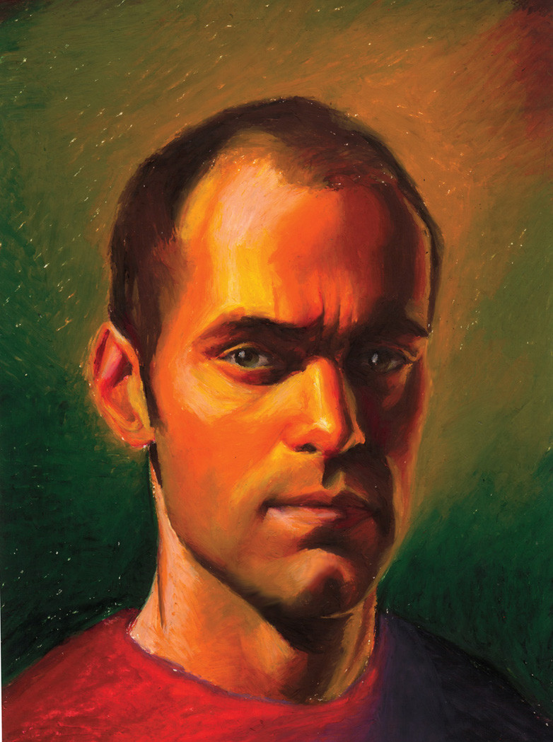
Number 5, what can i say? Getting tired now, one more to go. Pastel.Related content


Comments: 23

heh, that is great. I do agree abit on the Jim Carrey thing. You may not be as tall, but I'd bet one you on a fight to death any day. I would self destruct by the mere sight of you in the ring. I mean look at that death-grip and the fearless eyes... yeah. Im very much envyous of your skills btw.
👍: 0 ⏩: 0

haha you look like jim carrey 
👍: 0 ⏩: 1

bah! i'm no where near as tall or as good lookiing as him, but thank you
👍: 0 ⏩: 0

Sweet! Its very Dr. Jekyll/Mr. Hyde...almost like its in the mist of the transformation...awesome!!
👍: 0 ⏩: 1
haha, i was really stretching for expressions at that point, but it worked out
👍: 0 ⏩: 0

Freaking amazing times twenty.
I really like the expression you have here. Its like me on a good day
👍: 0 ⏩: 1
Thanks so much! you look like me? but your a lady.. awesome! what do i look like as a woman??
👍: 0 ⏩: 0

Haha amazing ")

👍: 0 ⏩: 1
")

Jeebus sykes! im gonna hang this baby upside down! hahah! inspiring! heck, i though it was a photo
👍: 0 ⏩: 2
")


I like this series. I assume you're working from a photo...how do you light it?
👍: 0 ⏩: 1
a spot light. I add in the secondary blue light from my imagination or whatnot.
👍: 0 ⏩: 0

nice work man. I do have to crit one part though..... left side of the face, the yellow highlight on the dimple area by the side burns screams a little to much. i'd throw the pink in there to make it more coherant. I think it would couple with the face and read better. ...just me maybe. I must say though that your sense of value contrast and chroma are fookin phenominal!
👍: 0 ⏩: 2
Please don't get me wrong, its a FRICKIN' AWESOME peace, I just wanted to point out something small I saw so it could be top notch. Koodos man!!!
👍: 0 ⏩: 0
mmm yea, good point, i'll change that. I do apologize for the digital picture though, kind of murders the colors. haha, didn't help that my reference was all blurry either, had to use my brain on this one more.
👍: 0 ⏩: 0

Fabulous!
👍: 0 ⏩: 0


 (Smile)")
