HOME | DD

TIT0 — ABC

Published: 2007-08-28 10:19:04 +0000 UTC; Views: 30415; Favourites: 245; Downloads: 0
Redirect to original
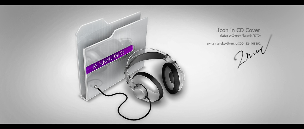
Description logo "Audit Business Centre"
Related content
Comments: 56

send2owais [2011-01-31 11:27:42 +0000 UTC]

looks liek ferrari

👍: 0 ⏩: 0

hugoo13 [2010-08-19 21:09:19 +0000 UTC]

Great logo design

carried in Cruzine: [link]

👍: 0 ⏩: 0

kaedesign [2010-04-02 19:42:35 +0000 UTC]

amazing

👍: 0 ⏩: 0

stylevault [2010-02-08 09:19:33 +0000 UTC]

Very nice!

👍: 0 ⏩: 0

seleporx [2008-07-18 14:10:44 +0000 UTC]

wow brilliant..BOWDOWN!...

👍: 0 ⏩: 0

Maharaja34 [2008-06-03 09:57:58 +0000 UTC]

Beatifull

👍: 0 ⏩: 0

shanokee [2008-05-27 09:44:19 +0000 UTC]

Impressing.

👍: 0 ⏩: 0

tombraiderfanart [2008-01-14 11:43:14 +0000 UTC]

Like every single logo of yours. They're all so uniqueand professional!
Especially like the silver/black contrast in this one and your choice of a blended side.
Would be great to see you in our Logo contest.

Good luck!
Simona

👍: 0 ⏩: 0

Awooo [2007-10-25 15:19:37 +0000 UTC]

Is the bluur for presentation purposes or part of the logo?

👍: 0 ⏩: 2

Awooo In reply to Awooo [2008-05-22 05:38:54 +0000 UTC]

Are you being sincere now?! (trick question)

👍: 0 ⏩: 0

Fel1x In reply to Awooo [2008-05-21 23:32:39 +0000 UTC]

100% for presetation. i swear! if not. kill me.

👍: 0 ⏩: 0

designer-brain [2007-10-14 05:03:40 +0000 UTC]

nice but look like peugeot logo

👍: 0 ⏩: 0

elusive [2007-09-23 12:57:01 +0000 UTC]

Sex.

👍: 0 ⏩: 0

yuriofpoland [2007-09-21 14:36:41 +0000 UTC]

niiiiiiiiiiiiiiiice !!

👍: 0 ⏩: 0

deC9r [2007-09-08 16:26:26 +0000 UTC]

keep it reel, hot shit man

👍: 0 ⏩: 0

nlite [2007-09-06 15:43:46 +0000 UTC]

amazing!! great logo

👍: 0 ⏩: 0

wilsoninc [2007-09-04 05:35:11 +0000 UTC]

nice, are the blurs manuals ?

👍: 0 ⏩: 0

dthowell [2007-08-31 11:00:56 +0000 UTC]

The logo as with all your work is great. But the blur does not represent Auditing.

Auditing is about clarity therfore the blur would do damge to the brand. No insult meant just froma practical point of view.

I am an avid fan keep up the great work.

👍: 0 ⏩: 1

osec In reply to dthowell [2007-08-31 15:24:20 +0000 UTC]

Thats probably the way he did it in the preview, I doubt the real life logo will be blurred.

But I could be wrong.

👍: 0 ⏩: 1

ZevuArt In reply to osec [2007-10-25 15:07:04 +0000 UTC]

no u are right

👍: 0 ⏩: 1

Fel1x In reply to ZevuArt [2008-05-21 23:34:03 +0000 UTC]

a blurred logo? NEVER. not here in this one.

👍: 0 ⏩: 0

naveedafsar1983 [2007-08-30 16:21:41 +0000 UTC]

wow, Peugeot logo modified !

👍: 0 ⏩: 0

Uribaani [2007-08-30 11:00:40 +0000 UTC]

My god man! The number 1 logo I´ve seen here! Absolutily amazing!

👍: 0 ⏩: 0

kurshun [2007-08-29 23:08:20 +0000 UTC]

wow.. beautiful..

👍: 0 ⏩: 0

thiagotasca [2007-08-29 12:04:20 +0000 UTC]

wow
beautiful job

👍: 0 ⏩: 0

jaysnanavati [2007-08-29 08:44:02 +0000 UTC]

good job mate keep it up it loosk like voxehell car logo

👍: 0 ⏩: 0

themajiks [2007-08-29 08:20:58 +0000 UTC]

Wow. Perfect.

👍: 0 ⏩: 0

Nakrocp [2007-08-29 06:20:56 +0000 UTC]

very nice, i like it.

👍: 0 ⏩: 0

Eltasia [2007-08-29 03:42:43 +0000 UTC]

Great work

👍: 0 ⏩: 0

hampux [2007-08-28 21:04:32 +0000 UTC]

I love the blurry! Perfect logo!

👍: 0 ⏩: 0

Conceptes [2007-08-28 20:04:05 +0000 UTC]

peugeot?

👍: 0 ⏩: 0

netbuzz [2007-08-28 19:11:17 +0000 UTC]

xoroshiy

👍: 0 ⏩: 0

AnubisGraph [2007-08-28 16:14:59 +0000 UTC]

is it just me .....
or that logo looks like the peugeot logo ?

👍: 0 ⏩: 0

termi1992 [2007-08-28 14:59:19 +0000 UTC]

thats hot!

👍: 0 ⏩: 0

denbas [2007-08-28 14:05:14 +0000 UTC]

хехе, логотип пежо )))
гут, мене подобаецця! то что надо для бузинесс центр, строго и са вкусом!

👍: 0 ⏩: 0

venom1209 [2007-08-28 13:28:40 +0000 UTC]

excellent

👍: 0 ⏩: 0

ceco-milanov [2007-08-28 13:10:11 +0000 UTC]

That's perfect!
Regards from Bulgaria

👍: 0 ⏩: 0

BraveDesign [2007-08-28 12:50:51 +0000 UTC]

Фригеру пора начать опасаться за свою пальму первенства

👍: 0 ⏩: 0

shftfrm [2007-08-28 12:39:56 +0000 UTC]

I agree with *badboythemer I think a clear version without the blurry effect looks better. The logo looks good but without the blur ti would be better.

👍: 0 ⏩: 0

EnzuDes1gn [2007-08-28 12:24:54 +0000 UTC]

not so sure about this oen mate, that blur is killing this preview imo, i would like to have seen a clean crisp version without the blur

👍: 0 ⏩: 0

Telpo [2007-08-28 12:22:49 +0000 UTC]

nice work man

👍: 0 ⏩: 0

MarinaSha [2007-08-28 12:17:29 +0000 UTC]

интересный и красивый логотип, похож на автомобильный... но внимание однозначно привлекает!!! стильно!

👍: 0 ⏩: 0

imadesign [2007-08-28 12:11:28 +0000 UTC]

yep Peugeot .. but awesome

👍: 0 ⏩: 0

exakt [2007-08-28 12:10:27 +0000 UTC]

гуд

шоп или что-то ещё ?

👍: 0 ⏩: 0

Indriks [2007-08-28 12:06:31 +0000 UTC]

He he, looks good, but again I have some critic. I dislike blur on company tile & on logo top corner. But still good job.

👍: 0 ⏩: 0

luccide [2007-08-28 12:01:45 +0000 UTC]

👍: 0 ⏩: 0

News150 [2007-08-28 11:22:05 +0000 UTC]

The best

👍: 0 ⏩: 0

kntz [2007-08-28 10:49:04 +0000 UTC]

FANTASTIC BRO!!!

👍: 0 ⏩: 0

a1ee [2007-08-28 10:38:54 +0000 UTC]

looks like peugeot!
but i like it.. nice work!

👍: 0 ⏩: 0

Nas-wd [2007-08-28 10:35:38 +0000 UTC]

awsome logo like it very much

👍: 0 ⏩: 0


| Next =>