HOME | DD
 Tngabor — Web design - KPI Georgia
by-nc-nd
Tngabor — Web design - KPI Georgia
by-nc-nd

Published: 2012-11-01 10:32:15 +0000 UTC; Views: 5346; Favourites: 26; Downloads: 0
Redirect to original
Description
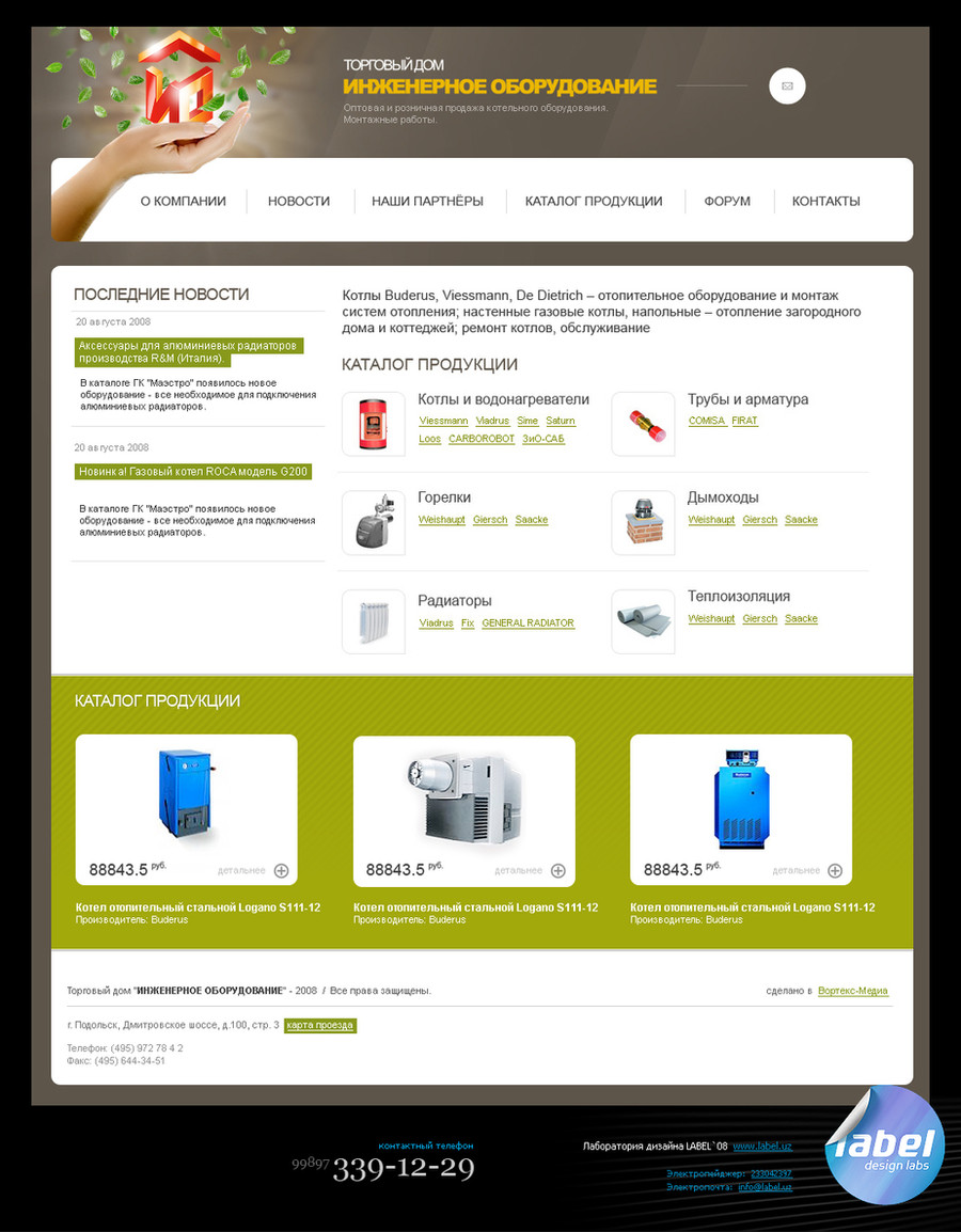
Web site design for KPI from Georgia.
They are selling medical equipment.
KPI Georgia - Product page: [link]
Copyright © Törőcsik-Nagy Gábor 2012. All rights reserved.
Do not steal, make your own art!
Related content


Comments: 4

Pretty nice but few things from my side:
1. Footer: Hover effects on links i rather would make them the same width for all of them (the longest link is the line), the map don't fit there to much .. better would by only a better zoom on the country and only the boundary of countries with names.
2. Color: i would stay with only blue or variations of blue (the logo is dark to light blue) there is no green in it.
3. I would remove the shadow from the product boxes (make them plain white) and at the hover effect i would make darker gray. The names of the products make dark gray to and on hover light blue or white.
It all looks a little minimalistic so stick with it to the whole design.
Good job btw.
👍: 0 ⏩: 1

Hey!
Sorry for the late reply.
Anyway, thanks! I rarely get such long critiques here on dA.
...and it is much appreciated!
1. Yeah, the hover effect would probably be nicer that way
Regarding the map, that can be fine tuned later. It also depends on how "international" the company is, and i haven't got information on that.
2. I see. Well a can't argue much here
3. Yep. Although this is one of those things that are out of the designers hands. How will they get the product photos and stuff. If they have an in-house designer, then the shadow (vignette) could work, if not then the photo background will be plain white anyway (no transparency). The truth (the reality) is that 90% of clients just don't care about the quality of photos.
Thanks again for the critique man!
Have an awesome day
 (Wink)")
")
 (Smile)")
👍: 0 ⏩: 0

It hast got potential but it's just to much, for my eye. Both in terms of frames and in term of colour. But then again, I'm a minimalist.
👍: 0 ⏩: 1
Unfortunately, the amount of info i have to put into an index page is out of my hands.
And this is an eShop, which means twice as much data.
Thanks for the input btw
Have an awesome day!
👍: 0 ⏩: 0