HOME | DD
 tnp08 — Balloons_WIP
by-nc-nd
tnp08 — Balloons_WIP
by-nc-nd
Published: 2009-11-17 20:23:55 +0000 UTC; Views: 557; Favourites: 15; Downloads: 14
Redirect to original
Description
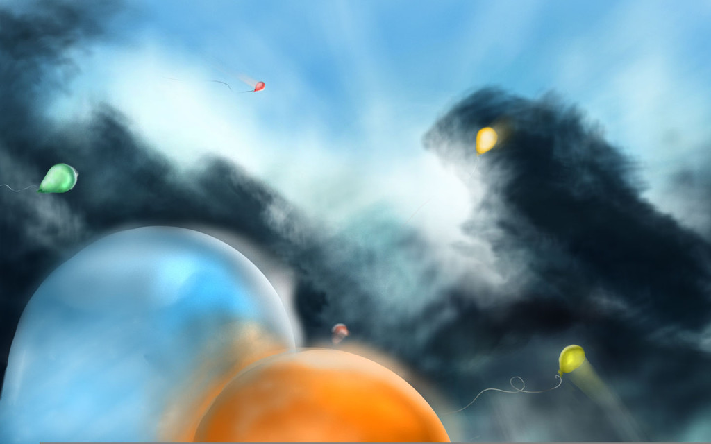
Still working on this one. I would appreciate any critique, but specifically I'm working on lighting and composition.Final here: [link]
Related content


Comments: 45

Wow, that is real shweeet.
The problem I have, though, are the balloons seem to be traveling at the speed of light with those blurs behind the smaller ones. And I also think the sky is far to bright, but at the same time dark; it's probably the clouds that make me think this...
Anywho, great job! Can't wait to see the finished product!
👍: 0 ⏩: 1

If you're interested then, the finished piece is in my gallery.
👍: 0 ⏩: 1


I smell potential.
I really like where this is going, it's a nice composition and the colours look promising. I would like it if you made the clouds and balloons rather sharp, and not so blurry, it would add more "harmony" because as it is right now it's pretty messy, which is rather difficult/annoying to look at.
Don't worry about the colours, they're gorgeous. Tell me when this is done, because I'd love to see it.
👍: 0 ⏩: 1
Thank you very much for the feed back. I noticed converting the file to a web jpeg muddied everything to some extent, but it does need cleaning up.
Thanks again, and I'm planning on posting the finished product for additional critique so you should see it then.
👍: 0 ⏩: 1
I'm looking forward to seeing it finished.
👍: 0 ⏩: 0

Beautiful idea and well-wrought image. 
I love the sense of depth and light. Absolutely breathtaking. The way they are all on a journey to the 'light', if you will, is beauty, pure beauty.
The only suggestion I have is this:
All of the balloons seem to be rather spaced out, and I like that. It looks great. But the two balloons in the foreground are right beside eachother! This looks unbalanced and strange. The way the colours play off is really cool, but I just think it's strange that they're beside each other. Take out the blue and move it farther away, I think.
👍: 0 ⏩: 1
Thank you for the critique, and I'm glad you liked it so much.  (Smile)")
Oh, and yes you've seen a piece or two of mine but not on this concept.
Thanks again!
👍: 0 ⏩: 1

:icongimmefeedbackplz:
All of the balloons seem to be moving up and to the right as well, so if it would be possible to add some sort of wind element to make it look like they're being blown to the right, it might look a little more natural (well, as natural as balloons can be XD). It seems to me from the perspective we're facing the balloons, they would be moving in all different directions (as well as up), so try experimenting with that.
Otherwise it is very well painted, for some reason it reminds me of an old French painting or something. I dunno, trying to think of the words to describe how it makes me feel... Good, for one!
👍: 0 ⏩: 0

I really enjoy the concept, nice colours and upward feel however, perhaps it's the strokes but I feel that the whole picture becomes confusing to look at with the amount of movement put into the strokes of the brushes that you're using.
For example there are lines and movement blurs everywhere.
I really like the picture though!
^^
👍: 0 ⏩: 1
lol, yeah.. I was attempting to make it appear light was coming through the balloons but mostly I just looks like they're zipping around in the sky. Thanks though! I've been revising it already and that's one of the things I'm taking a second look at.
👍: 0 ⏩: 1
Great~ I'd love to see it when it's finished~ good luck ^^
👍: 0 ⏩: 0

hummm... love the look of it... but composition wise... wouldn´t the baloons be affected by perspective (they look too much "parallel")
👍: 0 ⏩: 1
I'm afraid I'm missing your meaning. Could you elaborate?
👍: 0 ⏩: 1
Sorry for taking my time. The problem I see is the lack of a vanishing point. Since the ballons are parallel to each other, there is no perspective, which bothers me, because the ballons are spreaded far apart ono another. If you had a vanishing point to this work, it´s going to feel more tridimensional.
👍: 0 ⏩: 0

I do enjoy this one 
👍: 0 ⏩: 1

I do like the idea you have got here, the image bears a kind of deeper calm to it and evokes memories of my childhood, we allways release lots of balloons on national day.
You ask for Critque on composition, I think it could work if you pulled the canvas a little bit out to the left. As it is right now, the closer balloons are touching the edge and creating a tangent, and those tend to create some disturbance. I would extend the canvas with about the width that the green balloon has. I would also try rearranging the balloons, but I can't tell you where the right place to put them would be, but you could try making multiple smaller thumbnails where they are differently arranged, and see which ones looks the best to you.
Depending on if you want the background to be clouds or trees, I think adding a slight more layer of details could be useful to specify this, allthough I think it is nice to be a bit more abstract, I don't know weither or not you are going for photorealism eventually, but I don't think it is at all neccesary for this piece, you could have a more paintery style and it work better, that is up to preference. I like the colour palette here and if you start detailing out the clouds you have to be careful not to make them too bright, because i love the negative shape that they currently create (I blur my eyes when I look at your image to see it better)
👍: 0 ⏩: 1
Thank you for the great critique. I'm glad you enjoy it and I'm working now on trying to find a better compositional arrangement.
👍: 0 ⏩: 0

I think you should try not to smudge the balloons too much--the red on up the top looks like it's speeding along pretty fast but from the viewpoint you've given that wouldn't be obvious. The clouds would look better if there was a bit more light shining through them, but the latter point is just personal opinion and in general it looks very good, and huge changes are unecessary. ")
👍: 0 ⏩: 1
Thank you very much. I'd been wondering the same thing about the red balloon.
👍: 0 ⏩: 1
You're welcome
👍: 0 ⏩: 0

Great idea!
This has a lot of depth, the eye goes from the balloons on the foreground to the small ones in the background following a pattern that reminds me of a spiral (not completely tho). For this reason, I'd suggest making the yellow balloon on the bottom right a little bit bigger. Also, move it a little to the right to balance the image left to right. If you don't want to move it, perhaps a little cropping on the right could balance things.
There are two bright spots on the sky (at least on the monitor I'm working with), one towards the top and left and another one toward the right and more towards the vertical center. Perhaps toning down the bright spot on the top left will make for only one "sun" to seem to be present (unless you want there to be two).
Regarding the lighting, it looks great in general. I think you can add light patches (light grey/whitish) to the clouds to make them seem less uniformly thick and more translucent in some places.
The halos in the balloons are aesthetically pleasing to me, but I think that they should be less linear to look more natural. Perhaps you can play with them by adding an extra glow all around the balloons to the bright streaks you already have. This might also soften them a little. The green balloon on the left is missing its halo.
I hope this helps.
👍: 0 ⏩: 1
It does help, and thanks a lot of the great critique!
👍: 0 ⏩: 0

This is cool. I'm not quite sure how to explain it though, but something about the dark cloud seems a little random. It might be the extra piece coming out on the right, but I'm not entirely sure.
All in all though, this is great!
👍: 0 ⏩: 0

I like the idea of this piece! I realise the focus of this piece is the Orange and Blue balloons in the bottom left-hand corner however the orange color I feel is a bit overpowering, it's not in balance with the rest of the piece.
👍: 0 ⏩: 1
Ok I'll take that into consideration when I revise the piece.
👍: 0 ⏩: 0
I like the idea of this piece! I realise the focus of this piece is the Orange and Blue balloons in the bottom left-hand corner however the orange color I feel is a bit overpowering, it's not in balance with the rest of the piece.

👍: 0 ⏩: 0

on a personal note, I love the subject. balloons are pleasant to look at.
on critique, I like how the blurriness of the background gives the painting a sort of smoky feeling, and if that's what you were going for, then I would suggest perhaps making some of the balloons more blurred as well; in a photograph the further balloons would be bokehed. However, if you werent going for a smoky effect, then i would conversely suggest adding more sharp detail to the trees in the back (maybe not sharp-sharp, but just less blurry) >.> long critique.
anyways I really enjoy this image and wish you luck on your painting endeavor ^o^
👍: 0 ⏩: 1
^o^ no problem! i think the painting will turn out nicely :]
👍: 0 ⏩: 0

👍: 0 ⏩: 1
Look! Balloons! BALLOONS!
This is a wonderful piece - the colours and reflections are amazing.
My only suggestion is to clean up some of the edges of the balloons. The blue one, the yellow one to the right and the green one near the top look distorted. The green one in particular is particularly distracting. Other than that I think this piece is perfect
Dan
...Hehe...balloons!
Yea the green was the last balloon added and I tried to use it to balance the red in the background, and fill a space I felt was too empty. I may change it to a color that's less dominant and see about fixing the shape and pose of that and the other two.
Thanks!
👍: 0 ⏩: 1

So this isn't the finished product? I really like the idea and perspective going on here. It would be nice to have more defined light, shadow and outline. For the balloons, I noticed a blur behind them. Is that going to be the light filtering through the balloon? If so, I would tone it down a little. Definitely looks interesting, and I can't wait to see the end result!
👍: 0 ⏩: 1
Thanks for the feedback. It seems clarity it an issue people on and offline have mentioned so I'll definitely see about cleaning it up. Thanks again.
👍: 0 ⏩: 1

I love the perspective on this one, but I feel that the brushes you're using are taking away from the end result. The balloons are nice and round, but the colouring on them is muddled, same with the sky. I like the colours you used here, but I think that your painting technique could use a little more work.
On a random note, I really like the balloon strings.
👍: 0 ⏩: 1
I agree, oddly enough I didn't notice it till I uploaded so maybe it's an issue with seeing it in an online format, but I'm already planning on taking another look at it because of the blurryness specifically. Thanks!
👍: 0 ⏩: 1
I'm so glad I could help. After I reread what I wrote, I realised that I wasn't exactly specific on how you could improve. Sorry about that! I'm sure no matter what you do, it'll turn out looking great.
👍: 0 ⏩: 0

Wow, thats amazing! Really good, especially the dark clouds and the big ballons in the middle
I just think, you should put the yellow ballon on the right a bit more in a 'standing pose', if you know what i mean. I don't think ballons fly like that. But the rest ist really awesome

👍: 0 ⏩: 1
Thanks!
👍: 0 ⏩: 1
You're welcome
👍: 0 ⏩: 0