HOME | DD
 TobiasRoetsch — Disruption

Published: 2012-04-30 12:34:32 +0000 UTC; Views: 52322; Favourites: 1705; Downloads: 5858
Redirect to original
Description
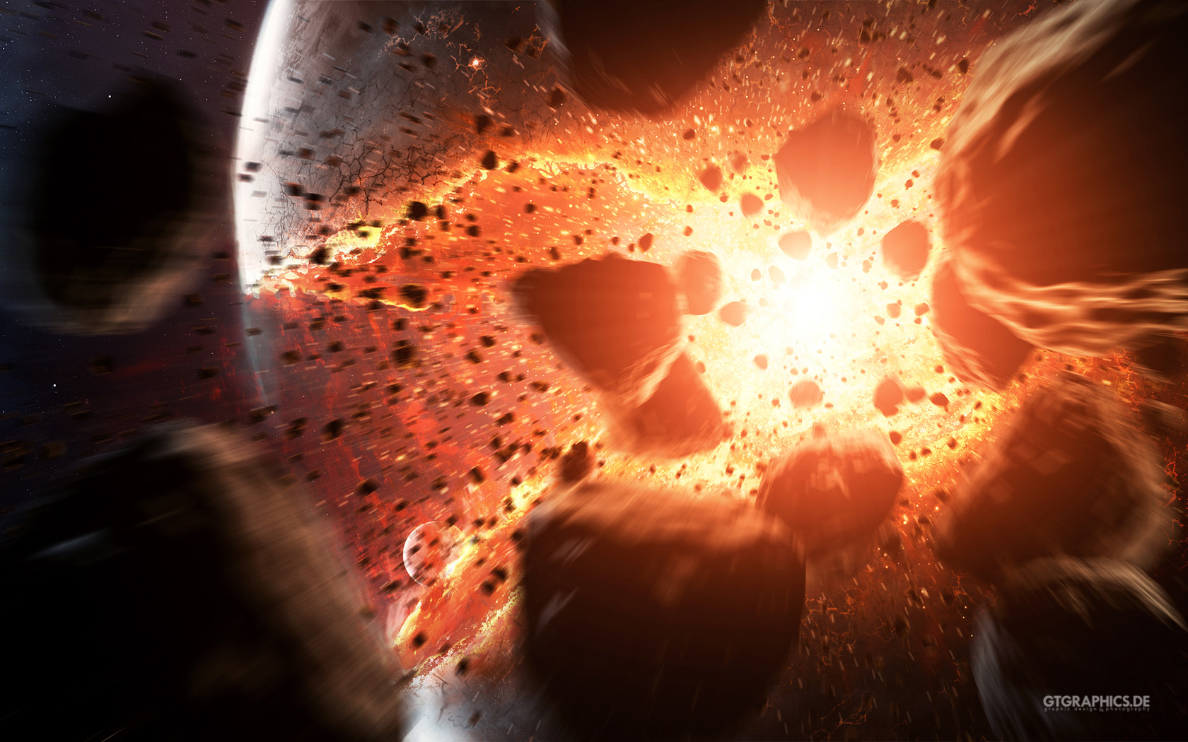
First time I made a planet impact image. Not very original but I wanted to give it a try on my own. All in all I am quite happy with the feeling I generated. I hope you like it as well.Several different wallpapersizes available on my homepage: gtgraphics.de
Related content


Comments: 157

Overall
Vision
Originality
Technique

A good artwork feels like a slap in the face. An apocalypse that destroys our world is not only a classic theme that was featured in many mediums but a reality. What this picture does is to remind us this reality. I especially like how the moon is depicted, it pretty much looks like the moon that I see through my window, reminding me of the fact that it will actually happen where we live. Also the stones add to the realism of this epic artwork. Yes, this artwork could tell the old story in a different way and it shocked me. The title is also very fitting, this is a disruption to everything we know so far. What could have been better? I think you could have picked a more original topic, but I would say it wouldn't make the same impact. Overall, a very nice depiction of what is to come - real soon.
👍: 0 ⏩: 2

This is a very good piece and deserves a better comment than some conspiracy theorist wittering on about the imminent apocalypse.
👍: 0 ⏩: 1
if you know better why didnt you write one? You have no credibility whatsoever.
👍: 0 ⏩: 0

Thanks for your critique!
👍: 0 ⏩: 1
Thanks for the artwork!
👍: 0 ⏩: 0


Originality
I always admire when an artist tackles a classic theme, and although a planetoid striking the earth isn't part of classical literature, it is a modern classic, one that has inspired fascination and fear.
I referred to the impactor as a planetoid because of its shape and scale in comparison to the larger planet. Such an object would be so large that one side could be melting miles beneath the crust of the Earth while the opposite side is still technically in space. Your shading of the planetoid reflects this accurately.
Other things I really like:
Excellent use of motion blur on the boulders in the foreground. It gives the image the appearance of a photograph, which I think has a very subtle and disturbing emotional impact, and it also, it provides a depth of field effect to help focus the eye ( even more) on the planetoid.
The sun's (or parent star's) glare is a good effect. A pure black background with a myriad of bright stars would be what we would see if we were facing the other way, but the glare of the sun AND the fiery flash of the impact would blot out almost every star. It could be that the parent star is dimmer than the sun, but if it's not supposed to be dimmer, or if it is indeed supposed to be the sun, it would be interesting to see if you could do a greater glare effect, and maybe even a subtle lens flare, without overpowering the main focus of the impact itself.
Great details on the ripples and shock waves radiating out from the base. I even sense the water reflection in the largest ring below the wave. Another effect that you might want to try to tackle in future versions is the sudden, circular clearing of the atmosphere around the impact. Just as there are blast waves emanating out through the surface of the earth, so there would be ripples of clarity rippling out through the subtle haze of atmosphere you've so accurately portrayed.
This is no ordinary impact. This object is large enough to have achieved a spheroid shape. I think you've done an excellent job of depicting what we imagine to be accurate as well as adding your own sense of drama, a good, artistic balance of what others think you "should" show, and what you see and feel in your mind's eye. I feel that's always a challenge for an artist.
👍: 0 ⏩: 1
Thanks for your critique and thoughts
👍: 0 ⏩: 1
PiXelPunk-1UK [2012-05-01 03:30:56 +0000 UTC]
Impact
This is too individual to give critique. All i could suggest is to increase sharpness in foreground and add a little contrast and hue (red) to the backdrop to give it a distinct distance seperation. The asteroid on the left should be lighter and have its detail noticeable; as anything that close to you in the forground you would be able to see with much more lighter detailed clarity. A lot more stars and maybe a couple more smaller fireballs higher up to look as though they are heading for their destructive impact on the surface of the depicted planet.
👍: 0 ⏩: 2
Thanks a lot for your critique!

👍: 0 ⏩: 1
PiXelPunk-1UK In reply to TobiasRoetsch [2012-05-14 14:26:44 +0000 UTC]
It was a pleasure to critique such lovely work. Thankyou for the opportunity to do so!
👍: 0 ⏩: 0

Lol, giving everything maximum score except the impact which was lliterally the image here
")
👍: 0 ⏩: 1
PiXelPunk-1UK In reply to Nils-Iver [2012-05-01 14:40:25 +0000 UTC]
You are absolutely correct Nils and the WOW factor impact was not totally there for me, hence only 4 stars. It does'nt mean i can't appreciate everything else and all the hard work that the artist put into this piece of art.
I love my artwork but only a few pieces of it give me that WOW impact feeling. At least i made you lol which is always a good thing
")
👍: 0 ⏩: 1
Oh but it was a pun intended, you see what i did there? i said 'literally'. in this image we see a planetary collision and that's the 'impact' you rated lower than other elements in the image, hence it would deserve the highest rate of 'impact'
👍: 0 ⏩: 1
PiXelPunk-1UK In reply to Nils-Iver [2012-05-01 15:15:21 +0000 UTC]
Stupid 
")
👍: 0 ⏩: 0

Overall
Originality
Technique
Impact
To start with, I think this was very well done. You have definitely done great on this piece. As for artistic ability, you exceed as an artist. And though you are correct, planetary impact isn't a very original idea, I give you credit for original style. I just didn't feel the [literal] impact in this picture.
To be more precise, this isn't exactly what I'd expect to see in a picture of an impact with Earth [or any other planet]. It seems like the streaks of orange flying into space, along with the area near the point of impact were a bit rushed. What would usually be the most detailed part of an impact picture is the actual spot where both objects touch - for instance, the smoke around the impression, the clouds spreading out and evaporating from the force and heat of the impact. And assuming the orange is magma/lava, it doesn't resemble a liquid in this piece, instead it fades off as if it were gaseous fumes escaping from the centre of Earth. The motion blur used on pieces of rock and magma rocketing out over the atmosphere was a nice touch, showing the force of such an impact.
Your technique is great, and considering this is a relatively small picture, it's very well done. Just for future reference, when it comes to space art [this is coming from a person that absolutely loves space art], detail is what attracts the viewer. The bigger, more detailed the picture, the better. I'd like to see a digital art of an impact that looks photo-realistic, but with a hint of the artist's original style incorporated. Of course, you noted that this is your first impact picture, so I'll be looking forward to your next one!
Hope I wasn't too harsh!
~Cameron
👍: 0 ⏩: 2
Thanks for your thoughts
👍: 0 ⏩: 1

Agreed. The weak point of this piece is really the lack of detail. It's just a bit blurrier than your other pieces.
As an aside to taenaron; I've had your MS background pack on my laptop for less than a year... but have already had two people comment in awe of it. I really enjoy it as well.
Thank you,
Biasedeye
👍: 0 ⏩: 2
 (Wink)")
Just was I was thinking. Still, it's great for his first try, right?
👍: 0 ⏩: 1

Originality
i love this picture, it's amazing!
but... i will try to put a critique if i can e.deviantart.net/emoticons/s/s… " width="15" height="15" alt="
 (Smile)")
the look of the picture and the colors are stunning!
the originality.... well, you said it your self, it's a common idea, but even so... it's still amazing!
i love the blur effect you did here, but i think (in my opinion) that it's wrong to blur the far rocks, because far things from us do not usually blur, but here, you blur-ed every rock, which (in my opinion) not very right
and, another thing, i found (in my opinion e.deviantart.net/emoticons/w/w… " width="15" height="15" alt="

well... that's my opinion and i think you artwork is a masterpiece e.deviantart.net/emoticons/s/s… " width="15" height="15" alt="
👍: 0 ⏩: 1

Hello! I've made an animation with your picture.
Link here: youtu.be/WCj7tQhvb7s
Thanks for your permission!
👍: 0 ⏩: 0

The fact of 🔥#Planet -X, 🔥the planet of chastisement from the decisive Book as a reminder to the possessors of understanding-minds..
27 - 11 - 1430 AH. 15 - 11 - 2009 AD. 12:26 am
🔴👇
www.the-greatnews.com/showthre…
English
www.facebook.com/D%C3%A9clarat…
👍: 0 ⏩: 0

A l o h a ! To you ~
Your graphics first caught my attention a couple of years ago as I was looking for some sort of background slides for my first laptop. After downloading the bundle many people commented on the artwork in a appreciative way. So, after all, catching you on Deviant Art was a pleasant surprise.
Keep on keepin' on.
👍: 0 ⏩: 1

What a great piece of art.
I loved the debris hitting us
👍: 0 ⏩: 0


it's fantastic. now this is something that would be really annoying to fix, but most impact events occur at around 35-40 degrees, meaning that the ejecta is higher and more pronounced on one side of the impact. the sound shockwaves are still circular, because the sound still propagates away from the impact at the same speed, but more material would be blasting off on one side.
👍: 0 ⏩: 0

Good one. Please check out mine version [link]
👍: 0 ⏩: 0

I agree with the others, it is a subject that has been soken on many of times. But this is so wonderfully done, I hope when i finally get creative suite I can post something that is as impressive as this, i'm a design student.
👍: 0 ⏩: 0

This is beautiful! So much motion for a single frame art!
Love it! I don't know what tools you used on this, but you really take the best from it! Clearly.
Congrats!
👍: 0 ⏩: 0


Look amazing! Especially for your first attempt
👍: 0 ⏩: 0


Good as any artist's work of a small moon smash into the earth's surface
👍: 0 ⏩: 0


reminds me a lot of "Melancholia" by Lars von Trier - well done, a great capture of a moment that was never seen.
👍: 0 ⏩: 0
| Next =>