HOME | DD
 TobiasRoetsch — Liquid Curtain
Published: 2013-06-30 15:36:31 +0000 UTC; Views: 24546; Favourites: 944; Downloads: 0
Redirect to original
Description
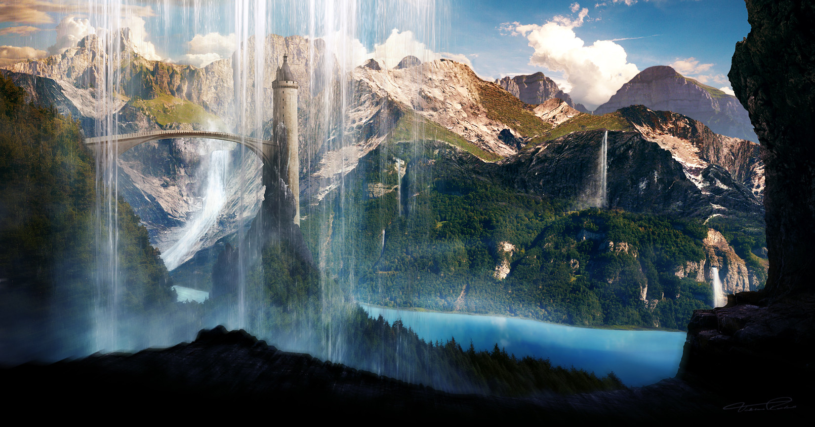
Landscape wallpaper without any Sci-Fi or space elements this time. It took my quite a while to complete this image as the concept changed several times. The keypoints of course are the waterfalls that are placed throughout the picture. Some HD-wallpaper for personal usage only are available. Resources from cgtextures and my personal photos.Wallpaper:
Download
www.gtgraphics.de
Follow us on facebook or google+
Related content


Comments: 51

Overall


Originality
Technique
Impact
I enjoy the piece, especially the lack of any sci-fi elements, nice work there, but my only issue is with the bottom left corner, how the rocks are blurry, that really disorients me, especially with how clear and in focus the farthest portions of the background are in clear focus. the mountains in the distance should have been blurred/ out of focus, with the rocks way more detailed and in focus. I also would have appreciated something that indicated where the waterfalls originated, even if it was a small set of rocks. It just seems odd that they are over the tower with no visible origin point. They look as though they are in the mid ground.
👍: 0 ⏩: 0


Wow, you've got some talent! I'm sure this will be set as my wallpaper for quite some time!
👍: 0 ⏩: 0


Facebook Design page , "Make your work more popular"  (Smile)")
👍: 0 ⏩: 0


Ur out of ideas for scifi or something? Or Ur just not interested in it anymore?
Anyways, it's a beautiful work and loving all the colors and stuff but generally I think the waterfall could be better, I mean atleast u could have used a better texture for the water and U forgot adding some out-glow on the water. And maybe more layers would make it realistic I dunno it's just it could be better.
")
👍: 0 ⏩: 0

I like it, but not as much as your other work to be honest. the bridge looks kind of weird for me. I don't know why. I personally think that you usually make much better, nevertheless, this is still nice to look at. Maybe it's because I'm a sci fi fan and you left out all sci-fi + space elements xD
👍: 0 ⏩: 0


schickes ding 
die bewegungsunschärfe unten links versteh ich allerdings nicht ganz
 (Wink)")
👍: 0 ⏩: 1

nur für die optik... hat sich halt was bewegt
👍: 0 ⏩: 0


