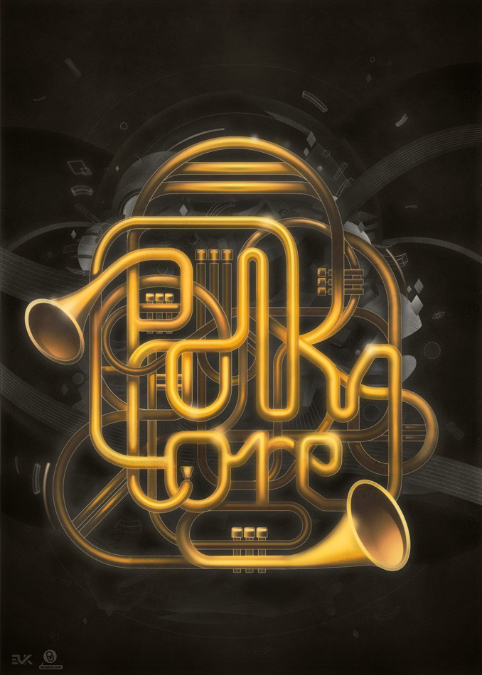
HOME | DD

tomasbrechler β€” idle by-nc-nd

Published: 2007-07-07 22:36:25 +0000 UTC; Views: 4763; Favourites: 65; Downloads: 151
Redirect to original
Description
Related content
Comments: 42

GreenMotya [2009-04-23 10:48:20 +0000 UTC]

nice!

πŸ‘: 0 ⏩: 0

SDoh9 [2009-04-19 11:58:22 +0000 UTC]

reminds me off the ecko logo, but yeah nice work i like it

πŸ‘: 0 ⏩: 0

mygirl [2008-02-13 03:28:21 +0000 UTC]

i lvoe the font! what typo is that?

πŸ‘: 0 ⏩: 0

nicolaegrigorescu [2007-07-15 13:02:19 +0000 UTC]

omg
wow
what a typo
love it
colors too

πŸ‘: 0 ⏩: 0

phveiga [2007-07-10 02:39:17 +0000 UTC]

nice job!

πŸ‘: 0 ⏩: 0

gomedia [2007-07-09 15:48:59 +0000 UTC]

nice looks pretty neat

πŸ‘: 0 ⏩: 1

tomasbrechler In reply to gomedia [2007-07-09 17:58:53 +0000 UTC]

thank you

πŸ‘: 0 ⏩: 0

gigimo [2007-07-09 15:32:48 +0000 UTC]

typography, colors, composition...everything looks great!! as usual...

πŸ‘: 0 ⏩: 0

FlowisKing [2007-07-09 07:28:39 +0000 UTC]

πŸ‘: 0 ⏩: 0

JuanMonroe [2007-07-08 19:53:57 +0000 UTC]

wow!! so cool!! amazing tt

πŸ‘: 0 ⏩: 0

Phepe [2007-07-08 19:28:16 +0000 UTC]

po shlednuti tohoto krasneho plakatesssku, bych se tam hnedkoussska pokukynkal...

- ne, je to pekne...

πŸ‘: 0 ⏩: 1

tomasbrechler In reply to Phepe [2007-07-08 19:33:43 +0000 UTC]

vo cem to meles? doufam ze aspon beres nakej chlast nebo uz si uplne slusnej co?

πŸ‘: 0 ⏩: 1

Phepe In reply to tomasbrechler [2007-07-08 20:24:25 +0000 UTC]

jo, to je dobrej napad... .)

πŸ‘: 0 ⏩: 0

jvgce [2007-07-08 17:04:21 +0000 UTC]

groovy.....

πŸ‘: 0 ⏩: 0

spystyle [2007-07-08 13:33:06 +0000 UTC]

i dont know why but i love it

πŸ‘: 0 ⏩: 2

DownInParis In reply to spystyle [2007-07-16 19:07:26 +0000 UTC]

exactly!

πŸ‘: 0 ⏩: 0

tomasbrechler In reply to spystyle [2007-07-08 13:44:02 +0000 UTC]

im glad you do

πŸ‘: 0 ⏩: 0

SPEARdesign [2007-07-08 09:29:43 +0000 UTC]

sexy they mingle well. think perhaps it could do with a slight tilt, and a bit more space around it. would make a tasty splash page.

πŸ‘: 0 ⏩: 1

tomasbrechler In reply to SPEARdesign [2007-07-08 13:43:53 +0000 UTC]

whats tilt? like italica..coursive? with the size...i was affraid about the visibility of details, i had to keep some id size for smaller screens... i have 22" but somebody has a notebook but i wanted that details clean so i got like 7 versions of it with various colors and sizes, and i choose this. but yeah, it would need more space

πŸ‘: 0 ⏩: 1

SPEARdesign In reply to tomasbrechler [2007-07-08 21:57:12 +0000 UTC]

i mean tilting the whole group of text, not just italics...or coursive. i understand what you mean about keeping it at a safe res. i think the way forward is .png also - make a non straight edge to the image and keep the transparency... looks better than just box... tell you what, send me a .psd file with flattened bg and text layers and I'll do a remix? how about it?

πŸ‘: 0 ⏩: 0

Juro7 [2007-07-08 07:36:46 +0000 UTC]

na prvni pohled rasta barvy

πŸ‘: 0 ⏩: 1

tomasbrechler In reply to Juro7 [2007-07-08 10:00:41 +0000 UTC]

nene, nahore je i modra takze rasta barvy & modra

πŸ‘: 0 ⏩: 0

lassekorsgaard [2007-07-08 06:05:51 +0000 UTC]

Lovely work!

πŸ‘: 0 ⏩: 1

tomasbrechler In reply to lassekorsgaard [2007-07-08 13:37:09 +0000 UTC]

thank you

πŸ‘: 0 ⏩: 0

Changoritmo [2007-07-08 05:37:42 +0000 UTC]

wow great typeface game and texture! congrats!

πŸ‘: 0 ⏩: 1

tomasbrechler In reply to Changoritmo [2007-07-08 13:37:04 +0000 UTC]

thank you, more will follow as i wrote

πŸ‘: 0 ⏩: 0

ElectroPunker [2007-07-08 05:33:46 +0000 UTC]

OpΔ›t super prΓ‘ce!!!! NΓ‘dhernΓ½

πŸ‘: 0 ⏩: 1

tomasbrechler In reply to ElectroPunker [2007-07-08 13:36:34 +0000 UTC]

dik moc

πŸ‘: 0 ⏩: 0

liquin [2007-07-08 04:03:04 +0000 UTC]

sweet

πŸ‘: 0 ⏩: 1

tomasbrechler In reply to liquin [2007-07-08 13:36:29 +0000 UTC]

thanks

πŸ‘: 0 ⏩: 0

saChicals [2007-07-08 03:48:04 +0000 UTC]

This really cool... the colours are great. and i love the background.

πŸ‘: 0 ⏩: 1

tomasbrechler In reply to saChicals [2007-07-08 13:36:21 +0000 UTC]

thank you

πŸ‘: 0 ⏩: 0

Cheps-Oner [2007-07-08 03:22:17 +0000 UTC]

Nice interplay here, loving it all around, instant

-cheps oner

πŸ‘: 0 ⏩: 1

tomasbrechler In reply to Cheps-Oner [2007-07-08 13:36:04 +0000 UTC]

thanks man

πŸ‘: 0 ⏩: 0

wickedsanity [2007-07-08 02:28:17 +0000 UTC]

Oo, very colorful. I like it.

πŸ‘: 0 ⏩: 1

tomasbrechler In reply to wickedsanity [2007-07-08 13:35:50 +0000 UTC]

im glad you like it

πŸ‘: 0 ⏩: 0

SirGrunt [2007-07-08 01:49:35 +0000 UTC]

Very very cool. I really like this.

πŸ‘: 0 ⏩: 1

tomasbrechler In reply to SirGrunt [2007-07-08 13:35:15 +0000 UTC]

im happy you do

πŸ‘: 0 ⏩: 0

Jomino [2007-07-08 00:44:15 +0000 UTC]

Great typo. Love the lines inside the typo.

πŸ‘: 0 ⏩: 1

tomasbrechler In reply to Jomino [2007-07-08 13:35:04 +0000 UTC]

thanks, i got to work more with typography, so i think you ll meet them again

πŸ‘: 0 ⏩: 0

mrgraphicsguy [2007-07-07 23:28:06 +0000 UTC]

That's actually very nice! How did you make the stripes? Is this just the font or an applied pattern?

πŸ‘: 0 ⏩: 1

tomasbrechler In reply to mrgraphicsguy [2007-07-07 23:42:08 +0000 UTC]

actually theire made in illustrator just with repeating the single shape then cutting it with pathfinder tool the font is that basic clarendon you can see on the right

πŸ‘: 0 ⏩: 0