HOME | DD
 tomaskaspar — Raw Power

Published: 2008-02-11 18:39:50 +0000 UTC; Views: 6571; Favourites: 530; Downloads: 0
Redirect to original
Description
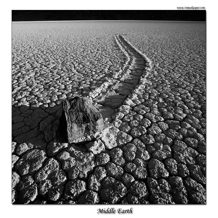
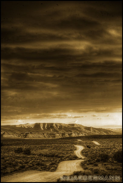
One of the most amazing cloud displays I evr witnesed.Please enjoy,
Tomas
1Ds,17-40,CP,GND
Experience the Nature's wild beauty at:
Kaspar Gallery
My Photoshop processing:
Digital Darkroom
Related content


Comments: 73

 (Smile)")

wonderful. maybe u could submit the color version as well,it must be amazing
👍: 0 ⏩: 0


I'm not sure which is more effective: the contrasting textures or the contrasting contrasts. ")
👍: 0 ⏩: 0

Almost looks like those clouds could end what looks to be a drought there... Beautiful photo, the cracks and sky is just great. Nice work
👍: 0 ⏩: 0


Insanely strong lines throughout the entire image, Tomas! Why did you choose to go B+W? Is the colored version any good? Thanks!
Jake McGuire
👍: 0 ⏩: 1

Yes it is good, but I am leaning towards this one a bit more.
👍: 0 ⏩: 1
Sorry, I didn't mean "good". Of course it's good. I can tell right now that it is because of the composition, leading lines, etc. I just meant to ask what it was that made you decide to go B+W? Was it the lighting? Was there too much of the same hues of colors? I'm just curious. Your opinions have always meant SO much to me because you have been one of my favorite photographers for quite a long time now, and because it gives me something to look for in my own work. Thanks Tomas.
Jake McGuire
👍: 0 ⏩: 1
I just like the B&W in this case. It is just personal preference. A lot of people like the color version more. Here is a link to color: [link]
👍: 0 ⏩: 1
I think I like the B+W more as well. It seems like it gives the clouds a more intense presence. I didn't realize you had a site with that much of your work. I'll definately be going back to that site to check everything else out when I have more time. Thanks Tomas!
Jake
👍: 0 ⏩: 0

Great photograph! 

👍: 0 ⏩: 0


Stunning capture! I love how the clouds lead the viewer into the picture. How did you create the colours, because it's not really b&w? Has a blue-ish feel about it.
👍: 0 ⏩: 0


This has a wonderfully eerie, other-worldly, sci-fi feel to it. It speaks of endless desolation and being all alone on some distant planet ....
👍: 0 ⏩: 0
<= Prev |