HOME | DD
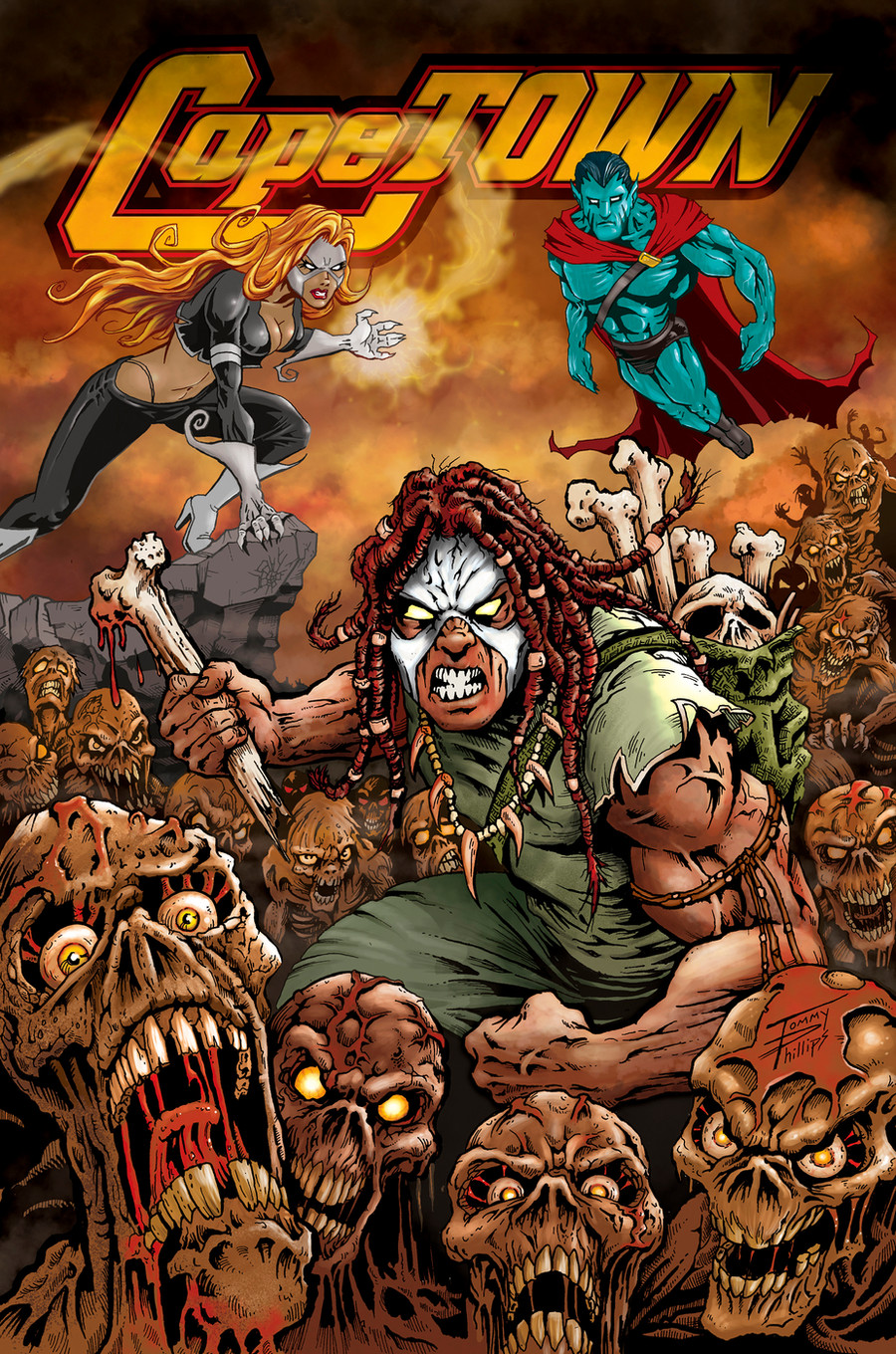
 TommyPhillips — CapeTOWN COVER issue 1

Published: 2010-01-25 15:28:26 +0000 UTC; Views: 2898; Favourites: 61; Downloads: 97
Redirect to original
Description
CapeTOWN CoverPencil, Inks and Color by: Tommy Phillips
Your Friendly Neighborhood Zombie....
chomp chomp chomp
Related content
Comments: 35

Well I would certainly pick up this comic book and consider reading it based entirely on this cover. And I would love to work with someone of your caliber on my own projects. I hope that is enough of a critique.
👍: 0 ⏩: 0

THHHHHAAAAAANNNNNKKKKKKSSSSSS!!!!
chomp --- chomp --- chomp
👍: 0 ⏩: 1

*Pats the puppy*
Love the detail. Keep up the good work
👍: 0 ⏩: 1

amazing work here, always love a good zombie fest, and the amount of detail in this is superb
👍: 0 ⏩: 1


👍: 0 ⏩: 1

Thanks Man... you got a lot of good response from you print at the Dallas Comic con are you going to the con in Houston?
👍: 0 ⏩: 1

Your stuff is kickbutt sir, as for houston, i'm planning to be there. how about yourself, you think you're going to make it?
👍: 0 ⏩: 1

I plan on being there to... It look like a big convention with a lot of good artist.
👍: 0 ⏩: 0

Thanks! what a compliment when it's coming from a colorist like you...
👍: 0 ⏩: 1

nooo i proud u came to my dirty place lol
👍: 0 ⏩: 0

Wow It looks even better In color bro! awesome work!
--
[link]
👍: 0 ⏩: 1

I think I am finally getting a hang of this color thing . I still have a lot to learn though
👍: 0 ⏩: 0

wow dude, this turned out better than I thought it might. Really incredible work!
👍: 0 ⏩: 1

I have said it before but i am saying it again.This has turned marvelous
👍: 0 ⏩: 1

Wow It looks even better In color bro! awesome work! you did a great job... very nice cover. chomp chomp!
👍: 0 ⏩: 1

thanks man... i love the comments and encouragement
👍: 0 ⏩: 1

How did you manage the lettering below the lineart? This looks fantastic, I love every aspect about it! Grimy and grungy, the fine mist in the air, the blood on the zombies/ghouls, I can't honestly find anything missing, but I'm an amaetur at best with this stuff!
FREE CRITIQUE!
👍: 0 ⏩: 2

The logo I designed in adobe llustration placed it in photoshop duplicated the layer and applied two different layer effects
👍: 0 ⏩: 1

WOW. That sounds complicated. I have yet to try my hand at illustrator.
👍: 0 ⏩: 1

corel draw or macromedia freehand will work as well
👍: 0 ⏩: 0

thanks I watched you video on your colors . they where enjoyable . thanks for the encouraging words
👍: 0 ⏩: 1

Your welcome, and thanks for watching my videos! I hope the music is...standable!
👍: 0 ⏩: 0


