HOME | DD
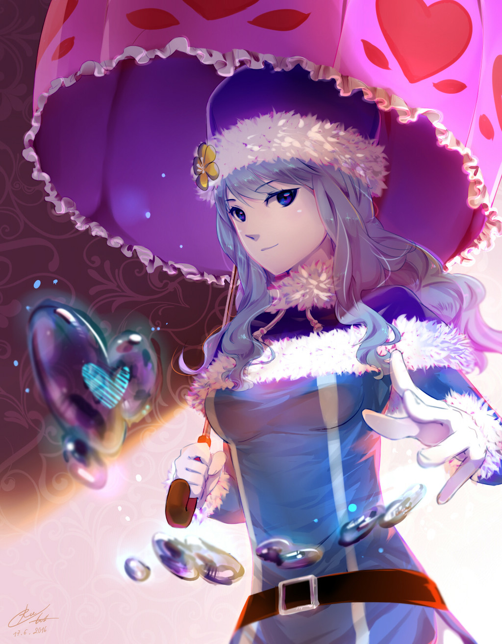
 tonyohoho — Spriggan 12

#fairy #fairytail #fanart #sai #spriggan #tail #painttoolsai
Published: 2017-02-13 14:20:25 +0000 UTC; Views: 6173; Favourites: 74; Downloads: 53
Redirect to original
Description
I've spent hours to finish this fanart. SPRIGGAN 12 from Fairy Tail. Done with Paint Tool Sai. Text used Adobe Photoshop.I am opening commission for semi realism like this too. $30 per waist up character. Just note me if you are interested.
Related content


Comments: 21

👍: 0 ⏩: 0


Vision

Very Great interpretation of the Spriggan 12. the shading is accurate, the expressions are spot on, and your design is practically flawless. The only thing I would've Changed is that Wall Eehto's hair is supposed to be black. I like that you're trying to do a change of pace, but with blonde/brunette hair, I can't really recognize him. It's almost as if i'm looking at someone trying to cosplay as Wall, but missed the correct hair color. Other than that. you're drawing is awesome! Keep up the good work, and I hope to see more of the amazing art of yours.
👍: 1 ⏩: 1

actually I used official colorscheme for Wall Eehto. In a volume cover.
👍: 0 ⏩: 1
I'm pretty sure his hair was still black. Which cover are you talking about?
👍: 0 ⏩: 1
it's from volume 58 cover. His hair is not black. But Army green. For comparison, Zeref hair is full black. And Wall Eehto is not.
👍: 0 ⏩: 0
")

You're welcome. You're art looks almost realistic
👍: 0 ⏩: 1
yes. it's called as semi-realism art
👍: 0 ⏩: 1
I see, but great job still
👍: 0 ⏩: 0


This looks absolutely incredible. Almost all look fantastic. If I were to give one criticism, it'd be that you put the best-designed ones in the upper-row, pulling away the attention from the bottom-row
👍: 0 ⏩: 1
to be honest, the bottom row is the ones that I drew late. lol. So maybe because of that I finish them a bit more rush.
👍: 0 ⏩: 1
I thought that as well, especially Neinhart seems a bit rushed. Together eith the fact that the upper ones just have very cool designs
👍: 0 ⏩: 0


 (Smile)")