HOME | DD
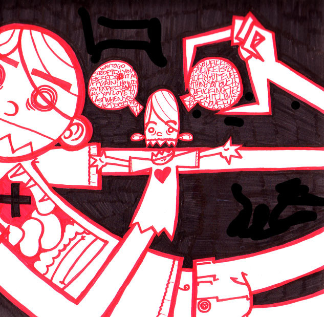
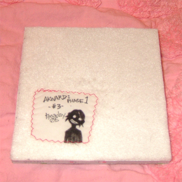
 tooaday — bad v day
Published: 2005-07-01 00:42:27 +0000 UTC; Views: 367; Favourites: 12; Downloads: 44
Redirect to original
Description
this is from a bad february day a year or so ago. a bit too personal, but i like the pic. done in red and black marker, obviously. one big page in a now full sketchbook.Related content


Comments: 22


That's fantastic, well urm, not that you got your heart shit on, I mean that this is a good expression of the feeling of worthlessness you get from the whole ordeal.
It's a little more serious than your other stuff that you've posted, but I mean that in a good way.
👍: 0 ⏩: 1

yeah well, it was mostly my fault.
i usually avoid doing pieces so obviously personal.
👍: 0 ⏩: 0


I love your style. The linework is so fuckin crisp. I must have that shirt.
👍: 0 ⏩: 1
thanks. not as crisp in this one as it appears. and...ohhh....ummm...bad news....that's not a shirt....that chest is a gaping hole.........and i don't think he's gonna get better....
👍: 0 ⏩: 1
Aww... gaping chest holes are not good, unless they are printed on a shirt... which I now see is not the case...
👍: 0 ⏩: 0

I've had that hand puppet before. I like how this is drawn, the red and black make a great mix and the feeling that went into the drawing is really visable. I really enjoy this picture
👍: 0 ⏩: 1
thanks. i don't really enjoy this picture, but i am proud of the feel of it. there is another full page picture done the same night and color scheme, but it's a bit TOO personal to post.
👍: 0 ⏩: 1
I understand completely, there are some things that just don't leave the scetchbook
👍: 0 ⏩: 0

Thats some sharp fucking marker work. Mine always comes out, shall we say, "rough around the edges". But this is pretty sweet, and the idea is killer too.

👍: 0 ⏩: 1
thanks. this marked a point in my work where my line work just got a helluva lot tighter.
👍: 0 ⏩: 1
What did you change to get it that way?
👍: 0 ⏩: 1
used microns (.08 & .01) in matching colors to touchup. but not too much, most of it was done with pilot bravo markers. i used the black to "angle off" the red to make points (you'll notice in full view that the red not adjacent to black has much duller points.)
👍: 0 ⏩: 1
Cool. Im makin note of that, never used micron. always used G2s. same for the markers. Thanks
 (Smile)")
👍: 0 ⏩: 0

I like the white and red on black and the whole composition is neat ")
👍: 0 ⏩: 1


thank you very much. the word "stylized" makes me feel jiggly all over.
👍: 0 ⏩: 1