HOME | DD
 Torsten85 — portfolio_template_r

Published: 2008-04-18 10:39:46 +0000 UTC; Views: 2249; Favourites: 16; Downloads: 80
Redirect to original
Description
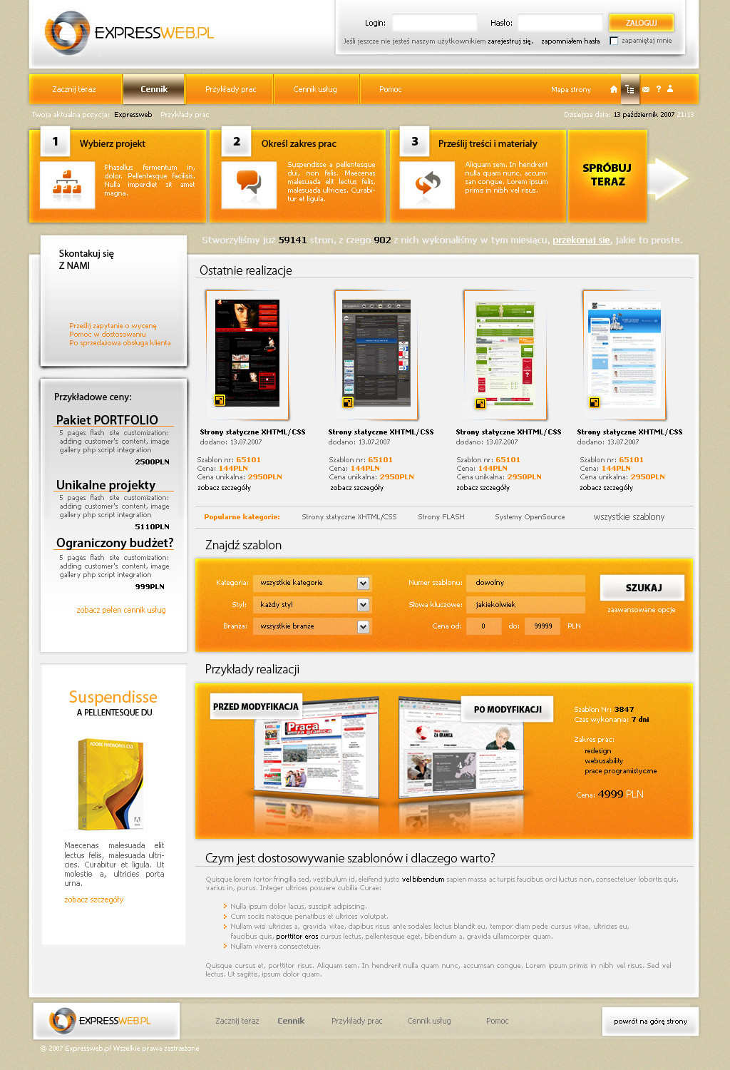
Hey @ watchers & visitors!!")
What should i say...new portfolio project!!
If somebody have some ideas for improvement so let me know!!
Comments and
 are very welcome!!
Related content


Comments: 39

Was fehlt ist einfach der Focus!!
[Das Auge weiß gar nicht so recht hin bei dem ganzen grün - dadurch wirks ein bisschen wirr.]
villt. mit den farben ein focus setzen - aber sonst siehts gut aus!
Schöne Farben und minimalistisch
👍: 0 ⏩: 1

STimmt schon irgendwie...dankeschön!!
👍: 0 ⏩: 0

hehe nich schlecht..... nur is etwas unübersichtlich da du nich viel mit headlines/bold/underline arbeitest. viel eckiges und mir fehlt ein passendes logo. farben sind ganz hübsch (Smile)")
👍: 0 ⏩: 1
Jo hast recht...nunja jetzt wo du es ansprichst fällts mir auch auf...danke für die konstruktive kritik...freut mich!!
👍: 0 ⏩: 0

und was wir alleine nicht schaffen ,das schaffen wir nur zusammen
oder irgend wie so xd
ne gefällt mir echt gut hal dich ran digga
cu
👍: 0 ⏩: 1
Wie kommst du denn darauf??!
Danke für das kompli!!
👍: 0 ⏩: 0


echt cool
farben passen und alles, auch schrift eigentlich... weiss ned, aber die schrift finde ich persönlich trotzdem nicht so cool
aber nice
👍: 0 ⏩: 1
Kein ding, welche font meinst du genau?!?! Trotzdem danke!! D:_
👍: 0 ⏩: 1
der "Lorem Ipmsum"-Standard Font find ich passt hier ned so...
👍: 0 ⏩: 1
Achso...ja is glaub verdana...arial gefällt mir net so ^^
👍: 0 ⏩: 0

jo sieht sehr gut aus bis auf den header also der weisse balken ")
👍: 0 ⏩: 1
Jo danke...hmm...wie könnt ichs besser machen?!?
👍: 0 ⏩: 1
vllt den header orange oder so oder irgendnen effekt rein
👍: 0 ⏩: 1
hmm...muss ich mal ausprobieren!! thx
👍: 0 ⏩: 1
joa mach ma
👍: 0 ⏩: 0

hehe danke...ja?!? Nunja find ich jetzt net aber np danke!! #
👍: 0 ⏩: 0


wow, great design and the green and orange color is great
👍: 0 ⏩: 1
Yes i think so 2..thx man!!
👍: 0 ⏩: 0

 (Wink)")

schon hamma geilo
vllt noch ein bischen mehr orange reinbringn !das harmoniert irgentwie gut miteinander
wenn du das machst bekommst auchnen
👍: 0 ⏩: 1
Jo ich wollte eigentlich noch bisl organe einbringen aber ich hab mich net getraut ^^ D:
👍: 0 ⏩: 0

die schrift ist zwar teilweise gewöhnungsbedürftig, aber alles in allem sehr nice
👍: 0 ⏩: 1


blub?
hmmm an sich find ich es gut doch mir ist es zu grün xD
👍: 0 ⏩: 1
hehe jo evtl. bau ich noch bisl orange ein! D:
👍: 0 ⏩: 0