HOME | DD
 Toxiccatnip — toxic mind

Published: 2004-07-04 09:55:49 +0000 UTC; Views: 200; Favourites: 1; Downloads: 66
Redirect to original
Description
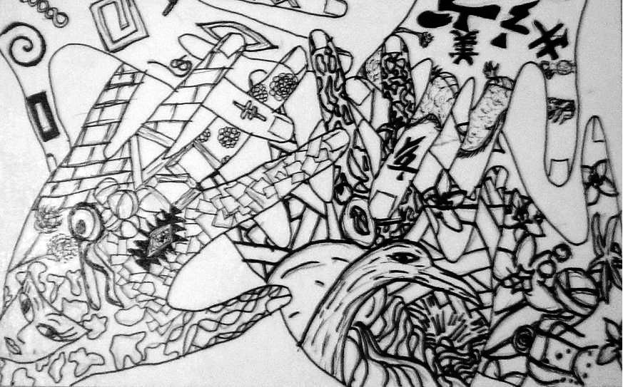
I have been messing around with paints lately... this was an experiment with some colors and theres also some symbolism of my thoughts thrown into it. the picture was a bit to large for the scanner, however, i did get the majority of it.Related content


Comments: 4

I rarely get into the abstract form of art (mostly because I have a hard time with it..) but I think this one has a great deal of artistic quality to it. It's much more interesting then most of the other works i've seen in the genre. When I look at this, I can see that you have melded so many different entities into it which seem to be open to distinct interpretation. Firstly, I see snow and fire and what appears to be spring and summer? Spring represented by the green plants in the upper right of the painting with summer in the lower left. I really like the way you've melded the two together like that. I can see other aspects of the paintings which I think represent heartbreak, sorrow, maybe hate (the fire) and possibly life itself represented by those rolling hills towards the top of the canvas. Also, there's the eye, right in the middle. The eye has been used in so many other abstract paintings, and I think perhaps it represents the human entity itself. You've painted it in such a way that it seems to "become one" with the rest of the elements, as if saying that we as people are complex and made up of so many other things that indeed bind us to Nature itself. We feel all of those things, such as the coldness of winter, the wrath of summer.....or MAYBE your intent was to use the seasons to represent the different stages of human life. (Birth, middle age, old age and death) There are so many different ways that this painting can be interpreted!!
I really enjoy this one, and I think it would be really great if maybe you caould have made the borders between the different elements a little more bolder and smooth. That would have really made a very strong format for this abstract artwork. The colors are just fine and you've really conveyed convincing texture and three dimensional shapes with the different hues of paints, especially on the big teardrop in the middle.
Very well done! This is a great work of art.

 (Smile)")
👍: 0 ⏩: 0

i'm really sorry but i'm not too into the abstract art thing, but i had to comment on this because i do love the use of the colours. they go very well together. if i had to choose a fave part on this piece it would be the burgandy with the sparkles... i think that was very well done
")
👍: 0 ⏩: 1

its fine, my point of this was to test different blends and shades of my colours
thnaks for your imput
👍: 0 ⏩: 0

