HOME | DD
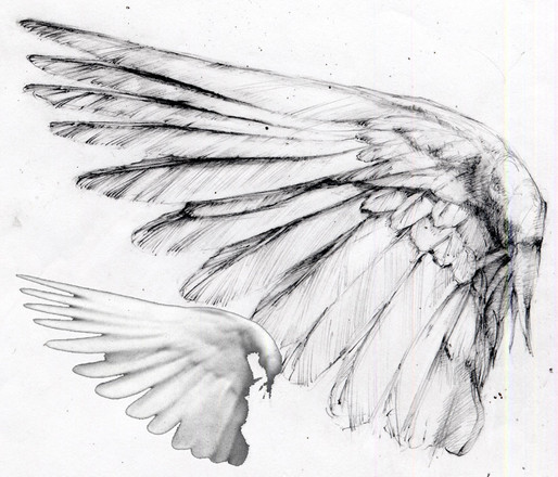
 TreeCree — Wing

Published: 2013-10-04 03:59:33 +0000 UTC; Views: 7926; Favourites: 370; Downloads: 10
Redirect to original
Description
Wing that I did in ink for the start of a tattoo portfolio


Related content
Comments: 12


This is a lovely design for a tattoo. I agree with Loilie, in that having such clean and bold lines will definitely work best for body art. You have a lovely graphical, illustrative style, and this gives the subject matter, a feathered wing, lovely defined quality, when it could easily look too soft and fluffy, which would not work as a tattoo. I also like your simplified use of tone. where you have the darkest tone, a mid-tone, as well as the light areas which, here, are white. Overall, this is a very well-drawn piece of work, showing excellent clarity and a bold, eye-catching design, and I think it will suit its purpose very well indeed. Great job!! e.deviantart.net/emoticons/s/s… " width="15" height="15" alt="


👍: 0 ⏩: 0


This artwork is very well drawn. The anatomy of the wing is great! It's almost as though you used a real wing to draw this. The little details of each individual feather is neatly drawn and placed in the correct spots. The sizing of each individual feather also makes the wing look extremely real. The way you inked the lines are very clear and clean. Personally, having clear and clean lines makes the art work look a lot more beautiful. Using different sizes for the lines, like dark, and heavy to smooth and light lines makes the details look very real. Over if I had chosen to get a tattoo, this will be chosen.
👍: 0 ⏩: 0


