HOME | DD
 tremorwave — Distortion

Published: 2005-08-16 10:21:20 +0000 UTC; Views: 4586; Favourites: 111; Downloads: 1551
Redirect to original
Description
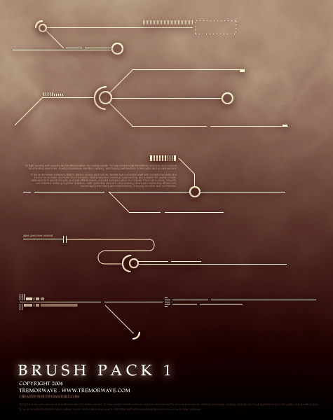
depthCORE XX | Voodoov.
...get distorted...
Related content


Comments: 52

what did u use to get the effects on this image i am doing a similar project with lots of distortion could you please elaborate as to what you did to get all the little fragments of color
👍: 0 ⏩: 0


Just awesome. Goes to 
I really like the simplicity, kinda drugsy.
👍: 0 ⏩: 0


I like this very much. I really like how you have distorted this piece, it came out with a very interesting look. The colours stand out very well.. obviously.. and it really catches the eye. The simplicity of the background, then there's just this distorted and vibrant piece.
👍: 0 ⏩: 0

Uhh. I don't understand very clear...... o_O
Sort of.... Nevermind that. Just great.
👍: 0 ⏩: 0


Have fun, il be around from 26th onwards
 (Smile)")
👍: 0 ⏩: 0

really like the nice typography and distortion, the colours are good and the girl element in it kicks in an extra dimension
but the interpretation to this piece is very general and sadly quite unimpactful... but it all lies in the beholder i think
but i really admire your designability and haze's too
👍: 0 ⏩: 0

great work
I love the little details in here
nice composition also
👍: 0 ⏩: 0

yay... distorted idd...
looks a bit sick but if you take a while to get used to it... i like it!
👍: 0 ⏩: 0


no print?? it would match the colors in my room!!!! 
👍: 0 ⏩: 1
lol, okay il sort it asap
👍: 0 ⏩: 1
*snaps whip* lol jk! i am serious though, i want it.
👍: 0 ⏩: 1


👍: 0 ⏩: 1
haha. I love he1z. Phenomenal artist. I have to admit, that I love these collaborations that you guys are doing. They're turning out really nice.
👍: 0 ⏩: 0

The typography at the top looks hot.
Nice choice of colors too.
👍: 0 ⏩: 0


You cant believe how much I love this one. Just so digital... I love the colors concept and 2d. Just amazing !
👍: 0 ⏩: 0


Nice job man! I like the colors you chose for this one!
👍: 0 ⏩: 0

dangit tremorwave...you stole that pic from me...lol im using that same syringe stock photo in my new one...the original pic is blue, right???
lol, anyways, nice job! i like it!
👍: 0 ⏩: 1
lol, i dono - haze did the syringes
👍: 0 ⏩: 1
lol, ok...ill go slap haze then...
👍: 0 ⏩: 1

no it's not blue. and those were vectors made froms tocks.
👍: 0 ⏩: 1
alright...srry man, i wasn't bein disrespectful or anything...
👍: 0 ⏩: 1


 (Wink)")


yeah pretty cool, better than the first version you did..nice job
👍: 0 ⏩: 0

That just rocks.
The swords in the background alone are pure genius.
o_o Oooh...

👍: 0 ⏩: 1
lol, they are syringes but nm ")
👍: 0 ⏩: 1
Oh... 

THE PIC ROCKS!
👍: 0 ⏩: 1
| Next =>