HOME | DD
 TRice01 — Power Rangers: Trans Quantum Gaurdians
#colorful #guardians #imagination #logo #megazord #power #powerrangers #quantum #rail #rainbow #rangers #resha #sentai #train #trains #trans #vector #zord #zords #power_rangers #toqger #tqg
Published: 2017-10-24 12:04:12 +0000 UTC; Views: 4344; Favourites: 28; Downloads: 0
Redirect to original
Description
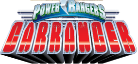
In the near future, Earth has created Trans Quantum Technology. An amazing innovation that seems only limited by one's imagination. But an evil organization known only has SHADE wants to steal this technology for their own diabolical uses. To combat them, 5 teens, searching for their pasts have been brought together to be newest generation of Power Rangers. Together they are Power Rangers: Trans Quantum Guardians!So as you can see, this is the latest entry in my patron's Power Rangers commission series. In this one we imagine what would the logo for a ToQger adapation may look like.
This one had a few issues coming together. The name involved several weeks of how to use the letters TQG. Then after putting an hour or two of work on the design, Adobe Illustrator crashed. I had not saved at all. And finally I got all the way to posting this here, and I realized I had spelled "Guardians" wrong, so I had to quickly fix all that. But despite all those troubles, I love how this came out.
As with most of my designs, they are available on shirts and other merchandise at my stores:
www.teepublic.com/t-shirt/1994… ?
www.redbubble.com/people/rodim…
Media is vectors in Adobe Illustrator.
Related content


Comments: 10


Now This, oh THIS is the Golden core of the Gold mine when regarding fan-adaptations for ToQger. Greatly well put together, the name is such a creative take on the Sentai's initials, and the train shape, you have to look around to know that it's supposed to be a train incorporated into the "ramp" of the typical PR logo design. You disguised it perfectly.
Awesome work, buddy! Morphenomenal!!
👍: 0 ⏩: 1

The rainbow effect is a little distracting. I know why it's there and I'm not saying to take it out or anything, but it makes the logo a little too visually busy. There's no central focal point for my eyes to narrow in on. (I have some pointers on how to make it work a little better, but I won't go into it unless asked.) But that is a nice way to reuse the "TQG" initials.
 (Smile)")
👍: 0 ⏩: 1

Yeah, I played with it a bit, but couldn't quite find something else I was 100% happy with. I thought about putting black strokes on the text, but that caused it to stand out TOO MUCH from everything else. I may revisit this sometime.
👍: 0 ⏩: 0

I thought of Power Rangers EXPRESS. It sounds better IMO.
👍: 0 ⏩: 1
That was one of the ideas I had discussed with my patron, along with Rail Rescue. But we wanted to use the TQG initials.
👍: 0 ⏩: 0