HOME | DD
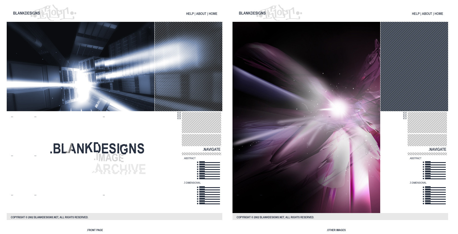
 triopt — THE DAV3

Published: 2002-12-10 04:44:10 +0000 UTC; Views: 5332; Favourites: 18; Downloads: 748
Redirect to original
Description
Yep, this is THE DeviantArt Version3 Skin. I will still work on this design, but I'm sure the users as well as staff can tell the basic elements of this design. I have implemented new ideas as well, now I just gotta put them in HTML. If I am anounced winner, I will complete this design as well as those elements.Fullview is a must.
Enjoy.
Related content


Comments: 82

Yeah I don't know what I was thinking back then with all those bright designs, I guess that's when I was a happy designer 
Anyways thanks for the feedback
👍: 0 ⏩: 0

i would vote for this is a winner i love how it looks, i like it a lot more than the current
+fav for you
")
👍: 0 ⏩: 0


love this, gr8 stuff
i just wish i wasnt so hang over, so that i could of given u a better comment, not some thing shallow like "love this, gr8 stuff"...i wish i could say some thing interesting, so that when u read it, u think to ur self, waw, that comment kicks ass, i feel so much better now
but i guess for now i guess u just have to settle for: "love this, gr8 stuff"
have a nice day
👍: 0 ⏩: 0


damn...
this is badass!
so clean & smooth
me thinks this should be DAv3
we shall see soon
mp
👍: 0 ⏩: 0

Very crisp and clean, looks very good and should deserve to be a winner
👍: 0 ⏩: 0

This is awesome. I cast my support for this as the DAv3 skin.
Any DA skin that matches my desktops, is clean enough to present information in a concise and attractive manner, and reflects the flavor of the community gets my vote.
👍: 0 ⏩: 0

OMG if this wins
This thing is awesome im so stupid i didn't even see it
If it wins woah this community is gonna grow and ... well it'll look cooler
👍: 0 ⏩: 0

Ungh! Even though your's are among the top three so far (as far as fav's and comments) I just wish it would all become skinnable at the end so we can all enjoy the different versions, you know what I mean?
Awesome job though. Heh.
👍: 0 ⏩: 0
Looks quite crisp and well-designed. I love it -- especially the colors... perhaps they should be a bit duller. It seems too bright. Heh, though you know what the problem is? I'm probably just too used to the present colors.
Awesome stuff -- I wouldn't be suprised if you rolled away the winner.
👍: 0 ⏩: 0

Looks damn good! I think that the navigation/devmessage bars should be only one line tall though.
Great work!!!
👍: 0 ⏩: 0


yeah, this is good, but I don't like all the blank white area like in the user page, even if it would be filled up, I think some sort of border would be great...hard to explain what I mean if you don't understand right now, but yeah. very nice, I would hope this would win.
👍: 0 ⏩: 0

provehitopoetry, go away f**ker, you just don't know how to appreciate others' works...
this is very nice but it's too 'rectangular' lol, still the silver feeling is very cooL!
👍: 0 ⏩: 0


Looks good
The topnav could use some work... as could some of the other sections.. but by far the best submission for the contest
with some work it could be great
👍: 0 ⏩: 0

I think even if some changes need to be made, triopt deserves the award. He obviously has the skills.
👍: 0 ⏩: 0

One of my favs! I would really like seeing this layout being implemented in DaV3! Good luck
👍: 0 ⏩: 0

Pretty nice Design. The use of "neutral" colors brings you the oportunity to match it if every desktop you got, staying more harmonious.
I loved the buttons. Light still nice.
Pretty nice work, hope you win it. But I don't have sex with DA
👍: 0 ⏩: 0

sorry what i mean whats this is fucking ugly ass hell but you obviously know how to use digital art software well ok?
👍: 0 ⏩: 0

Fuck all of you who dont like this. Personally, this is the best entry out there. Just because some of you people cant make anything this good doesnt mean you have to hate on it. Also, if you dont like this one then why dont you make one that you like instead of bitching about this one. Badass.
👍: 0 ⏩: 0
lol its funny how towards the end I get nothing but bad comments, thanks a lot guys
👍: 0 ⏩: 0


it looks a bit too messy and not particularly well thought out, I'm also with the "others" it isn't really ingenious or much different from the current design. Try working more on the colour scheme though but wuth a new deign, I tihkn you've got the colours nailed.
👍: 0 ⏩: 0

This is very well made, very slick and clean. I do tend to agree that it's really a reskin of v2, but I can't really see how much rearranging needs to be done to the interface anyways. So you've got my vote, besides I love the 'go' button.
👍: 0 ⏩: 0

That's pretty cool. It's a little bit mixed up though. There are too many things mixed together and the buttons are a little too big. Apart from that, I love the colors and the side bars. Nice work!
👍: 0 ⏩: 0

i think i like it better the way it is.
i agree with that guy^^^^^^^
👍: 0 ⏩: 0

Not much change from the skin DA has now. All that is different are the colours and a few 'fancy' new buttons. I don't get it.
If I had to pick between yours and the skin DA is using now... I'd choose the current DA skin.
I agree with ~smashmethod's comment above
👍: 0 ⏩: 0


This is really fucking ugly. A lot of people, including myself, would probably be turned-off to the site if this won.
👍: 0 ⏩: 0
fuck this, no offense i just prefer the black design that is currently in second place here on the contest more! nice work though
👍: 0 ⏩: 0

Yea, its very nice, but I think the whole interface is too similar to the one that exists now (like practically all other submissions here as well). I mean, I would think that DeviantArt is looking for a real "verion-3," not just a re-skinned "version-2".... you know?
👍: 0 ⏩: 0

Slick, clean, nice. Buttons are a bit too wide and large for me though.
👍: 0 ⏩: 0


needs some changes, but still it's definitely worth a
👍: 0 ⏩: 0

all of em look the same but this one is still good +fav
👍: 0 ⏩: 0


instant fav man, love the choice of the color tones, the design is not too heavy and very nice looking
👍: 0 ⏩: 0

With these kinds of deviations I can;t wait till DA3 comes to town. Awesome job my friend.
👍: 0 ⏩: 0

i don't really like this its too flashy and not very usable.
👍: 0 ⏩: 0

Yeah, this is one of my fav's so far. But, I really wished you would have finished it. I think that'd make it look a lot better. I'd like to see how you plan to arrange the personal page.
👍: 0 ⏩: 0


| Next =>