HOME | DD
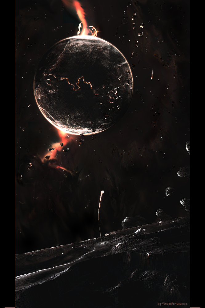
 trs17 — Lost on an Asteroid

Published: 2008-08-07 12:39:09 +0000 UTC; Views: 4203; Favourites: 98; Downloads: 153
Redirect to original
Description
Lost on an asteroïd, seen through the eyes of a deserted person


 .
.(I am SORRY, i couldn't find a better title


 , I'm going to change the title later on i think)
I spent a lot of time on this one. It started with asking Kire some questions about space art and how-to. His tips were very helpful and I managed to make my first planet.
Terrain [link] is the same as in Era Silver [link]
And I think I'm going to buy a drawing tablet, I think it will help me in my future works.
I hope you like this one


Related content
Comments: 47

I like the lighting here, dark, yet shiny. And those little bits of red in the nebula really contrast well against the dull surroundings
👍: 0 ⏩: 1

Hey buddy,
Your wonderful art, has been featured in this news article right here, [link] . So would be cool to see you there 

Kind Regards,
Sangiev,
👍: 0 ⏩: 1

My god, to have my art featured between other works like that :0 I'm speechless. Thank you a lot!
👍: 0 ⏩: 1

My favorite part is the little flare coming up from the viewer’s ground. Nice touch.
👍: 0 ⏩: 0

De sterren zijn over het algemeen idd een erge pain in the ass, maar de uitkomst over het algemeen is erg goed! je 3D werk in combo met photoshop doet het goed 
Faved!
👍: 0 ⏩: 1

I like the terrain
And i love the planet itself
It looks like those paintings you see with gravity
And yeah, those red parts are not that good, especially at the top
But anyway, great job
👍: 0 ⏩: 1

The top looked better in the beginning, I covered up the worst of the bottom part just before posting it. Both of the effects were horrible
👍: 0 ⏩: 0

i think your journal worked man,
lots of comments on this one
i think its damn good ! ^^
but i would like to see more light in it, if u know what i mean
i dunno, cant really explain it well
dont really like the border either,
besides that, great job!
👍: 0 ⏩: 1

I understand what you mean. It ís very dark XD
And the journal wasn't intended to do this, but if it did well, mkay cool xD
👍: 0 ⏩: 0

wow that's a big compliment 
👍: 0 ⏩: 0

yeah it is a bit 
Thank you
👍: 0 ⏩: 0

Big wow,
You made a very nice Bg over there, ur the smudging pro ^^
I don't really like the line, in the Asteroid, can't really explain why.
Nice work ( again.. but hey, I'm getting used to it. )
👍: 0 ⏩: 0

how did you get rid of the square pattern?
btw you can add subtle textures to your nebulae to give them more detail and look realistic
👍: 0 ⏩: 1

smudging on 70% strength with a softbrush and then lowering opacity.
And I think I'm going to do an update later on, too busy packing atm XD
👍: 0 ⏩: 1

yeah I tried smudging as well but it looked shitty XD
👍: 0 ⏩: 1

get rid of the dots behind the 2nd link
and nice piece i am not sure about the depth from the "flying" pieces of rock apart from that it's very nice
👍: 0 ⏩: 1

What do you mean, dots behind the 2nd link?
Thnx
👍: 0 ⏩: 0


