HOME | DD
 trybit — edski shit

Published: 2010-04-09 16:17:40 +0000 UTC; Views: 819; Favourites: 21; Downloads: 32
Redirect to original
Description
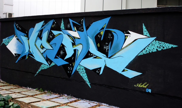
ok - so that was little warmup after winterfucked up lettering, so don't tell me it's good
just truth
 (Smile)")
Related content


Comments: 53


real nice bro this clean as fuck dude keep it up homie

👍: 0 ⏩: 1

I digs it man, might have too much white, kinda seperates it too much, but man EDSN, 100 times better than what I've been sprayin' lately, and the design of the "E" is genius!

👍: 0 ⏩: 1

thanks for the critique bro!
better than Ya? hmm... naaah
👍: 0 ⏩: 0


no prob. keep up the dope ish
👍: 0 ⏩: 0


Man this right here has MAD IMPACT!!
it could do with a keyline around the whole thing to tighten it up a bit but dont be too hard on yourself, like you say its a warm up...i bet you have seen a million times worse by others in your time
keep it up bro!!
👍: 0 ⏩: 1
hahaha... damn thanks for Your words brutha!
👍: 0 ⏩: 1


the truth? lettering is lovely, really like it, colors are so eye-catching, but You really used a bad cap for making those inner lines. I was making these with the skinny or needle cap and from a big distance, it does not look it was made with a spraycan - the line is not so obvious( :
but its really lovely piece( :
👍: 0 ⏩: 1
thanks a lot for Your words girl - all the advices means a lot
👍: 0 ⏩: 0

thx! but it looks damn shity
👍: 0 ⏩: 0


Thats my shit right there man. Im lovin the colors!!!!
👍: 0 ⏩: 1
yeh just tellin the truth broski
👍: 0 ⏩: 1

No to ja Ci pojade teraz!
Czowieniu patent na wypełke fantastyczny - nie wpadłbym na tak prosty, ale bajerancki pomysł! Tylko troche skopałeś ten outline
Mogłeś dać troszke cieńszy i staranniej go zrobić jakimś skinem - wygląda jak na facie robiony
I fajnie by tu zagrało jakbys tym czerwonym zrobił backline a tło zostawił gładkie ewentualnie zaprószył żółtym
Ale generalnie fajno jak na piersze koty za płoty
👍: 0 ⏩: 1
na ten comment czekalem najdluzej
wiedzialem, ze jako jedna znielicznych osob powiesz co jestnie tak ")
wielkie dzieki brat!!
👍: 0 ⏩: 1
Chlopaku jak ja cos spitole to tez licze na opierdziel od Ciebie
Chwalic trzeba za to co dobre, a jak cos spaprane to nie ma innej opcji - krytyka musi byc
Ale konstruktywna chyba - staralem sie jakos wyrazic co mogloby pomoc i zrobic te prace jeszcze zajebistsza. Tak btw. Stary tak dopiero teraz ogarnalem - Ty to na hardcorze robiles czy na luzie?
👍: 0 ⏩: 1
wiadomka - konstruktywna krytyka lepsza niz setki pochwal
na spokojnie robilem, ale dosc pozna pora byla i sciana to blaszak, wiec zacieki szly :/
co tu gadac - nie operuje pucha za dobrze jeszcze wiec efekt lipny
chcialem gruby outline, ale nie wyszlo - o dziwo cienkie kreski stawialem dosc ladnie (glupi, moglem zostawic, ale sie uparlem na tluuuuusto ")
👍: 0 ⏩: 1
W sumie taka praca fajnie by wyglądała mniejsza i właśnie z cienkimi kreskami
Się uczysz cały czas, jak każdy więc luzik! (ale jakby to była Twoja 30 praca na ścianie to bym Cie za nią opierdzielił aż miło
👍: 0 ⏩: 1

Trochę chaotyczne, ale podoba mi się ten chaos  (Wink)")
👍: 0 ⏩: 1
ale mogl byc bardziej dopracowany ten outline
i wypelka tez jakos ciekawiej zrobiona
👍: 0 ⏩: 0


Sweet colors man! That would grab anybodies attention driving by..... breaking a few necks in the process lol.
👍: 0 ⏩: 1
means a lot, but still i think it's piece of shit
👍: 0 ⏩: 0

i looove the coloring
even if u dident get the lettering right it looks a bit like one of picaso's peaces so yeah its awsome to me
keep it up
👍: 0 ⏩: 1
thanks for all Your support girl!
👍: 0 ⏩: 1

No na rozruszanie sie jest OK, czego sie burzysz!
Troche malo serca w tym widze, a to lubie u Ciebie najbardziej - emocje, uczucia, realnosc rzucona prosto w twarz.
Pozdrawiam.
👍: 0 ⏩: 1
bo do d... jest!
a w innych projektach widzisz jakies uczucia, realnosc itp?
co, jak i gdzie?
blagam mow!
👍: 0 ⏩: 1
o mamo.
Powiem, ale jak wroce. Ide na koncert zrobic zjdecia i na krotki spacer. Pewnie kapele beda do niczego, ale dam im sznase.
Milego wieczoru.
👍: 0 ⏩: 1
heh... ok
wzajemnie milego tam...
👍: 0 ⏩: 1
| Next =>