HOME | DD

Tsabo6 — Dungeon Delve sketches

Published: 2010-11-10 21:09:06 +0000 UTC; Views: 10290; Favourites: 95; Downloads: 0
Redirect to original
Description 
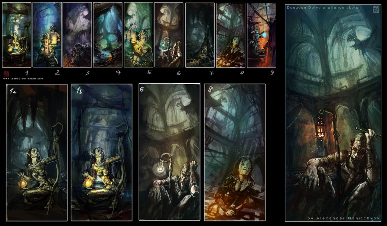
Dungeon Delve sketches for contest @ artorder

[link]

my goal in these 9 thumbnails is to catch the mood and composition. Now the hard part is to decide wich one to finish.

comments, critiques and feedback is welcome
check out the contest guidelines and tell me with one to finish

i have narrowed the ideas to 3 concepts
please let me hear your thoughts and comments.

well i choose to finish N6

thanks for all the feedback and comments!

- Inca, Artofinca
Alexander Nanithckov
Related content
Comments: 54

Tsabo6 In reply to ??? [2012-02-27 13:45:21 +0000 UTC]

heh thanks

👍: 0 ⏩: 0

Gnawl [2012-02-26 19:33:29 +0000 UTC]

id really like to see numbers 3 4 and 8 completed. also in all the deviations I've seen for this contest, how come I haven't seen any torches? everyone used some form of lantern. was that part of the rules? id look at them on artorder or try to at least, but the site is down.

👍: 0 ⏩: 1

Tsabo6 In reply to Gnawl [2012-02-27 13:53:29 +0000 UTC]

this is old contest and my piece won, thanks

👍: 0 ⏩: 0

mzclark [2011-07-02 17:32:56 +0000 UTC]

veeerry cool. love your details.

👍: 0 ⏩: 1

Tsabo6 In reply to mzclark [2011-07-05 08:22:30 +0000 UTC]

thanks, those are only sketches

👍: 0 ⏩: 0

Khaine17 [2011-01-11 01:08:24 +0000 UTC]

good choice :]

👍: 0 ⏩: 1

Tsabo6 In reply to Khaine17 [2011-01-12 08:44:54 +0000 UTC]

thanks!

👍: 0 ⏩: 0

DameOdessa [2010-12-16 15:12:33 +0000 UTC]

This is so magnificient!
Best of luck!

👍: 0 ⏩: 1

Tsabo6 In reply to DameOdessa [2011-01-13 08:44:27 +0000 UTC]

thank you

👍: 0 ⏩: 0

yellowbouncyball [2010-12-14 22:27:56 +0000 UTC]

you are so Talented!

👍: 0 ⏩: 1

Tsabo6 In reply to yellowbouncyball [2010-12-15 12:49:18 +0000 UTC]

oh, thank you!

👍: 0 ⏩: 0

sedivyk [2010-11-16 03:28:18 +0000 UTC]

Nice details you've added looks great !

👍: 0 ⏩: 1

Tsabo6 In reply to sedivyk [2010-11-16 09:25:50 +0000 UTC]

thanks!

👍: 0 ⏩: 0

PetraImboden [2010-11-15 15:45:58 +0000 UTC]

Great use of composition and colors

I wish you good luck for the contest^^

👍: 0 ⏩: 1

Tsabo6 In reply to PetraImboden [2010-11-19 10:16:59 +0000 UTC]

Thank you!

👍: 0 ⏩: 1

PetraImboden In reply to Tsabo6 [2010-11-19 12:20:45 +0000 UTC]

You are welcome

👍: 0 ⏩: 0

RoyAlign [2010-11-15 13:06:38 +0000 UTC]

Really cool , I would still go with 1b though

👍: 0 ⏩: 1

Tsabo6 In reply to RoyAlign [2010-11-15 13:10:28 +0000 UTC]

thanks m8!

👍: 0 ⏩: 0

Lady-Tempest [2010-11-14 17:40:47 +0000 UTC]

I like the colours and dungeon of 4. However, I think 6 is the best for the contest theme of the 3 you have chosen.

👍: 0 ⏩: 1

Tsabo6 In reply to Lady-Tempest [2010-11-14 23:34:58 +0000 UTC]

Thank you!

👍: 0 ⏩: 0

SCHIMPANSEN [2010-11-14 14:16:33 +0000 UTC]

good stuff

👍: 0 ⏩: 1

Tsabo6 In reply to SCHIMPANSEN [2010-11-14 23:35:05 +0000 UTC]

cheers!

👍: 0 ⏩: 0

shoecow [2010-11-13 02:36:41 +0000 UTC]

i love 1B personally

👍: 0 ⏩: 1

Tsabo6 In reply to shoecow [2010-11-15 12:37:00 +0000 UTC]

👍: 0 ⏩: 0

Nosgk-teh [2010-11-12 23:04:36 +0000 UTC]

no 6 is good...

👍: 0 ⏩: 1

Tsabo6 In reply to Nosgk-teh [2010-11-14 23:36:02 +0000 UTC]

yeah

👍: 0 ⏩: 0

auen [2010-11-12 20:09:29 +0000 UTC]

I really like #6. It has more to it than just "I am a person in a dungeon" - I want to know what's got him down!

👍: 0 ⏩: 1

Tsabo6 In reply to auen [2010-11-15 06:52:56 +0000 UTC]

yeah, thanks!

👍: 0 ⏩: 0

sedivyk [2010-11-12 19:43:02 +0000 UTC]

#6 from the 3

👍: 0 ⏩: 1

Tsabo6 In reply to sedivyk [2010-11-15 06:53:03 +0000 UTC]

cheers!

👍: 0 ⏩: 0

EdGarcia [2010-11-12 18:46:05 +0000 UTC]

I like 1b because in smaller size or larger the character is more distinct so you're drawn in by the contrast then you notice the details of the Dungeon delver then you notice the details and ambiance of the dungeon. 1a blends in so much that it loses some of the drama that 1b conveys. The other two while interesting characters and possible back stories seem more still then 1b as I look at it I have no trouble imagining sounds of water spattering on a stone floor and this is the moment before the delver hears a moan and jumps clear of her light. This is just my take others will see it different. Thank You for asking.

👍: 0 ⏩: 1

Tsabo6 In reply to EdGarcia [2010-11-15 12:36:34 +0000 UTC]

Thank you!

👍: 0 ⏩: 0

WCSallySally [2010-11-12 08:40:53 +0000 UTC]

They seem to have separate stories, not all but many are differing concepts ... hard indeed!

👍: 0 ⏩: 1

Tsabo6 In reply to WCSallySally [2010-11-15 12:36:38 +0000 UTC]

👍: 0 ⏩: 1

WCSallySally In reply to Tsabo6 [2010-11-16 00:25:16 +0000 UTC]

... keep up the good work!

👍: 0 ⏩: 0

sedivyk [2010-11-11 20:46:59 +0000 UTC]

#9 makes me think of prince of persia a bit, I llike it, but I think my favorite is #4, its original from the games I've seen it doesn't remind me any.

👍: 0 ⏩: 1

Tsabo6 In reply to sedivyk [2010-11-15 12:36:46 +0000 UTC]

thanks!

👍: 0 ⏩: 0

differentego [2010-11-11 18:46:40 +0000 UTC]

wonderful. my favourite one is #6. the background reminds me on the "carceri" etchings by piranesi, and the character in the foreground is great.

👍: 0 ⏩: 1

Tsabo6 In reply to differentego [2010-11-15 12:36:50 +0000 UTC]

👍: 0 ⏩: 0

DeverelDraws [2010-11-11 15:51:42 +0000 UTC]

I personally feel that number 6 is beautiful...with 4 closely following...however number 4 might not work as well for the contest requirements.

👍: 0 ⏩: 1

Tsabo6 In reply to DeverelDraws [2010-11-15 12:36:24 +0000 UTC]

cheers!

👍: 0 ⏩: 0

0wnenstein [2010-11-11 15:32:16 +0000 UTC]

I like 6, it speaks to me.

👍: 0 ⏩: 2

Tsabo6 In reply to 0wnenstein [2010-11-15 12:36:10 +0000 UTC]

thanks!

👍: 0 ⏩: 0

carlosranna In reply to 0wnenstein [2010-11-13 17:19:35 +0000 UTC]

me too.

👍: 0 ⏩: 1

Tsabo6 In reply to carlosranna [2010-11-15 12:36:15 +0000 UTC]

👍: 0 ⏩: 0

w-hc [2010-11-10 22:59:23 +0000 UTC]

number 1 as figure, number 4 or 7 as background, a mix of number 2 and 4 for colour palette and some more stuff on the foreground to use the reflection lights at your advantage to create more depth.all looks decent enough thou.that was just my 2 cent.

👍: 0 ⏩: 1

Tsabo6 In reply to w-hc [2010-11-15 12:36:02 +0000 UTC]

thank you

👍: 0 ⏩: 0

CSnyder [2010-11-10 22:50:48 +0000 UTC]

these all look superb

👍: 0 ⏩: 1

Tsabo6 In reply to CSnyder [2010-11-15 12:35:51 +0000 UTC]

hehe

👍: 0 ⏩: 0

Sindah [2010-11-10 22:17:15 +0000 UTC]

They all have a lot of potential but I like #4 and #8 best...

👍: 0 ⏩: 1


| Next =>