HOME | DD
 tsok — ICR logo proposals

Published: 2008-11-29 16:01:52 +0000 UTC; Views: 7218; Favourites: 21; Downloads: 0
Redirect to original
Description
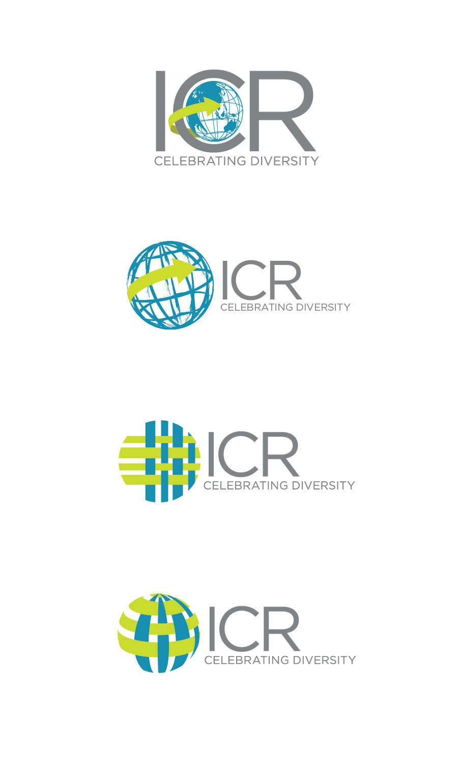
A friend asked me to propose new logo/s for ICR, or the Intercultural Relations cluster (I think?) of organizations in Ateneo. As far as instructions went, they said they wanted to keep the globe, sorta like in the original logo: [link]The first logo is just a revamp of the original (so it didn't look as "recycle the Philippines"-ish). The second was a simpler/less formal version, but still keeping a globe (in wireframe).
The third was the logo that I wanted, which was less literal than a globe but which I thought was apt. It's supposed to look like a weave, since the point of the org/s is to bring many different cultures to work together.
The last is because I thought they might not like the weave idea flat, but would like it better in the form of a globe.


Related content
Comments: 29

I think the last one seems like a great mesh for the interrelations
Is there a website for that organization? I actually plan to do my minor project on diversity of people and culture, and when I saw that I was like wow, I could really do with the research and info.
👍: 0 ⏩: 0

3rd one's symbol is better than others but still needs more attention to typography.
👍: 0 ⏩: 0

galing!! 
sabi ko na nga ba parang hindo mo gagawin ung 1st and 2nd unless instructed.
👍: 0 ⏩: 0

The last logo is a fine piece of work. Might feel too much "corporate" though.
👍: 0 ⏩: 0

the last design is excellent i think the weave idea is excellent... i do hope these goes through but i mean i've always had problems with corporate logo changes that are too drastic
👍: 0 ⏩: 0

I love the last one, but I'd add some arrowheads.
Fantastic work!
👍: 0 ⏩: 1

I like the last one, but the third would look good printed on shirts and stuff.
👍: 0 ⏩: 1

"recycle the philippines" lol. the last one's great
👍: 0 ⏩: 1

I'm not sure yet, I think they were still voting on it.
👍: 0 ⏩: 1

Keep me posted. I'm in graphic design program in georgebrown college right now. So i'm interested. Well, plus i like your work. But to be totally honest I liked your pictures, the ones with the blurred out background, i think they are the most happy face pictures i've seen in my life.
👍: 0 ⏩: 0

The weave designs are waaaaaaaay better; they're spot on in conveying diversity.
👍: 0 ⏩: 1

I just hope they'll see it that way.
👍: 0 ⏩: 0

ICR is love. Thanks Gia~
I happen to live the first, and the second and the fourth. XD
👍: 0 ⏩: 1

The idea with the weaves as very good. I like the third and fourth, the penultimate is very abstract
👍: 0 ⏩: 1

I personally hope that's the one they go with, but we'll see.
👍: 0 ⏩: 0


