HOME | DD
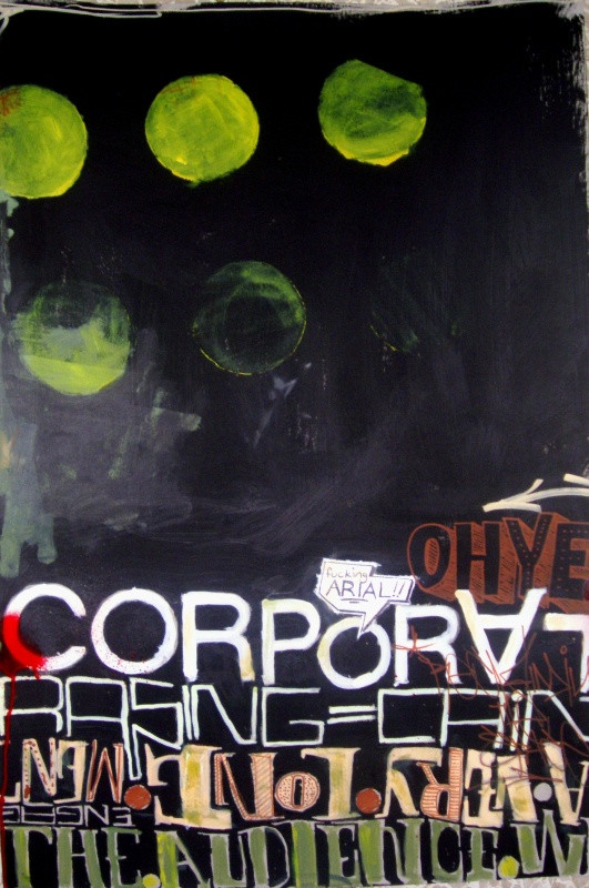
 TurquoiseHexagonSun — This Mess We're In
Published: 2005-08-17 08:57:33 +0000 UTC; Views: 1137; Favourites: 25; Downloads: 70
Redirect to original
Description
probably the start of some great new phaseRelated content


Comments: 30

that's my favorite ....
wondrful works.....for typography..cheers
👍: 0 ⏩: 1

thankx chocchop
👍: 0 ⏩: 0


I like how you drawing the letters, great job and nice colors
👍: 0 ⏩: 0


thankx ktessie  (Smile)")
👍: 0 ⏩: 1

I really like this one...you're so talented...Im glad I watch.
👍: 0 ⏩: 1
wow thanks! you've got amazing photos too aqui!
👍: 0 ⏩: 0

thankx man
👍: 0 ⏩: 0

hehe no!! that's helvetica!!
👍: 0 ⏩: 0

that made me happy man.. !
👍: 0 ⏩: 0

wow that's fabulous, i'm really liking the position of the text on the page and the text itself. If it was my piece though i'd say the dots kind of deter from the focus but it seems to be kind of a trademark thing for you. It may just be the fact that i'm obsessed with 'looking' space..empty space.. Anyway, great piece, i'll definately be watching you in the future
👍: 0 ⏩: 1
many thankx for your comments man! yes, as you've probably noticed i love dots and circles - i donow why.. i just like them.
big thanks for the watch too! your stuff rocks..

👍: 0 ⏩: 0

.. loved the 'fucking arial' part - we all hate arial. lets kill it !
👍: 0 ⏩: 1

jeez 22468, i'm really honoured that you're telling me this!
yeh, i love typograhy.. this was kindof an experiment with type. i used helvetica for the 'corporate' and the rest is invented.

👍: 0 ⏩: 1

thats it! the swisscorporativeinstitutionalneat stuff all in a block with the hyperfolk that messes it up and you living in malta - thats what makes it so unique
months ago this guys came to show their work to my uni and they have a fantastic gallery of folk type - as much of the project lies on the meaning of the texts there isnt an english version, but the images are still beautiful: link hope you like it
👍: 0 ⏩: 1
thankx for that link.. although it's in spanish and i can't understand a thing.. but i think i can get something mm
👍: 0 ⏩: 0


thankx echeo
👍: 0 ⏩: 0

such a powerful work. between your paintings and your typo work. if it might be a new phase for you, go for it, you found something amazing.
👍: 0 ⏩: 1
thankx px
i'll be doing some more stuff in this style.
i was browsing thru your faves and gallery, and i noticed that we got quite some common tastes. your work is cool man.. !!
👍: 0 ⏩: 0