HOME | DD
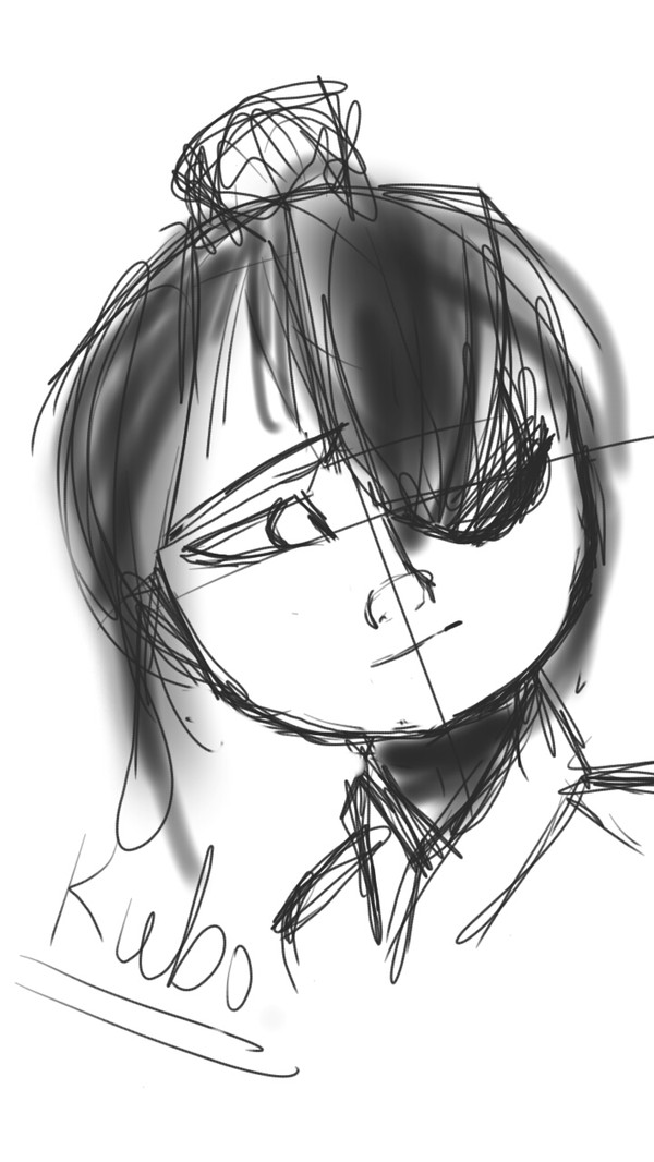
 Turtle-Back — Kiwi Hyena Icon
#anthro #anthrofurry #anthrohyena #furries #furry #furryanthro #hyena #hyenaanthro #hyenafurry #furryhyena
Published: 2019-03-11 22:50:17 +0000 UTC; Views: 484; Favourites: 37; Downloads: 1
Redirect to original
Description
Art for myself i did a while agoDesign bought from: trenchdoq/indigoadopts on instagram
I submitted this in Project Comment's gallery! If you're here to comment, what do you think of the shading? I have trouble deciding where shadows fall around the subject. What should I refrain from? What should I add? And what do you think of the art style?
Related content


Comments: 20

Hi, I'm from ProjectComment!
first of all, I wanna say that I love the color scheme in this! It's very bright and eye-catching, but it isn't so heavily saturated as to hurt. And for someone who's kind of sensitive to that, it's much appreciated! I like the blurring in certain places, it gives it lots of depth. And in the same kind of vein, I love how you draw fur and apply shading! I especially love the shading on the pink crest of fur and the shadow over the eye. And I'm absolutely enamored with how sharp and piercing that eye is. It doesn't look real, but not in a bad way -- it conveys the feeling almost better than realistic art could. The lighting is gorgeous and really ties the piece together. The subject is well-grounded in-frame and has a very strong feeling of character and personality, and your eye has lots of places to go in this! My only criticism would be that the neck seems a little too long for how thick it is? It might just be me, but there's something I can't put my finger on. If you'd like, you could also add some whiskers on the muzzle because that would look rad as hell. But I digress. The neck just seems a little off, like I'm expecting to see a collarbone and shoulders when I get to the end of it. Aside from that, this is stellar! The tongue and the teeth being the same color is a little distracting but honestly, it's not a big deal and you wouldn't notice unless you're looking to critique.
Again, this is a wonderful piece and I love your style!
👍: 0 ⏩: 1

Thank you so much! When I was lining this I wondered how to imply/suggest a collarbone or shoulder but really unsure how. Thanks for noticing it and thanks so much for your time!
👍: 0 ⏩: 1
of course, it's no problem at all! it looks great!!!!!! unfortunately i'm dry on ideas on how to imply a collarbone but good luck with figuring it out kelsfdjnlsd
👍: 0 ⏩: 1

Ooh, nice job on the expression! The colors look lovely?
👍: 0 ⏩: 2

Nice job with the colors here. Usually the colors on this character, but you just made it work here.
👍: 0 ⏩: 1

The colors are wonderful and the shading is very nice!
👍: 0 ⏩: 1

Heyyoo! I'm from ProjectComment !
Okay so -
I'm not great at giving critique, but I'll try my best! ^^
Okay first I wanna say I love hyenas so this made me wanna scream NDBS ANYWAYS...
Things you did really well on:
-the anatomy! I think for a cartoon character it looks semi realistic in the facial features and looks really amazing!
-the expression is priceless! With the whole scene, it feels like the expression and colors all match up to make one single emotion.
-i love the blur effects, it makes sure we see what the artist is wanting us to see.
A few things I feel could be worked on:
- The shading looks a bit awkward. It fits and looks great, although the shading on the neck doesn't for very well. Like, the flame is right under it therefore there wouldn't be shading there...?( I am not a professional and I'm actually horrible when it comes to shading, so like, this is just my opinion and probably isn't correct)
-i feel like the highlights could be more brighter/saturated because the fire seems bright, yet the highlights seem kinda dull.
-consistency when it comes to details. If you look at the ears and hair there is a massive amount of details and I love it! But there doesn't seem to be as much when it gets closer to the face and neck. A think I struggle with as well ( and maybe it's a stylistic choice) but maybe if there were just as many details.
I'm not sure. An nd I hope that helped a little bit. Like I said I'm not great at critique when it comes to stuff like this. Keep up the amazing work!!<3
👍: 0 ⏩: 1
Thanks so much! I'm trying to get more comfortable in trying to convey fur on anthro/animal characters. As for the shading on the neck, are you saying that there shouldn't be shading on the neck or should? Also thanks for the highlights notes! When adding light tones I wonder if I'm overdoing it or not. So if I do another fire environment art I'll try again for brighter highlights! Thanks for your words <3
👍: 0 ⏩: 1
NP! And sorry, I probably didn't say that right! ^^"I
I meant that the way and direction the flames were coming didn't make much sense with the shadow on the neck, and I didn't find it necessary.
👍: 0 ⏩: 1
Oh I understand now! Thanks!
👍: 0 ⏩: 0

H m
I feel a p p r o p r i a t e d.
Nah, I'm kidding. This is awesome, though XDD And the shading turned out really nicely ^^
👍: 0 ⏩: 1