HOME | DD
 tuxie — Second Sight

Published: 2003-08-14 19:11:15 +0000 UTC; Views: 962; Favourites: 14; Downloads: 409
Redirect to original
Description
Second Sight____________________
Well.. yesterday-eve Darulian ([link] )
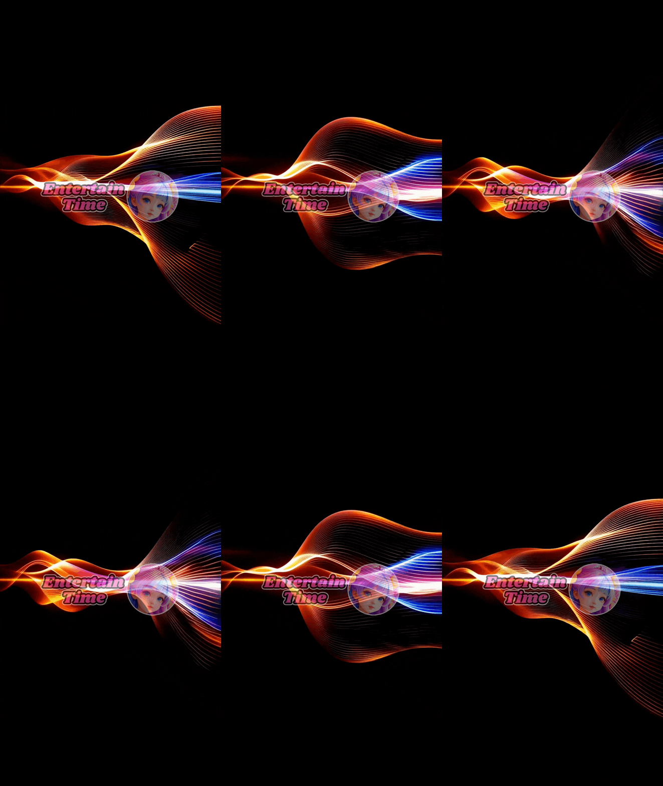
, Res`uk ([link] ) and i had a talk on irc.. We where talking about some art and res`uk showed some images, darulian to and so did i. I showed an image, an res`uk said, remove the render and upload it again. I thought.. wtf ? but the .psd was still opened so, why not. I uploaded it and an hour later res`uk contacted me, he made a remix of the image. It was so damn horny


Well this is the result. Enjoy
original created at 3840*2000
Related content
Comments: 21


👍: 0 ⏩: 0

instant 
👍: 0 ⏩: 0

gr8 work both of u!
this looks just sweet 

👍: 0 ⏩: 0

THis is really horny, hot and spicy!!! Wow, it shows perfectly the process of adding awesome 2D effects to something...
beautiful!
👍: 0 ⏩: 0

Wonderful 2d work, I love the light and the small objects around it. I like the middle one most, great job.
👍: 0 ⏩: 0

i really like the presentation here... youve definitely brought out some elements that i woudnt have noticed had it been just one large image.... the middle one is defintely the one that is most elegible for a larger showing... but at the same time i think that having the light and dark variations adds significatly the middle one... each variation interacts with the others in some really interesting ways.
great work on the originial image... and great work on extracting it for all its worth with the tripdych layout.
👍: 0 ⏩: 0

Me loves this one . Personally I like the last one the most ,
but all three are great . The linework is fantastic and the colors are stunning . Well done
👍: 0 ⏩: 0

It is very very nice. Love it. The thing that makes it is that yellow line with the text 'second sight'. Excellent job you guys
👍: 0 ⏩: 0

ahh... very slick... lovely man 


👍: 0 ⏩: 0

If I didn't like this, you would never have seen it. LOL
I just had an idea for that lighting right away, so I made it 

+fav
👍: 0 ⏩: 0


