HOME | DD
 tuxie — CuleaS

Published: 2003-05-17 19:27:09 +0000 UTC; Views: 1286; Favourites: 8; Downloads: 184
Redirect to original
Description
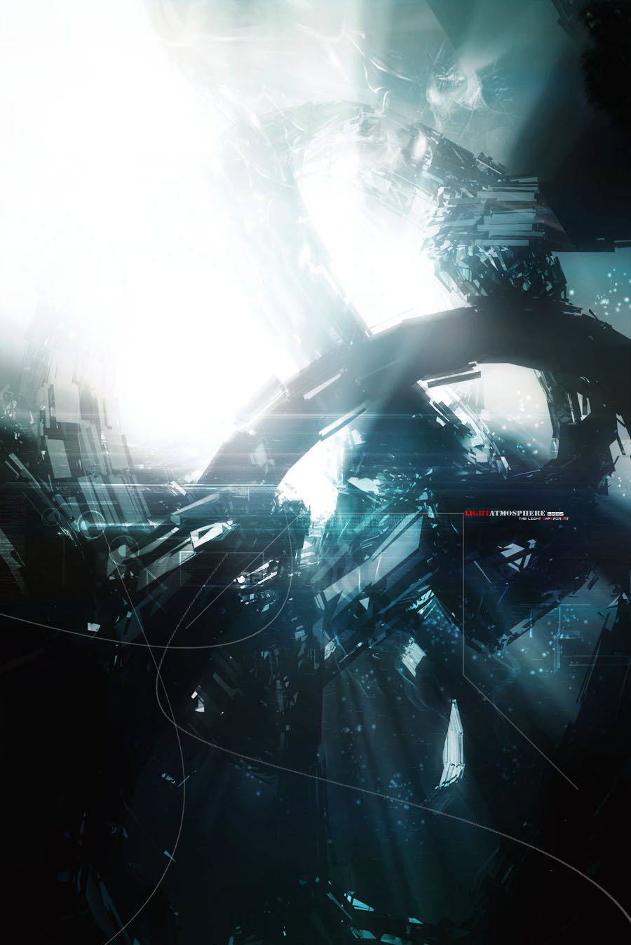
CuleaS______________
wallpaper of an older image, cause there where a lot of comments for wp size
Comments and Favs appreciated.
Related content


Comments: 28

I don't like the typo but the lightning is really nice
👍: 0 ⏩: 0


Great render... but why don't you center the 3d? That could fill up the space you left at the left.
Keep up the good work!
👍: 0 ⏩: 0

very cool, great 3d although the typo doesnt fit, i like it though!
👍: 0 ⏩: 0

there are some things that look a little dull on it, but all together it's a really nice image, good that u added another color :]
👍: 0 ⏩: 0


Dont like it, but a like deviation cuz the normal image is pretty good.
The fading you erased is reaaaaly bad, as i already told you, making a WP size is mostly bad with those images.
And the trendwhore really sucks.. stop the damn big and yes :$ ugly tw
👍: 0 ⏩: 0

its sweeet but im not that fond of the óvergang..hehe...what i said...maybe add some brush
👍: 0 ⏩: 0

I like it
But the lining is too unsharp, and too thick...and the typo in the left bottom corner (2003) isn't too well either :s
But that's just MHO of course :}
I've got a new wallpaper though
👍: 0 ⏩: 0

Not really feeling this one, at all. Very poor composition wallpaper wise, the way you blended the image into the WP res. is just, eeeew, cos the fade looks horrible. On the image you used, you could have blended the lighteffects so much better, they look too slapped on. The 2D and the thumbnail looks horribly misplaced, and add nothing to this.
You can do better.
👍: 0 ⏩: 0


nice wallie
i dont like the 2d though, dunno, lets say im crazy
take care
👍: 0 ⏩: 0

Hehe tuxie, what did i tell ya?? P
I love the lighting in this one, but its a little empty at the left and the typo doesnt fit in..
great wp though..
👍: 0 ⏩: 0


As I said at depthCORE, I really like the lighting in this one.
I don't like the 2d typography, nor the vast emptiness.
But I like the colors. keep it up!
👍: 0 ⏩: 0

th 2d needs more work
the rest is fine to me great work
👍: 0 ⏩: 0

Concept: 10/10
“I love the whole composition”
Effect: 10/10
“The light effects in this own”
Effort: 9/10
“I can tell you worked your ass off on this”
Trendyness: 7/10
“The trends on the right are cool, but there could be more”
Brushwork: 10/10
“You always do good brushwork”
Overall: 9/10
“This might be my new wall, a definite +devpack”
👍: 0 ⏩: 0

Nice work .. but I don't really like the linework :\ other then that it's pretty neat
👍: 0 ⏩: 0

Lightning is great.. 2 bad youve mixed something in this one..
Great work..!
👍: 0 ⏩: 0

Typo is bad,its a bit empty and the brush will all kind of colours sucks.
👍: 0 ⏩: 0


I like it
Nice lighting
work more on the 2d
nice job
👍: 0 ⏩: 0


looks aite on the right, but the 2d doesnt really do ne thing for it imo
👍: 0 ⏩: 0

Very cool, I like all the colors a lot well done.
👍: 0 ⏩: 0