HOME | DD
 TwilightEmbraced — Astartee

Published: 2004-07-01 22:02:47 +0000 UTC; Views: 1427; Favourites: 30; Downloads: 493
Redirect to original
Description
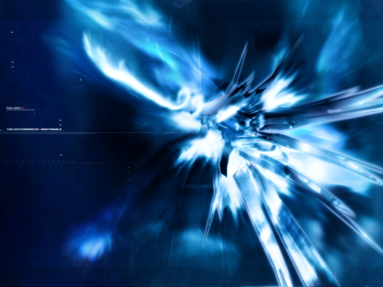
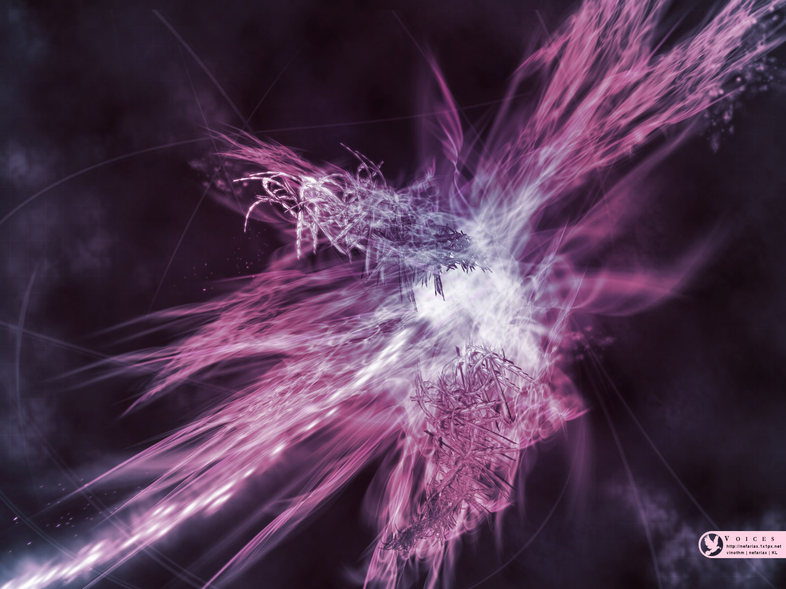
Well, didn't look as good as I thought it would be but then again, I guess it's alright. Just another abstract.I can't do 2D, I get really drustrated when everytime I think 2d is needed on a piece of artwork. I don't want to spread it over with brushes downloaded from others. Really need some tips but I don't know where to start. the text in this one definitely look outta place. But the comments looks like this piece didn't really need 2D muhahaha so yeah.
I guess this has a lil stellar looking atmopshere to it, I wasn't really clearly sure what I wanted to achieve in this piece, it was quickly done and I'm direction less. I think I need some kind of vacation, but hell I'm on vacation right now, still can't create anything good. I don't know why, maybe just an artist block. but I'm afraid, cause I got all these collab I need to finish, it's like at least 1 person ask me for collab everyday O.o don't know. but I need to find my self, find my style and start over new.
Edit: I changed this abit. Thanks to nightingale for the text tips. Really helpful.
fullview recommended
All comments favs and whatever in between welcome. I love constructive crit, so don't be afraid to say that it sucks, but if you do, then tell me why. thanks in advance. Happy viewing.
Related content


Comments: 75

Very nice work Sophie @__@;
Render is quite cool, the brushing is pretty we done oO;; and the colors are nicely chosen =]
Great job =], lookin forward collabing with ya ^^
👍: 0 ⏩: 0


 (Wink)")

Overall the brushing looks fine to me... a nice variety of textures ranging from metal and crystal (top left of the center lines) to faintly shimmering foil.  (Smile)")
👍: 0 ⏩: 0

beautiful job
i love the brushing in the bottom left the most.. looks great
way to go sophie
👍: 0 ⏩: 0

awesome 3d and the brushwork is fricken perfect
👍: 0 ⏩: 1

Thank you
your minirit icon is really adorable

👍: 0 ⏩: 0

ooo nice ")
heheheh i love the brushin
heheh

your rendeR?? lol

👍: 0 ⏩: 1
hehe thank you
and yes it is my render
👍: 0 ⏩: 1
heh your welcome!
see!! your getting better at renders~!!! lol

👍: 0 ⏩: 0

i love it, the color looks great on it and the brushing is awsome. even if it doesnt have any 2d, its still one of the most beautiful things ive seen. +Fav
👍: 0 ⏩: 0


lovely colours, little too bright for my eyes but still awesome
👍: 0 ⏩: 0


Sooophie! The render and brushing is gorgeous. ^^ And yeah, the text is a bit out of place. It's still nice though.
👍: 0 ⏩: 0


looks great and your right it needs some 2d, i hate doing 2d also its very annoying ")
👍: 0 ⏩: 0


Yep 2d needed. but its ok. exactly i like the lightening effects..
👍: 0 ⏩: 0


<= Prev |