HOME | DD
 TwilightEmbraced — Astartee

Published: 2004-07-01 22:02:47 +0000 UTC; Views: 1427; Favourites: 30; Downloads: 493
Redirect to original
Description
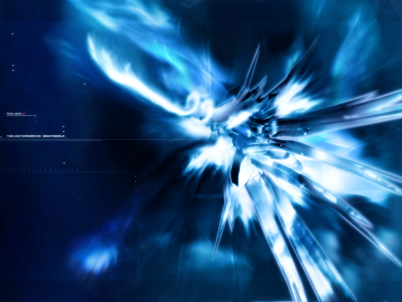
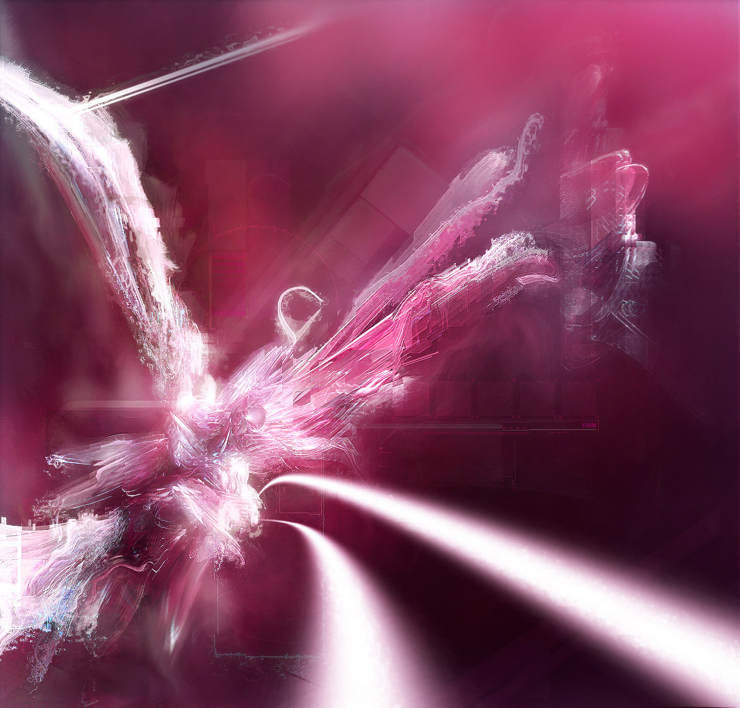
Well, didn't look as good as I thought it would be but then again, I guess it's alright. Just another abstract.I can't do 2D, I get really drustrated when everytime I think 2d is needed on a piece of artwork. I don't want to spread it over with brushes downloaded from others. Really need some tips but I don't know where to start. the text in this one definitely look outta place. But the comments looks like this piece didn't really need 2D muhahaha so yeah.
I guess this has a lil stellar looking atmopshere to it, I wasn't really clearly sure what I wanted to achieve in this piece, it was quickly done and I'm direction less. I think I need some kind of vacation, but hell I'm on vacation right now, still can't create anything good. I don't know why, maybe just an artist block. but I'm afraid, cause I got all these collab I need to finish, it's like at least 1 person ask me for collab everyday O.o don't know. but I need to find my self, find my style and start over new.
Edit: I changed this abit. Thanks to nightingale for the text tips. Really helpful.
fullview recommended
All comments favs and whatever in between welcome. I love constructive crit, so don't be afraid to say that it sucks, but if you do, then tell me why. thanks in advance. Happy viewing.
Related content


Comments: 75


*___* Dude, I think it's nifty. And I wish I had your problem-- I can't do 3D.
👍: 0 ⏩: 0

Wow, the brushing work looks great! Nice colors too!
👍: 0 ⏩: 0

Contrast is nice, its one thing I really do like about it. I see you also made the structure and form of the stellar object somewhat more balanced and easier for the eye to follow. The text is the main thing that bugs me, I think it would have done nicely if you just put a black border around it and put the text in there, give it a simplistic feel on the outside while having this awesome piece on the inside.
Don't worry, you will get out of your block, it just takes a little bit of time and practice for you to open yourself up to something else, I keep telling myself that, though its happening very ....very...slowly.
Looks great, keep it up.
👍: 0 ⏩: 0


 (Smile)")
A word to describe it : Majestuosity

👍: 0 ⏩: 1


👍: 0 ⏩: 0

Don't worry, 2d is crap and generally ruins most pieces.
This is a very nice piece ! ")
👍: 0 ⏩: 0

looks awsome. i just dont really like the highlights being white, though...
👍: 0 ⏩: 0

It looks much better now. Another thing I just noticed is that you made the typo also feel a part of the atmosphere. Nice. ^_^
👍: 0 ⏩: 0

that brushing is , hmmm how would u put it... ahhh yes AWSOME. great job
👍: 0 ⏩: 0

I like it! The final result is very original and beautiful.
Congratulations!
👍: 0 ⏩: 0

That's beautiful, looks almost like Fireworks. Heh. Good work...I guess you could have your own website of wallpapers eh?
👍: 0 ⏩: 0

omg your just getting better and better.... the render and the brushing is just awesome... the colors are 2.... great picture man.... i just dont like the typo.. and the stroke at the bottom... but else this pic is really great done... !!
👍: 0 ⏩: 0

Hmm.. It's still like I last saw it. Perhaps it is my cache. I'll check back here later. ^_-
👍: 0 ⏩: 0


omg sophie its amazine keep it up girl
👍: 0 ⏩: 0


hmm pretty nice, yeah with 2d get some funky dory fonts. I mean i suck at 2d but hey, a good font helps.
Nice work
👍: 0 ⏩: 0

lovely colour!!!! well, it's cool enough without the 2d

👍: 0 ⏩: 0

damn, you have some insane brushing skills. you must tell me how you do it!
great render, and like teh pink
nice work
mP
👍: 0 ⏩: 0

ooh, pink
nice color choice and great brushing. nice job
👍: 0 ⏩: 0
2D is not actually needed to make an image a polished piece of art. It depends on the artist. There are those who can make an image feel complete and solid with out even the slightest addition of 2D, take a look at ekud. I think your art looks fine and complete without any 2d.  (Wink)")
PROJECTED FRESTILE (hehe.. sorry, could barely read that. 
ASTARTEE
TWILIGHTEMBRACED.SOPHIE
And white would work better for a colour than purple here. Pretty much basic typo design but it works great.
That aside, I haven't already said how amazing this is. You make the render and brushing feel a part of each other. ^_^ wicked job Sophie. ^_^

👍: 0 ⏩: 1
thanks for the fav and thanks MORE for the comment and tip
love you!
👍: 0 ⏩: 0
very cool, but the white for highlights doesnt give it justice.
👍: 0 ⏩: 0


Not bad Sophie. You could work on the colours IMO. Maybe add a seondary color?
👍: 0 ⏩: 0

mm looks nice... i like te colors and the brushing is awesome as always
👍: 0 ⏩: 0

Awesome, much better than the pre release version you sent me, I see you touched some areas up abit to give it more of a deffinitive feel. Looks great, the colors are so vivid and lush. The text went along great with it, looks as if the piece went fine without any major 2D. Great job, keep it up.
👍: 0 ⏩: 0


thats some good artwork right there! great job on the fantasic colors
👍: 0 ⏩: 0

beautiful brushing and the render is awesome too, im also liking the colors nice job. +fav
👍: 0 ⏩: 0

very nice soph, only the overall pink is...... pink
i like your works with more colors better (not that i dont like this one ^^)
👍: 0 ⏩: 0

hey soph great piece, lovely colours and render, awesome brushing too
👍: 0 ⏩: 0

excellent colors and great render and great brishing as always..
👍: 0 ⏩: 0

Amazing...this is really nice. That color! That brushing.. bravo ! nice work!
👍: 0 ⏩: 0

your brushing is really spot on target in this one

👍: 0 ⏩: 0

it's so full of girlpower ; omfg :-D
I can see pink everywehre ")
👍: 0 ⏩: 0

Why feeling horrible ?
Its a verry great art sophie ^__^
PINKIEJ POWER
👍: 0 ⏩: 0


very nice work here, some nice brushwork and render is great too, also liking you typo
👍: 0 ⏩: 0


👍: 0 ⏩: 0
damn sophie this is great i love ur work keep it up
👍: 0 ⏩: 0


| Next =>