HOME | DD
 tymora11 — FEZ Contest WIP--Updated 5-29
Published: 2010-05-27 16:16:37 +0000 UTC; Views: 764; Favourites: 9; Downloads: 0
Redirect to original
Description
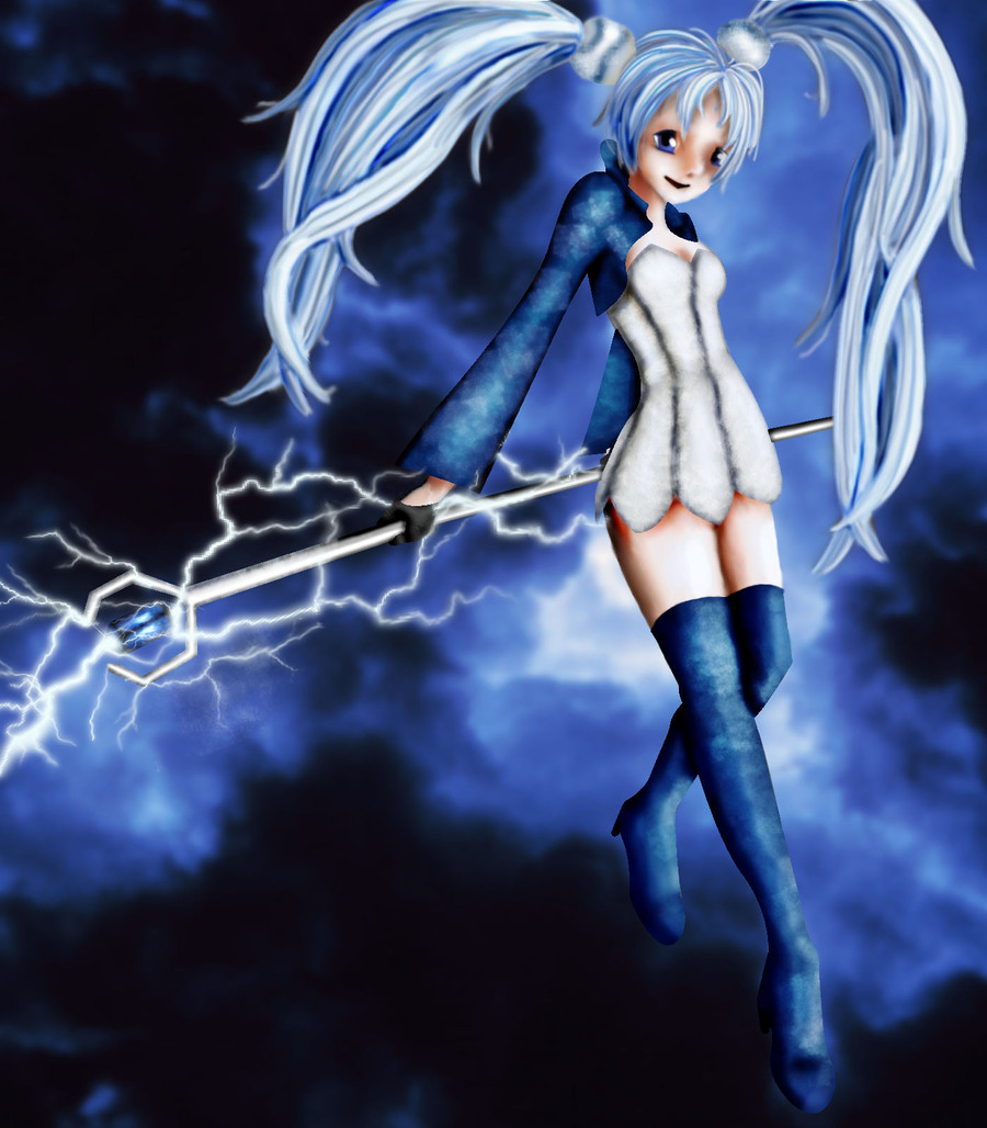
FINISHED! The WIP is being moved to scraps; see the final versions: [link] and [link]This is my WIP contest entry for the Fantasy Earth Zero contest. Posted mainly for feedback before entering.

UPDATED 5/29: If you commented before, please comment again!

Pose ref from Zerochan (not copied, mind you, just referenced)
Clothing, hair, and staff referenced from dA's FEZ resources and the FEZ website
Lightning and clothing textures are from ~redheadstock (OK to use for the contest; I asked)
Background photo is public domain (from the NOAA), modified by me.
~~~~~~~~~~~~~~~~~~~~~~~~~~~
CRITIQUES:
--I spent about 3 days completely repainting and messing with the hair. Better now? Still too blurry?
--I altered the shading around her face and legs. In particular, I added more shading to her right (topmost) leg to match the other one, and I worked on defining her nose and other facial features. Do they still need more work?
--I softened the lines in her features and some clothing. In particular, I both recolored and softened the lines for her eyes and mouth, and softened the border of her boots. I also smoothed some of the lightning because it was a bit pixellated. Have I softened these enough, and are there any other areas that need softening?
Related content


Comments: 33

Wow, this is pretty amazing! I love the background

👍: 0 ⏩: 1

First of all, this is a great choice of colours and I love the posing of the character. But her two ponytails are a bit off, especially her right ponytail (on the left of the drawing). It was a bit pull backward and her left ponytail (on the right of the drawing) looks like it was on top of her... head instead of the side. As for her hair, it does need more practice. Try to look on some reference. I suggest to check on Arina Tanemura one since her characters hair are really detailed.
This does remind me of Black Rock Shooter somehow. 
I hope this help

 (Smile)")
👍: 0 ⏩: 1

")

the proportion is very nice and the overall placement of the picture is good.
i suggest you try a layer of lineart to keep areas sharp, if you dont like that because it may take away from the real effect of the picture maybe try softer lighter linearts and thinner lines. Also expand your shading and highlights colors, skin has purple, blue, orange, yellow, - basically a lot of colors that are very fun to explore.
👍: 0 ⏩: 1

I'll give it a shot!
👍: 0 ⏩: 0

I have the say the hair could do with a bit of work. It needs to be less blurry and have a bit more definition.
The shading for the right leg doesn't match with the picture as its too defined when compared to the others. I think it should be blurred a little to match the others.
One small point, maybe its me but the nose doesn't look as detailed. Perhaps a little more shading
Other then that good work
Hope this helps
👍: 0 ⏩: 1
Thanks! I've had several people comment on those things. I think I'm going to increase the shading on the other leg rather than soften the middle, and I'm already working on the nose.
👍: 0 ⏩: 0

Super cute! You may want to look at the contrast between her dark clothes and the background. I think the hair could use some smaller strands to be proportional, but its your call
👍: 0 ⏩: 1

I would say the hair definitely need to be less blurry, along with maybe some other things.
the shading goes to being too black, and there's more colors you can put in shading than just blue, and try a contrasting color for the highlight to really make the pop.
Some area have edges that are just too hard, like the top of her boots, and something is up with that hand we can see, but i'm not sure what. her legs need more shading. having lines like that on her face looks really off when nothing else has any lineart, especially lines that are that black with such constant thickness. her feet look a bit long, and watch her right ankle, like the angle it's bent at. also i like the lighting effect, but it's sort of pixelated.
don't get me wrong it's not bad, just needs a bit of work (like a bit more shading would really improve it). and don't let a mouse get you down, a mouse can be used to get just as good line art as a tablet, though this doesn't seem to have much for line art.
👍: 0 ⏩: 2
I spent a while working on those things; I even decided I agreed with you after all about the lightning. Better now?
👍: 0 ⏩: 1
definitely better. And maybe you'll find this: [link] helpful for any future works.
👍: 0 ⏩: 1
Thanks! I'll work on those things. I'm already working on the hair and shading; I'll have to look into softening and lightening the lines on her face. The proportions and positioning were all taken from the reference, so I think I'll probably leave those alone.
Regarding the lightning, it's actually supposed to be a bit jagged and sharp, because that's the way lightning really looks. Is it possible that you're mistaking jagged for pixelated? Because the lightning brushes were made from photos of lightning, so they kind of can't be incorrect. Possibly using larger ones would look less pixel-y.
I'll try it out!
👍: 0 ⏩: 0


The overall look is good, but I think this could use a bit more detail in places - especially her hair and facial features (the nose is very indistinct, I think). The shading on her thigh is a little weird - it looks more like a stray line than a shadow to me.
Nice image and effect - just a few spots that need a little cleaning up.
👍: 0 ⏩: 1
Thanks. Which thigh shadow are you referring to: the one in the middle (between her legs) or on the left (the edge of her right thigh)? I've had several comments that one or the other needs to be changed for consistency, but if it looks like a line I need to soften it or something.
Also, I'm aware the rod isn't actually straight. The original reference model's hands weren't positioned along a straight line, so I modified my staff to fit the hand (I didn't want to redraw the hands). You're the only one who's noticed, and unless somebody else does, I'm probably not going to worry about it.
 (Wink)")
👍: 0 ⏩: 1
Oh, should've specified that -I meant the edge of her right thigh - sorry!
Fair enough.
👍: 0 ⏩: 1

The shading looks good with the blue here. For hair, I'm gonna link you to some hair tutorials to get that more realistic or anime style.
[link] [link] [link] [link]
I would also recommend a little darker shading around the eyes and mouth, but other than that, it's pretty good. Hope I could help!
👍: 0 ⏩: 2
I'll have to try some of those techniques on other pieces, too.
Meanwhile, this one's been updated!
👍: 0 ⏩: 1
Ooh, thanks! Tuts are always great!
👍: 0 ⏩: 1

I love all the blue in this picture, it produces a really dramatic effect. ♥
I think her hair needs to be clearer, it looks a bit unfocused and blurry...
As for shading, she could use some more on the left (our right) side of her face and the right (our left) side of her right thigh... The side of her white dress could use more shading too.
This looks great, I love the depth of the shadows you've used! Good luck in the contest ♥
👍: 0 ⏩: 2
Done! Wanna take another peek?

👍: 0 ⏩: 1
It looks awesome now, I love her hair! ♥
👍: 0 ⏩: 0
Thanks! I'll work on those.
👍: 0 ⏩: 0