HOME | DD
 Typewriter-xx — Anatomy/Pose practise

Published: 2019-05-08 12:35:26 +0000 UTC; Views: 585; Favourites: 38; Downloads: 1
Redirect to original
Description
I am quite the bad at poses anatomy and expressions so i ogtta git gudIf anyone can give me any advice I would appreciate it???????
a lot???????????????????????????
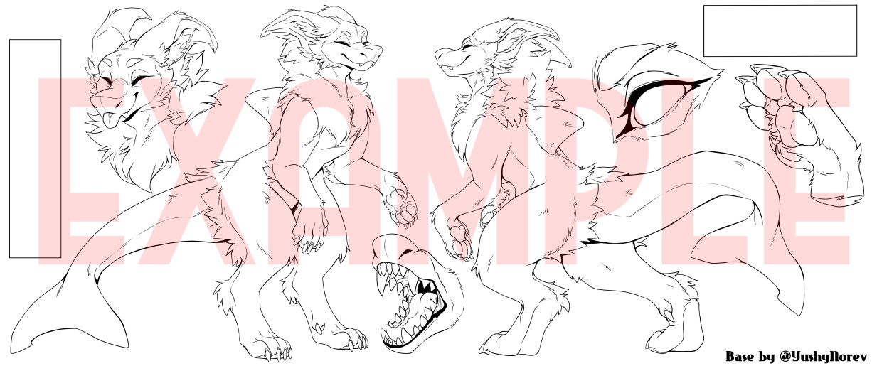
This character is based off wolf/greyhound anatomy
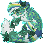
Character ref;
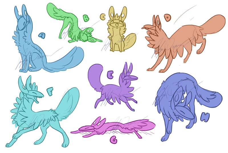
Some references I used;
ProjectComment people I mostly want feedback on anatomy uwu [keeping in mind my character design up top and that I'm not aiming for realism]
Related content


Comments: 17

Hello there! This is from ProjectComment , (sorry if the link is a bit weird) And for the most of it, I really enjoy how you are able to draw the greyhound’s snout nicely (I had problems with that in the past), and how the proportionality of the dogs are really accurate! I enjoy how you understand how to pose a greyhound (as in not in a really uncomfortable position) and that the paws looks so delicate and in touch with the rest of the greyhound!
Although heres something to help you:
The greyhounds look beautiful because you understand where everything is, but maybe around the stomach area try to make it a bit more (big), and try not to make the Chest area and the stomach difference so noticeable
An example of this would be in the 5th reference picture you posted, where the greyhound is rolling in the grass. Notice how it’s belly kind of smooths in with the chest area, as if they weren’t too dramatically separated  (Smile)")
i hope I wasn’t a bit rude through all of this advice! Have a nice day
👍: 0 ⏩: 0

Hi, coming from ProjectComment here.
So in terms of anatomy, highly stylized work like this can be difficult to critique, because the line between making a character more recognizable as the animal in question and trying to "correct" the entire style is pretty thin, but I do have a few pointers:
Since you're using wolf/greyhound anatomy, I suggest giving the head a gentler slope. Dogs have much more of a hard angle, even if that dip is shallower in greyhounds. Smoothing out the slope would add that wolfiness into the face, especially if you have other characters in this style who aren't wolves or are other breeds of dogs. Although, in the context of, say, this one being the only wolfdog in a pack of wolves, you may want to keep the more exaggerated brow line for contrast.
The ears also look HUGE for a wolf or greyhound, but they can also be useful for enhancing expressions, so, technically inaccurate, but not something that necessarily "should" change. :3
The more noticeable issues are the shape of the spine and the relative size of the head to the body. Stylized or not, such a skinny frame with such a large head (especially because the large ears take up even more space on the page) gives me some real uncanny-valley vibes. Fast dogs have that deep chest because they need to have a bigger heart and lungs; when you have the shape but not the depth, a waist and neck less than half the size of the head, and big strong wolf paws but not the bones on the legs to support the frame, the character looks starved and too weak to do...pretty much anything. 
Great work on the paws, though!
Hope this helped. :3
👍: 0 ⏩: 0

Hello there!
For the most part, this is very good! the important thing to be careful about is making your character seem thin without appearing underweight. one good way to do this is by not making the waist of the animal (specifically the part closest to the haunches) much thinner than the base of the neck. contrast the waist-to-neck look of the bottom-right purple pose with that of the middle-right red pose. This may make your chest need to stick out lower than you want it to, so play around a bit with the shape. Good luck!
👍: 0 ⏩: 0

I really love the flow and movement of these drawings!
👍: 0 ⏩: 1


this is cANTENT if i've ever seen it
👍: 0 ⏩: 0

Hehe thank you ! Always looking to improve tho ^w^
👍: 0 ⏩: 0

Heheheheh my thoughts exactly
Legs for days
👍: 0 ⏩: 0

@ projectcomment people I mostly want feedback on anatomy/pose uwu [keeping in mind my character design up top and that I'm not aiming for realism]
👍: 0 ⏩: 0

ndfebhrnsJK ahhhhh I need to do these sheets > - > but for paws and anatomy like this xD but it looks amazing! ")
👍: 0 ⏩: 1
Haha yeah I don't get to do them often because I get kind of bored but I think it helps a lot with improvement !
Thank you ^-^ I just wish I could see actual improvement in my art lmaoo
👍: 0 ⏩: 1
O:< I see improvement your crazy!! And practice Never seems to be fun xD
👍: 0 ⏩: 0