HOME | DD
 Typomonger —
Yesterday
Typomonger —
Yesterday

Published: 2013-02-25 19:54:58 +0000 UTC; Views: 13629; Favourites: 838; Downloads: 239
Redirect to original
Related content


Comments: 81

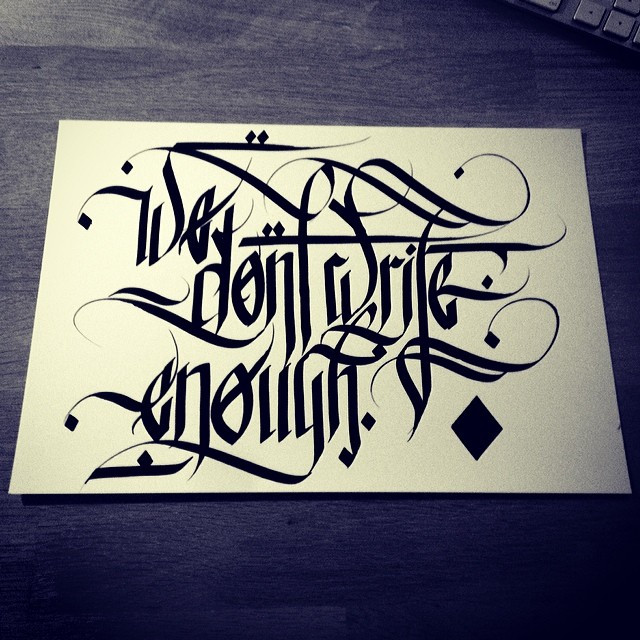
Yesterday, all my troubles seemed so far away~
👍: 0 ⏩: 0


wow this is awesome did you use a black letter nib? [link]
👍: 0 ⏩: 1

Glad you like! I used Pilot Parallel Pen 5mm!
👍: 0 ⏩: 0

I want this font!! Lol. I wish I had such nice hand writting
👍: 0 ⏩: 0


SOMEBODY MAKE A FONT OF THIS!
Oh and congrats on the DD
👍: 0 ⏩: 1
Thank you! Yeah, maybe someday I give it a try and make a somplete font of this style
👍: 0 ⏩: 1
Thank you. And be sure to note me when you done Okay?
 (Wink)")
👍: 0 ⏩: 0

Congratulations on your well-deserved DD!!!

👍: 0 ⏩: 1


Nice!!!! What did you use to make it? A pen? marker? ...
👍: 0 ⏩: 1
I used the Pilot Parallel Pen 5 mm! It is a great tool!
👍: 0 ⏩: 1
Gorgeous.
Although I definitely spent five minutes with my head spun around like an idiot to see if it spelled "illuminati" upside-down. xD
👍: 0 ⏩: 1

I may be pretty good at calligraphy, but im not THIS good (yet), GREAT job!
👍: 0 ⏩: 1
Thank you so much, glad you like!
👍: 0 ⏩: 0

All my troubles seemed so far away...
Lovely Calligraphy.
👍: 0 ⏩: 0

The gothic lettering combined with the splatter dots is a rather cool effect - reminds me of a mind that is formally organised but likes playing around and being crazy.
👍: 0 ⏩: 1
Thank you. yeah it was much fun to create it!
👍: 0 ⏩: 1


")

I can only hear Beattles...when I see this word! XD
GREAT JOB! You would be a super star in the medieval illumination book times! <3<3<#
👍: 0 ⏩: 1
yeah me too  (Smile)")
")
👍: 0 ⏩: 1
It was pretty good in the style of typography!
👍: 0 ⏩: 0

Thank you very much to all of you! The DD beautified my day
👍: 0 ⏩: 0


The order and chaos cited by ^pica-ae reminds me of music that has just the right proportion of consonance and dissonance: enough consonance to be pleasant and enough dissonance to be interesting.
👍: 0 ⏩: 0

This is one of the prettiest fonts I've ever seen

👍: 0 ⏩: 1

Wow, this is really beautiful
👍: 0 ⏩: 1
Thank you so very much, glad you like!
👍: 0 ⏩: 1

Very Nice calligraphy! The dirt-effect really finishes it off!
👍: 0 ⏩: 1


| Next =>