HOME | DD
 ueberbobo — SilverBullet
Published: 2001-07-29 22:37:14 +0000 UTC; Views: 795; Favourites: 3; Downloads: 388
Redirect to original
Description
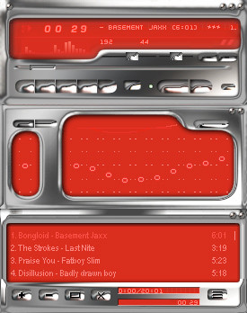
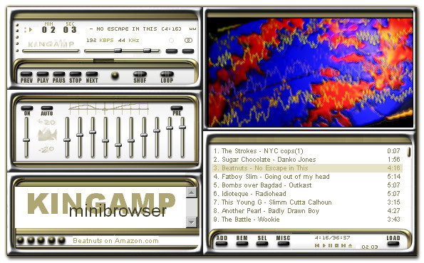
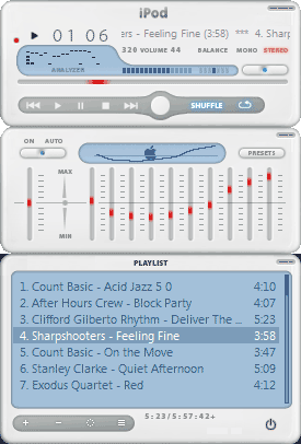
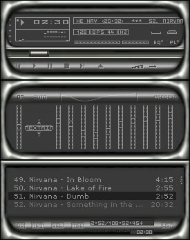
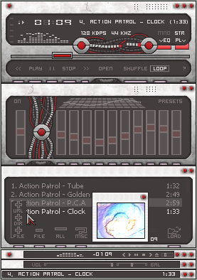
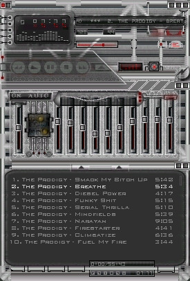
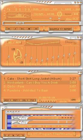
here's my new skin. enjoyRelated content


Comments: 15

Hey dude, reupload the skin, this look bitchin'!
Might be good in blue as well.
")
 (Wink)")
👍: 0 ⏩: 0

the croming and the red is awsome.. but I think the skin needs some work.. on the main I think the bal vol buttons is a bit to big.. and on the EQ the bottons are nice... but I think the "uppåtböj" looks a bit off.. think it would look better if it dident go up like that .. on the playlist I think u should remove the labels on the buttons cus u don´t have labels on the other buttons.. woa.. but thats just me
..
- This comment was sponsored by Loiden
👍: 0 ⏩: 0

That is pretty tight for a metalic skin... I would prefer to see a blue background with black text
Also, I'm all for putting the little icons on the buttons...I always end up hitting stop instead of pause or vice-versa w/o the icons.
👍: 0 ⏩: 0

Awesome. Will there be other color variations of this?
DaGuy | http://www.daguysdomain.cjb.net
👍: 0 ⏩: 0

exceidingly chrome!!! I like it...man that crome is killin my eyes. how u do that?
-- Dredwerk
MSN IM: Dredwerk
AIM : dredwerk123
Your bound to catch me sometime!!
👍: 0 ⏩: 0

Swift! Yer an excellent skinner! And without posting three million previews and begging for comments, etc. Way to go.
*tsp*
Pull your skirt down girl, your fetish is showing!
👍: 0 ⏩: 0

ahhh reminds me of strawberry sherbet in a silvery container ... good colour scheme, but needs a tad more work - i'm not particulary crazy about the surface of the buttons, especially on the main - they look as if they were eroded, not chromed. fix it so i can like it more.
// biopfoten //
______________________
i wish i was dead or asleep
👍: 0 ⏩: 0

Very nice. Extremely clean and crisp. I love it. Great work.
Mathias
http://www.brazengraphics.com BrazenGraphics.com
👍: 0 ⏩: 0

Label: BOOOOO
Non-Labels: Whopeeee!
Jstigma
Happiness
-We're all in it together
Http://I.am/jstigma
👍: 0 ⏩: 0

absolut masterpiece!!!
P.S. I prefer it without labels
👍: 0 ⏩: 0

Cool chrome and red combination, but some icons on the buttons would be greatly appreciated.
👍: 0 ⏩: 0

dont label the buttons. it will not look as clean if you do. the mouse over hints/help that is built into winamp tell what the buttons are. one thing wrong is that there are no control buttons on the main windowshade or on the playlist. good work.
Ill end up alone like I began
👍: 0 ⏩: 0


Awesome! I am learning to skin, and this inspires me! Keep up the good work. I agree with lamb though, I think you should label the buttons... other than that, it's awesome! Like the chrome, too.
One by one, the Penguins take away my sanity.
iCrap - Poop Different
~!chrism!~
👍: 0 ⏩: 0

wow. that crome looks great....and the red bg is a nice touch...i think it would look good if you chaged all the text to white instead of that light red. and if you labeled the buttons that would be nice also-not everyone knows them by heart...but the crome is tight!
ahhhhhhhhhhhhh
The Lamb of God
👍: 0 ⏩: 0