HOME | DD
 UEY-S — SIK design graphics - V

Published: 2008-07-06 17:37:42 +0000 UTC; Views: 4091; Favourites: 37; Downloads: 0
Redirect to original
Description
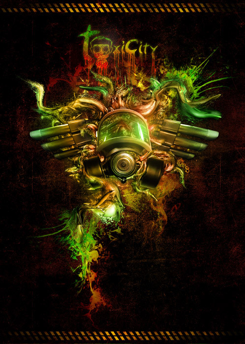
Just playing around and trying out things.Which one do you like better? Critic is MUCH appreciated as always
")

[link]
[link]
[link]
[link]
has my permission to add this deviation to their ass kicking gallery
ALL WORK HERE IS COPYRIGHTED, using this image without asking for permission is prohibited and YOUR ASS WILL BE SUED.
Related content


Comments: 29


Hey, love the deco style and perspective but agree with a few folks about the texture. I think the grunge need to be a bit more fine (smaller), and more detailed, it looks like you've scaled it up too much. If you look at the E, Y, A and P, its spot on and looks great...
👍: 0 ⏩: 1

thanks for the constructive criticism mate, point take
 (Wink)")
👍: 0 ⏩: 0

I do love the colors in this version, however, they're not quite as eye catching. Still works though.
👍: 0 ⏩: 1
thanks for all the criticisms! much appreciated
👍: 0 ⏩: 0

I think this one and the green/blue are the best. But I really love how you did these.
👍: 0 ⏩: 1
thanks ay, good to know! i keep changing my favourites but this one is probably the most favoured by me out of the rest.
👍: 0 ⏩: 0


hahahahahaha... haha .. ahahahaha! man your aviator is hilarious. thanks dude
👍: 0 ⏩: 1


The typography is very nice, but the textures make it look cheap. Still nice work though.
👍: 0 ⏩: 1
cheap like a $10 whore? haha well cheers for been honest, i'd rather hear the harsh truth, i'll keep this in mind next time. but to be honest i was going for more of a grungy look.. grunge is very urban and rather cheap looking
")
👍: 0 ⏩: 1

I don't think it looks cheap, though I get MSDesigns point. Um, how do I say this.. If you'd shift the texture a bit for each letter/rectangle would fix it I think  (Smile)")
")
👍: 0 ⏩: 1
no i don't quite get that, sorry.. what exactly do you mean by shift the texture?
👍: 0 ⏩: 1
Sorry, not very good in English
I made an image because I don't konw how to say this in English.
[link]
The first one is how you did it and the second is what I was trying to say
👍: 0 ⏩: 1
oh i see now! yeah i like that, i'll keep it in mind for next time
👍: 0 ⏩: 0

I'm a bit torn, but I decided that I liked this colour scheme the best. Love the deco look, very stylish

👍: 0 ⏩: 1
thanks, i faver this one too
thanks again
👍: 0 ⏩: 0

