HOME | DD
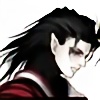
 Ultamisia — Aurlena SWAT armor [outdated]

Published: 2012-04-01 17:53:49 +0000 UTC; Views: 17853; Favourites: 349; Downloads: 466
Redirect to original
Description
Finally finished up an Aurlena piece showing off her Sci-fi SWAT armor. The Design itself is a mix of light, medium and heavy armor bits. As you can tell, the light armor bits help show off her assets a little")
You'll notice a lot of the blue glowing bits on the armor.Those are embedded shield emitters perfect against ballistic weaponry.
Additional Equipement can be listed as follows:
- Combat Knife
- Flashbang Grenades
- Rhino Pistol
- Spirit Assault Rifle
- Optical HUD (when helmet is removed)
I'm basically gearing this up as a concepts for an upcoming book i'm doing with that should be released early summer. My Story i'm cooking up will be called: "Ascertaining Ascension"
-Enjoy!
Related content


Comments: 38


thanks!! ill probably end up changing it like i usually do haha
👍: 0 ⏩: 0

This armour looks really cool do you have a picture with the helmet on?
👍: 0 ⏩: 1
uumm none that are published
👍: 0 ⏩: 0

I love the helmet; it looks like a fighter jet helmet from the future, and part of it actually looks like the new helmet on the F-35 joint strike fighter. Great job.
👍: 0 ⏩: 0


interesting design, you have a great imagination and skill to show it, keep it up
👍: 0 ⏩: 1
thanks for the encouraging words!
👍: 0 ⏩: 0

Her legs, dem legs. Also quite fond of the upper shoulder armor design, very sexy and sleek. I really like your artwork, you have this developing style that I can see becoming insanely strong and unique. There are vast improvements already from your works just a few months ago. I'm finally going to give you some constructive critique that I think will help you reach a much more professional level. In my opinion anyways. The things I'd like to point out are not a 'per picture' thing but a consistent trait in all your works I believe could be improved on.
First off, shading and lighting. You rely primarily on the dodge and burn tools, which when used properly, can make a very nice effect (shirow) BUT relying on them so heavily makes the work too soft and flat, it gives off an amateur feel and affects how much UNF your work has. Start playing with the base brushes and working with opacity and gradients. If you add solid shadows to your work you will make it pop. Look at most photos and you will notice how the 'edges' of some shadows are smooth and fade while the others are solid. Normally the darker the shadow the more solid it will be. Say for example the light is from above, there will be smooth shadows all along the bottom of the persons face, hard shadows from the bone of her eyebrow casting down as the skull caves in there. Under the shin and across the collarbone you will have a hard dark shadow from her entire head casting down onto her chest. (suddenly the example person is a girl, durp durp) [link] Look at this pic, I know its not the subject at hand but ignore that and look at the coloring. Look at his face, the cheeks are lightly shaded yet the darker shadow (bigger obstruction from the light) *his nose* is making a large solid shadow. Now this applies to lighting as well, solid lights can give you such a richness to your artwork. Something to start with is making a tapered shiny solid white line down the leg of a girl in shiny pants, along the thickest point use a bit of the tools you normally work with but keep the rest solid. I'l give you some examples on your own work, maybe it will help you visualize. From what I can tell your softer light source is from the right shining onto her with a hard light tapering her edges on her left. The shadows on her face are incorrect. In any case, think about the objects being hit by the right side with light the hardest. It would be cast along the right sides of her breasts, on the left (like her left arm) you could have put a thick solid shadow casting from her boob. Same goes with her left inner thigh, it could also have a deep solid shadow that bends up and around her crotch piece. Since the light seems like its kind of from right top ish you could have even put a large solid shadow casting from her head onto her left side and just down from her neck. Keep lines to these shadow blobs solid and blend them only when the shadow gets a bit weaker (light filters onto it a bit) All of this can be applied to light as I mentioned. Use the brushes and blend with them using opacity. A trick to that is having it around 25, keep your finger on the 'alt' tab and once you have blended the shadow out a bit touch the alt and click on that shadow (its a shortcut to eyedropper) now blend a bit more into the other color, alt+touch blend more. So really you would be using the eyedropper to blend the color out by grabbing each blended smear you do. I think I need to make a vid tutorial to this, I just can't explain it right haha.
As for the second thing I have noticed that consistently takes away from your works, is the nose. The bridges flatten out and blend to heavily into the forehead, they end up to big and make the girls look a bit homely. If you have the base of the skin done take the gradient tool and set it to colored on one side and transparent on the other, now make sure its set to the 'round' flood so that it makes a dark circle when you use it. Use a darker skin tone then base. Now make a gradient all around the tip of the nose going only slightly up the bridge. It should look like a dark circle of shading right on her nose that fades all around the edges. Now grab your base skin tone again and set your normal brush to full opacity. If you run it straight down her bridge you'll get a wonderful nose base to work with. If this doesnt make sense I can photoshop up an example. Its a nice shortcut to color an effective nose with very little effort. Also remember that the forehead slopes down and in between the eyebrows, shade there, light the bridge. Otherwise you end up with girls that have noses like the blue navi (avatar)
Also one last thing while on the faces. Under eye bulges. The lines you draw that resemble itachi from naruto. I'm not sure why this part is always added with shadow under it and light on top. What happens is that you end up with bee stung eyes. The line that you are drawing needs to be on the top of the cheek bone near the inner part of your eye (feel on your face under your bottom lid and follow your skull line, think about where that line is being placed on your girls compared to where it is on your face) The opposite lighting effect that you are doing needs to be done, shadow above, light under. So in other words, shadow under the eye socket and lighting hitting the upper cheek is the most effective. Look at it here [link] Notice where the shadow is under her eyes? I think a big problem that is throwing you off in every work is that the eyes are too far apart so you draw the bridge to match, which then throws off the nose AND the under eye line. Structurally everything else on her face is wonderful and is always good in your works. But these consistent traits are taking away from your style. Do some facial studies, go through my faves and draw some of the eyes, noses and faces you like. Try out other styles and try to come up with a better balance in facial features.
I honestly do enjoy your work, I've been watching for awhile now and checking in to see your improvements. You're bodies are getting much stronger its just the faces holding you back. I know you have potential to do some amazing work, I wouldn't be writing this if I didn't. So please don't take this as a flame. Please try giving this all a shot and see how it works. You can add me to facebook at Mei Phon ( look for the derpina pic.....) Id be happy to go over stuff if you want help. Red line even.  (Smile)")
👍: 0 ⏩: 1
")
👍: 0 ⏩: 1

You're a lucky rat man. I almost never get such extensive and helpful comments
I only get the crappy ones.
(sorry for stepping in)
")
👍: 0 ⏩: 0
Hi, I really like your style, you would be interested in participating in the contest for the realization of the cover of my sci-fi literary magazine?
👍: 0 ⏩: 1
Thanks!! i would like to participate, however i have a lot on my plate at the moment
👍: 0 ⏩: 1
Thanks anyway, I wish you good luck for your projects
👍: 0 ⏩: 0

Nice work here! Would be great to see more of her fully suited up!
👍: 0 ⏩: 1
ha ha probably will
👍: 0 ⏩: 0

Now, if she puts on the helmet is it able to open? Meaning to reference like Ironman (best and quickest comparison). Just wondering.
👍: 0 ⏩: 1
yup pretty much opens up unto 3 parts (or more, still have to design)
👍: 0 ⏩: 0

Very cool, looks practical, durable and flexible to me.
👍: 0 ⏩: 0

Who says that pratical armor can't look hot  (Wink)")
👍: 0 ⏩: 1
Your Welcome! Keep up the great work!
👍: 0 ⏩: 0


