HOME | DD
 undefinedreference — Dayglo Blazing Fire Chart
Published: 2022-04-09 03:22:33 +0000 UTC; Views: 221; Favourites: 3; Downloads: 0
Redirect to original
Description
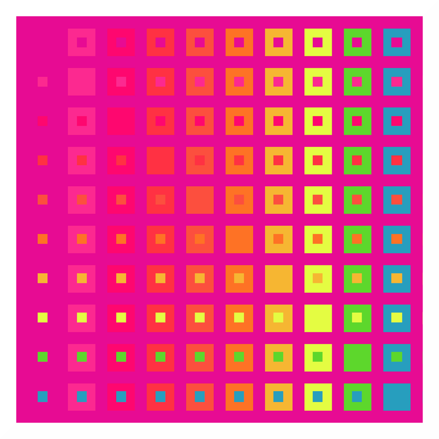
Dayglo Blazing Fire Chart, based on the Dayglo Contrast Reference Chart www.deviantart.com/undefinedre…Rationale
---------
Existing dayglo artwork (e.g. 4.bp.blogspot.com/-YXInugPa8qY… ) shows that teal works great as a background with these colors, because it contrasts more or less evenly with all of them. A thick, pinkish lavender or fuchsia (in this case it is DayGlo's very own Corona Magenta) also turns out to work well with those in the orange-blue range. With the pinkish/reddish ones it has a very particular effect: the ridiculously low contrast causes it to look like the canvas is being consumed by a raging fire! In many cases, like drawing attention to a text on a poster, this would hardly be a workable combination, and so far I haven't encountered any dramatic examples. If you were to venture deep enough into hippie/acid territory, however, some pretty mind-boggling ones should be available.
The point here being that similar tests can be run for any background color. Egg yolk yellow, for example, looks great as well, while its complement, a kind of azure blue, makes the chart look rather bland and nondescript. Lots of room for experimentation.
Related content


Comments: 2

👍: 0 ⏩: 1

👍: 0 ⏩: 0