HOME | DD
 undefinedreference — Quite Smitten
Published: 2015-12-12 10:03:49 +0000 UTC; Views: 215; Favourites: 10; Downloads: 1
Redirect to original
Description
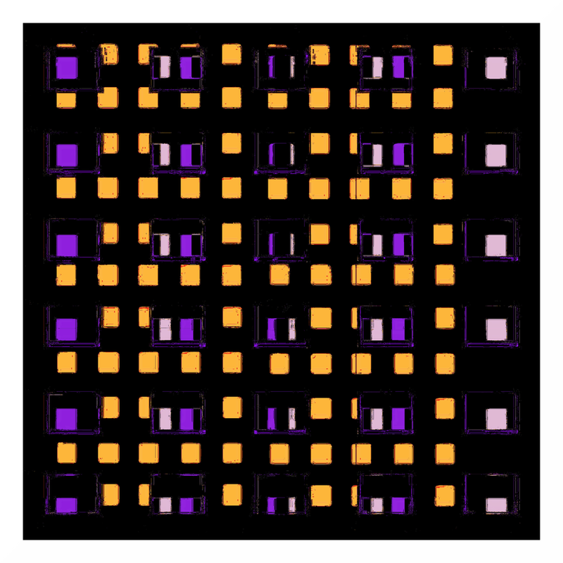
Quite Smittenwww.youtube.com/watch?v=JTM80U… - The Passions - Man On The Tube. I used to be quite smitten with this song for some reason, even though being alone at night never gave me a fright, quite on the contrary (if anything I'm more about tactical daylight avoidance, a goth by nature one might say, even if I don't dress like one). Hearing it again did send shivers down my spine.
Related content


Comments: 13

I think this is super successful. I can tell from your other versions of this piece that there are outlines around groups of squares (I'm not explaining that well; what was your original source?), but here those lines are hard to spot, and where they are present they remind me of the edge of a rubber stamp that is accidentally inked. Especially on the far left side, with the column of lilac rectangles, it looks like you used the same stamp with some ink stuck on the edge over and over.
In short, this piece looks hyper-traditional instead of traditional, and I really love it the effect that you've achieved. There's a lot of emotional charge and a compelling reductionism that come with printmaking, and you really manage to harness into that aesthetic.
Also, LOVE the colors.
👍: 0 ⏩: 2

And yes, I do have a thing with "off" colors, they're probably my main point of attention.
Interestingly, here in Holland (and probably elsewhere too), in the shops where low-wage people go buy their clothes, the textile is all in dull, ugly and very much "off" colors, while the rich people are served bright and happy, or at least in some way sophisticated, colors. Which has the advantage that you can identify people's social status already from a distance from the colors of their clothes (plus poor people's clothing also tends to come with tons of screaming text print)
👍: 0 ⏩: 1
 (Smile)")
There's a similar situation here in the US, but I've never thought about it. It depends on the geography of "low-wage," but the colors here are either aggressive/dark or wan/dull. At least in my association -- there's bound to be disparities in color psychology between cultures and regions.
There's also "screaming text print" on poor people's clothes here in the US. That's a very interesting observation ... You hijack people's aspirations or what little money for recreation and nutrition that they have.
So, where are you going with colors?
 (Wink)")
👍: 0 ⏩: 1
Here's a good example of colors which are apparently deemed festive enough for poor people: holland-webshop.nl/files/11307… . These are children's clothes from one of the local bottom end discounters. They could be bright orange and red or something, but instead they are something that vaguely resembles the infamous "dA pea puke green". And they come complete with screamy text! What I wonder is who decides about these colors and why. Are they purposely designed this way? Are they fabricated from failed or leftover products? Or are they cheaper to produce because they require less dye? And if so, do these savings outweigh the cost of printing something like "BEACHWATCH 82" in huge letters into them? Is that meaningless text there to distract from the ugliness of the color, to break the general monotony and blandness of this outfit? Or are there more sinister forces at work here? Is this perhaps the product of an utterly cynical mind that has found out through in-depth sociological research that if you dress people up like in ugly-looking clothes with grotesque and idiotic statements printed onto them, this will rob them of their dignity and keep their sense of self-esteem at an acceptably low level, making it easier for the "better" people to put them in their place?
I don't know. And I guess I like "off" colors because I like everything "off"
👍: 0 ⏩: 0
I can tell you studied art and/or literature or something related. The ism in reductionism suggests that there is a belief system behind it, or at least a method and a goal. Trust me, my "art" is totally free from any belief, method or purpose - I'm merely a Follower of the GIMP
👍: 0 ⏩: 1
I studied molecular neuroscience, actually! :b Wish I had studied literature. Well, I think there's a compelling reductionism in the methodologies and products of printmaking -- that's my belief. I think there's a myth that I've bought into a bit, that if something is an analog process someone's thought about it more. From the luxury of my computer, where I can hit "undo", it seems nerve-wracking to put a stamp on a piece of paper or cut into a piece of linoleum and hope it turns out all right!
Your GIMP process seems like sculpture, actually. Are you considering both the positive and the negative, what you're trying to "get at" and what you've got to "take away"?
My boyfriend was telling me about an electronic musician who divides original lossless recordings by their mp3 versions -- taking the sonic fuzz omitted in the compression process and making sound art with those ... song ghosts, so to speak. Reminds me of this discussion ...
Interesting! Do you take photos or make images or find images?
Definitely irrelevant -- I'm just wondering what that little "stamp edge" is!
👍: 0 ⏩: 2
I've become horribly unpractical ever since my body got glued onto a computer, just reaching for my camera's usb cable seems like a major enterprise and annoyance these days. I suppose what you write about analog processes is correct, you can't just shift the hues a little or increase the contrast with oil paint, at least not with a simple slide. I guess I would miss that if I were ever to go analog. My GIMP process is quite simple:
while (not interesting enough)
do something;
I don't use many filters & stuff, but any image of mine does typically undergo 50-100 processing steps, so your idea of sculpting isn't that far off. I like to think that an artwork needs to be "wrought", it has to be a Dirty Job in some way, for that reason I'm not that keen on fractalia for example. What that musician does with mp3 is interesting, because for a large part that's what I do with jpg. It's all about layers, processing them, inverting them and merging them back into each other. Often to the point where I end up with an almost grey square (the "ghost") image, which a repeated run of the Alien Map filter (more often than not used as the "lazy guy's curves tool" in my case) putting some shape, color and contrast back into it. I usually work from found/borrowed/stolen/adopted pseudo-random images, most of my own photography ends up in the aptly named Photos folder. I also like to start with a white square, copy the layer, colorize the copy and from there there's just no telling where it can go. There certainly is a particular kind of satisfaction in starting from scratch like that and ending up with something neato
I can't remember where that stamp edge in this one came from, but your observation about the (multiple) print reduction is correct, when you "abuse" layers like I do it does indeed have pretty much the same effect. Lots of loss of details etc., but as they say, "loss is more"
👍: 0 ⏩: 0
Also sorry for bad prose -- tired and sick. Love this piece. The end.
👍: 0 ⏩: 0

still not used to you using all these colors. it's good tho. i like this a lot
👍: 0 ⏩: 1
My style changes all the time, which is a nice way of saying that I'm totally inconsistent. It can be a challenge building an audience this way, though
👍: 0 ⏩: 1
yea i sometimes wonder if i should stick to one style
👍: 0 ⏩: 1
Maybe some day a style will stick to either of us. Or maybe not
👍: 0 ⏩: 1
nah. i'm too undisciplined. just do whatever i feel. think i prefer it that way

👍: 0 ⏩: 0