HOME | DD
 under18carbon — Ride The Lightning
Published: 2004-01-02 14:21:45 +0000 UTC; Views: 7819; Favourites: 65; Downloads: 949
Redirect to original
Description
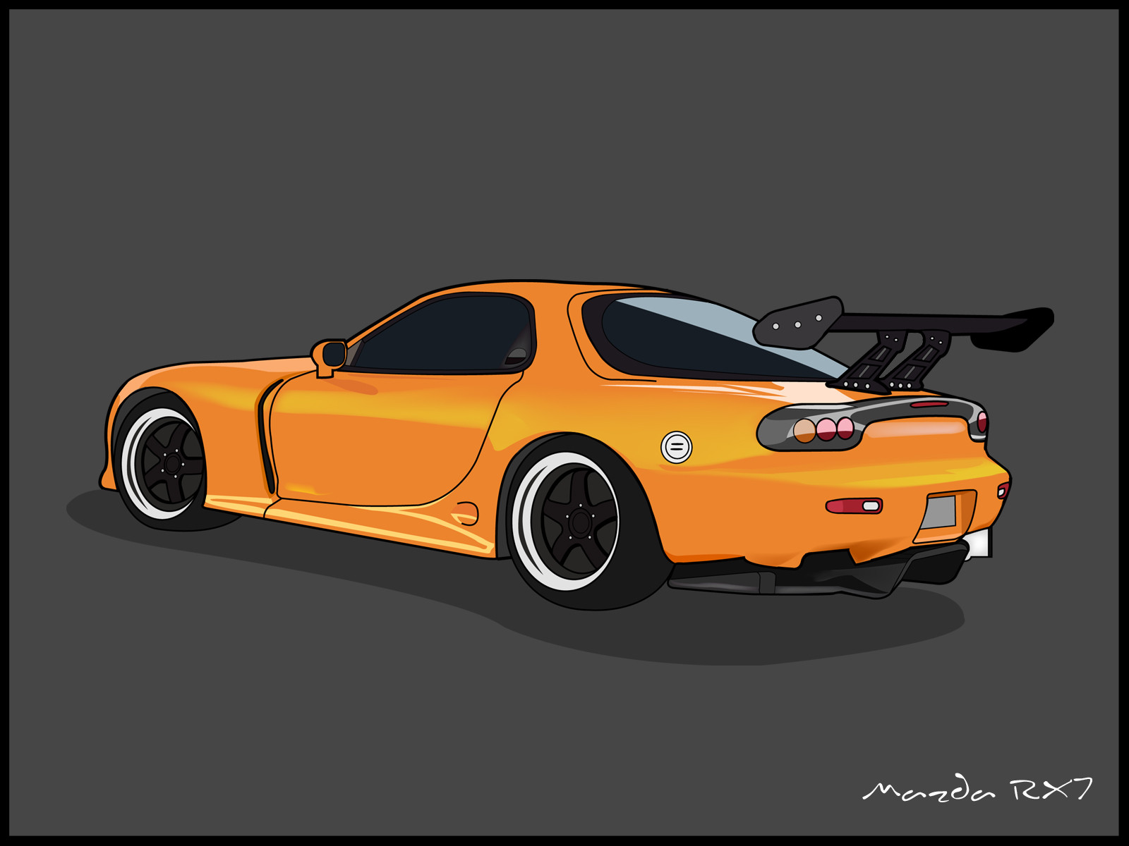
Umm.. I don't know why I put that title. I think because Metallica rules! w00t! And I like that song. This car is fast, the song is fast, so duh, uhh, Ride The Lightning duuuude!
Okay, well seriously. Me needs some suggestions for a title. I don't wanna put up 'Mazda RX7'. My gallery is already full with car names, people are gonna think I worship cars or something.
I dedicate this piece to ~passenger-nq , simply because I want to. Orsome stuff up there, visit him or else I will.. erm, nevermind. This is my new year gift to all my watchers, and posibbly my last deviation for sometime.
Yes. It's another orange car. I like orange.
******
Wallpaper available at request.
Edit: Okay, well I've given it a new background. If anyone finds it offensive or any crap, just note me. Is the grey one better, or this one?
Edit: I changed the background back to the original one. Sorry for making it re-appear as a deviation, there's no need to comment on this piece anymore. I'm terribly sorry for the whole mix-up.
Related content


Comments: 93


Cool illustration of a cool car! Maybe just call it "Seven" or "7". -YD
👍: 0 ⏩: 1

That never crossed my mind...
👍: 0 ⏩: 0


!!!wow. clean as hell very nice. rx-7 always been the favorite car of mine, nicely done.
-crzisme-
👍: 0 ⏩: 1


What a brilliant image. You have a really slick style man.
👍: 0 ⏩: 1

one of my favorite cars! You just cant beat the ol wankel engine eh? Sweet car stuff, check out some of my ferrari and lambo sketches if ya want. Great job!
👍: 0 ⏩: 0


this is nice too!
but i personally prefer the grey background.
👍: 0 ⏩: 1
In a way... I like the grey one too. The background seems to stand out more than the foreground. Gah! Why do I always have to think so much!
👍: 0 ⏩: 0

I dig the new background! It gives it a bit more of that "cliche" look that's ever-so-popular.
👍: 0 ⏩: 1

must have one! must have one!!! nicely done my fried...
👍: 0 ⏩: 1


really good reflections.. i need to start using gradients
")
👍: 0 ⏩: 1
Thanks!
I didn't use the gradient tool though.. used the mesh tool for this one. ")

👍: 0 ⏩: 0


 (Smile)")
👍: 0 ⏩: 1
Eh?
Give me a bit more details, I don't exactly get what you're trying to tell. You want this RX7 to be a custom one, or another car?
👍: 0 ⏩: 1
I want it to be THIS car, in THIS deviation, but I wanted the colors to be green and yellow. But I want a stripe going thru the car. Itll look like this:
GREENGREENGREENGREENGREENGREEN
YELLOWYELLOWYELLOWYELL(0 (Cool)")
GREENGREENGREENGREENGREENGREEN
So yeah.. And then thered be the number 08 on the side a bit behind the door, so it'd look like above.
The text picture is ugly... so I know you can make it better. And make it shiny. I will definetly make you a gift art in return!
👍: 0 ⏩: 1
I'll try my best, but with tons of homework and school stuff, don't expect me to submit anything sometime soon though.. it'll definitely take some time to get done. I'll see what I can do.
👍: 0 ⏩: 1


Mmm....I got a passion for 7s (seeing that I own one) and I really like this. But uh, you gotta create some backgrounds for a change. Great job, nice, unique style.
👍: 0 ⏩: 1
Thanks.
Background one coming soon. I just don't have time to add it in (school).
👍: 0 ⏩: 0

wait a minute... you mean you DON'T worship cars? i would have guessed otherwise...
just kidding man, this looks awesome! a very sexy car indeed, and orange is my favorite color
i really do like the title "ride the lightening", somehow it fits the piece very well
👍: 0 ⏩: 1
Yes, I don't worship cars.
Thanks for the comment.

👍: 0 ⏩: 0

Dammit Shanti, this thing RULES, I can't wait to see the poster...
I need Illustrator DAMMIT!
👍: 0 ⏩: 0
Holy CRAP Shanti, this is bloody sensational! Can't wait to see the poster...
I need me a copy of Illustrator DAMMIT!
👍: 0 ⏩: 1
This isn't included in the poster series J.Lo. ")
Yes, you need Illustrator.
👍: 0 ⏩: 0


Erm, I mean, thanks for the comment!
👍: 0 ⏩: 0

i can really tell the curves of the vehicle by the awesome highlighting
the smooth yellow gradient across the side is killer - mesh tool?
love the wheels too
really fantastic work

👍: 0 ⏩: 1
Indeed, I did use the mesh tool. This is my second time using it... pretty tough to make it look smooth/right.
👍: 0 ⏩: 0

Spectacular! Honestly this is the best vector by you ever!
A few critical comments although on my work my shadows aren't correct and I know they aren't I can tell that the highlight your rear windscreen is completely wrong.
I feel the grey mark on the rims, one should be in a slightly different place, otherwise it makes the drawing look too repeditive and what is the white thing on the right of the rear of the car?
I really love the colours and the highlights on the RX-7, go the rotary and go you!
")

👍: 0 ⏩: 1
Gah! A mistake!
Should I just remove the highlight behind?
Will change the grey marks on the rim as well.  (Wink)")
👍: 0 ⏩: 1
Leave the highlight but let the inside edge follow the shape of the glass except it may need get a little tuck in here and there.
👍: 0 ⏩: 1
| Next =>