HOME | DD
 Underpable — Draw This Again
Published: 2016-06-14 18:43:08 +0000 UTC; Views: 8655; Favourites: 300; Downloads: 112
Redirect to original
Description
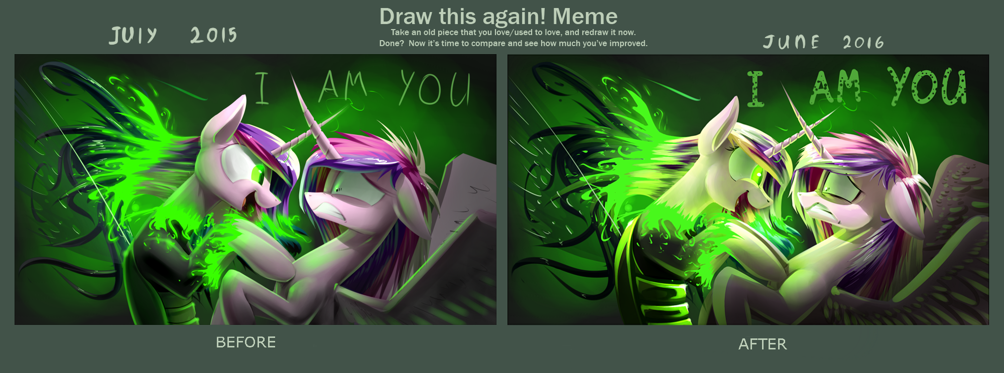
Meme: Before and AfterRelated content


Comments: 32

👍: 0 ⏩: 0

Love the shading on the new version but I think the original thin lettering was more menacing.
👍: 0 ⏩: 0


 (Wink)")


it doesn't matter if there's enough green, it's just up to the artist how she/he draws
👍: 0 ⏩: 1


You can see the improvement with the finer details and Cadence looks far more stressed than the original. Good job
")
👍: 0 ⏩: 0


These are both from the same file I guess. You did improve the lighting.
👍: 0 ⏩: 0


Волосы, крылья и морды лучше, а копыта стали толстыми бликующими сосисочками Х)
👍: 0 ⏩: 0


Yes, it's what striked me the most as well.
👍: 0 ⏩: 0


I think Chryssy's expression is the greatest improvement.  (Smile)")
👍: 0 ⏩: 0


Yeah, the color stands out more in the After portion of it. Personally it kind of draws away from what I think is the center of attention, mainly Cadence and Crysalis. It's not bad, by all means, it just makes the focus a bit different with the brighter colors
👍: 0 ⏩: 0


I see better proportions and finer detail in the after, although the hooves are better before on the real cadence. wings are excellent in the after. overall,... I love it! XD
👍: 0 ⏩: 0

New version is better than older) Not so much, but better)
👍: 0 ⏩: 0

To be honest, I don`t see that much differences, sorry.
👍: 0 ⏩: 1

you have to look really close, like the wings, the colors are different. It's meant to be a improvement, not a redraw by a different person with a different style.
👍: 0 ⏩: 0

awesome, it looks like you are a bit more famliar or better with lighting effects.
i am no artist but that stands out to me.
looks awesome though
👍: 0 ⏩: 0

