HOME | DD
 UnluckyMorpheus — SvC Styled Megaman X REMADE

#megamanx #snk #svc #unluckymorpheus
Published: 2015-02-26 04:52:05 +0000 UTC; Views: 800; Favourites: 7; Downloads: 0
Redirect to original
Description
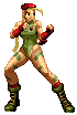
So yeah...I made this a couple months ago:
unluckymorpheus.deviantart.com…
Also, I remade the color palette and ALSO i used Original Neo-Geo color shcemes .3.
And like i said...I sometimes go ham with this style -w-
So yeah...
Enjoy...For now...
-Morpheus-
Related content


Comments: 4

It looks pretty decent in terms of shape, but it's still a bit too off to be considered SvC/KOF sprite style (which are both the same, actually).
First things first, the palette itself has way too many colors for a playable SvC character. If you pay attention to characters in the game, their palette doesn't goes beyond 15 colors, and counting the color of your sprites, you have 23 colors going on that sprite. What I can suggest is that you don't need so many colors on the palette just for shading the face, because five shades is way too much for just a single area, and the second row of blue also doesn't looks like it needs a whole lot of colors either.
Secondly, I feel that you've overdone the brightening a bit too much in the sprite in here. I know that X is made of metal, but it's still way too shiny for the sprite style. If you look at characters in SvC or KOF games, you'll see that white colors is hardly used for brightening at all-- at least not as much as in this sprite in here. They mostly use the brightest color of the palette row, and white is often used only for subtle shiny parts (such as the tip of someone's shoe). Also, if you need a better idea of how metal is done in the sprite style, you can look at Cyber Woo from Neo Geo Battle Colliseum: vignette4.wikia.nocookie.net/s…
This is another thing regarding the palette, because I feel that one palette row can kind of clash with the other. The white row of the palette looks pretty accurate to the style, and the blue looks acceptable, but then the purple(?) part looks way too unsaturated to go along the rest, and so does the skin palette. I highly recommend that to give those two rows of the palette some more saturation to make the composition of the sprite work out better.
Also, this is just my personal opinion, and I'm well aware that you wanted to recreate the MMX8 stance... but that pose doesn't fits the vibe of a fighting game style that much. In fighting games, that kind of sprite is something you would probably see during a win pose, but not really as the stance animation-- in case this concerns you, you could give X a pose that makes him look more prepared for a fight. I personally think that something like his stance pose from MMX1 would be more fitting for a fighting game.
Still, it's a pretty good sprite, and well polished. You've done quite well in here, and I hope to see more from you like this.
👍: 0 ⏩: 1

Take it easy dude ._.
I'm still a novice compared to all of these guys out there on DA, And remember, nothing is perfect, the first try isnt the exception ._.
👍: 0 ⏩: 1
Don't worry, I don't mean to go hard on you about it. Only thing I'm doing is giving you advice on how to get better at the sprite style, and I only have the intention of helping when it comes to the criticism I give. Besides, you still did really well for a novice, and getting better with the SvC sprite style won't take you too much!
👍: 0 ⏩: 1
Yeah, But to be honest, i dont like this style as much as the others, the one im really after is JUS, but i still appreciate your possitive critique, so thank you ^^
👍: 0 ⏩: 0