HOME | DD
 unrealnighthawk — Needham Sign - Fresco II
Published: 2005-06-10 07:23:43 +0000 UTC; Views: 101; Favourites: 1; Downloads: 6
Redirect to original
Description
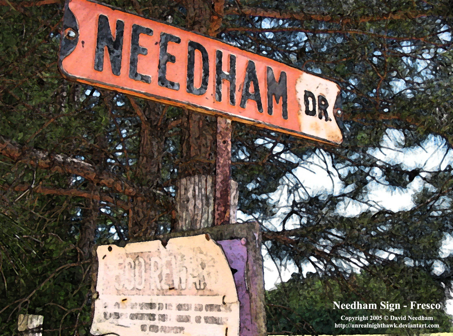
This is a redo of my previous pic with the added border, 9x5 size conformity, title, and copyright. The old pic is now in my scraps folder.Related content


Comments: 8

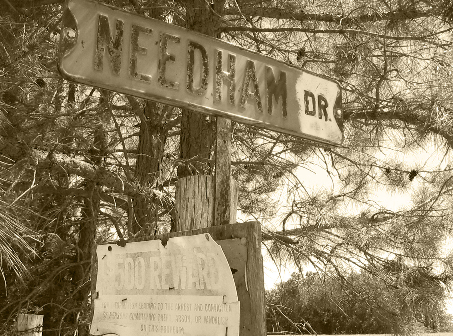
...very cool pic! It's interesting how a filter can change the feeling of an image! I also looked at the Sepia-toned version of this one, in your scraps...and there is a completely different feeling to that one. The Sepia one has that cool "old-timey" feeling, like you said, and this one looks almost like it was painted/drawn... I like both versions a lot! Great job!
 (Smile)")
👍: 0 ⏩: 1

Thanks! yeah, that was my goal. Isnt the sepia one in my gallery too? It's supposed to be if it's not...I'll have to check that.
I was kinda disappionted that I didnt get more comments on this one. I thought it looked really cool with that painted look, but I've noticed when I submit multiple versions of the same pic I only get comments on one of them...*Shrug* oh well. Thanks for commenting on everything!
👍: 0 ⏩: 2
Ahhh... I figured it out by accident. Hee hee! I was scrolling through your gallery, and when I put my cursor over your Arkansas Waterwheel photo- in your gallery, right next to this photo (with the borders), the name Needham Sign- Sepia II appears. ...so I think you just accidentally put the wrong name with the wrong pic. You'll see it and know what I'm talking about, if you haven't noticed already... 
👍: 0 ⏩: 0
You're very welcome! Hmm... I went back through your gallery, to see if the sepia-toned one was there, but I only saw it in your scraps. ...but maybe I just over-looked it.
Hey! I thought it looked really cool with the painted look too! ...and I just figured that the photos in your gallery that look like duplicates as thumbnails would have to be a little different...because you wouldn't just put two of exactly the same thing in your gallery. Maybe people just don't realize that the multiple versions of photos in your gallery aren't identical.
You are very talented David! Keep up the good work!
👍: 0 ⏩: 1
Thanks for helping me figure this out.
Any ideas how I could get ppl to look at my ones that look alike?
Awwwww, thank you! You're pretty darn talented yourself!

👍: 0 ⏩: 1
You're very welcome!
I'm not sure what you can do about that- unless you want to write a journal that explains that you have images in your gallery that look similar as thumbnails, but are actually different, and that you just wanted feedback as to which ones people like the most- or something like that. ...but ultimately, no matter what ya do, people are going to decide whether or not they will take the time to look at them.
They should take the time, because your stuff is really awesome, but when you only receive comments on one of the ones that look similar, it's not because people don't like it. They're just being lazy or don't realize it's not the same.
...and it's true! (about you being talented) Thanks for your kind reply! 
👍: 0 ⏩: 1
Hmm, that's true. I'm not sure what else I could do to make them look more diff. Aw, thanks for everything!
👍: 0 ⏩: 1
You're verrrrry welcome, although I'm not sure what I did... 


👍: 0 ⏩: 0