HOME | DD
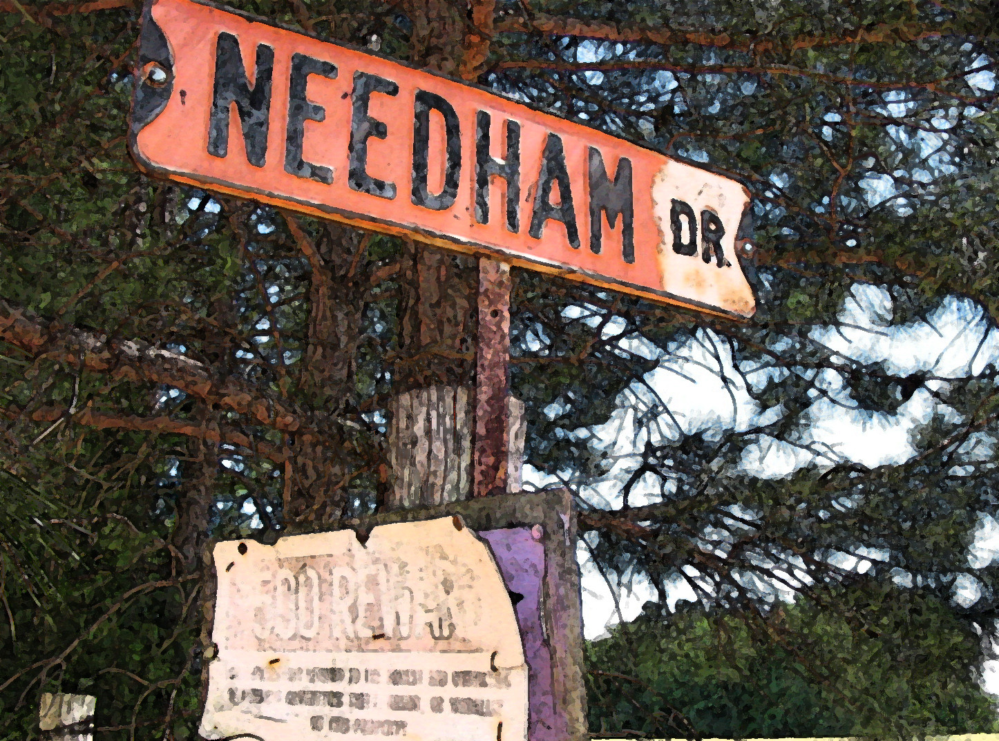
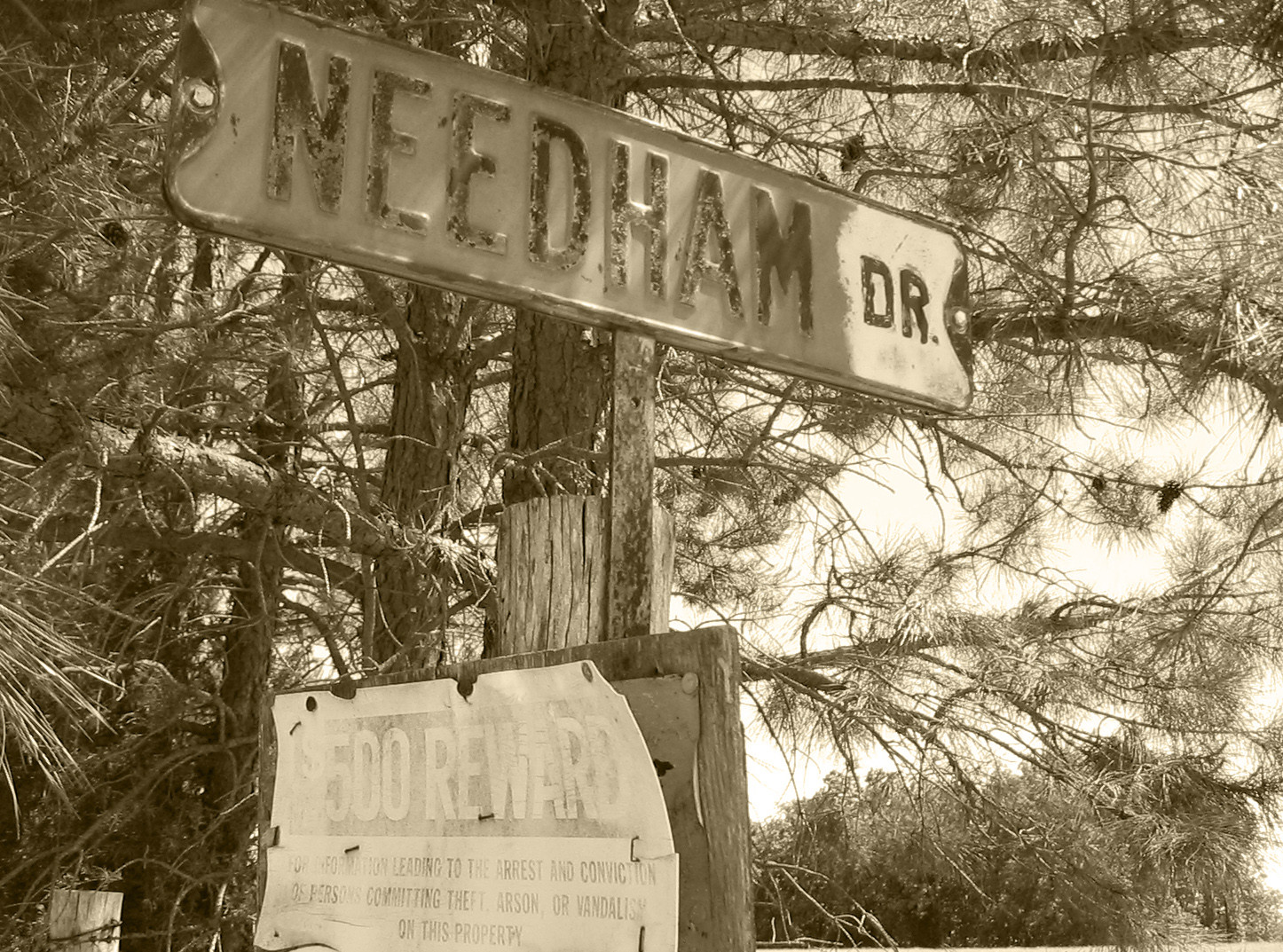
 unrealnighthawk — Red Tin Roof III

Published: 2005-06-13 08:04:53 +0000 UTC; Views: 146; Favourites: 1; Downloads: 8
Redirect to original
Description
This is part 3 of a series of 3 pieces, each with a black and white copy.This is a little shack thing that I pass nearly every day. I thought it looked nice and rustic, so I took pictures at different angles and made some black and white. I'd appriciate any comments anyone has about this set of pieces.
 (Smile)") Thanks!!!
Thanks!!!
Related content


Comments: 13

Like landscapes where its so natural....beautifulshot


👍: 0 ⏩: 1

Hehe...thanks! The countryside is so beautiful out here.
👍: 0 ⏩: 0

This is my favorite of the set. It seems balanaced yet dynamic, though it leaves me wishing I could see the top of the pole. May not be possible to frame everythign so nicely and get that too...
It seems that I have a definite pref for the color photos over the grey.
👍: 0 ⏩: 1
I think this one is also my favorite of the series. Unfortunately, the pole it much taller than it looks due to it being as close as it is. If I included it wholely, I would either have to keep it as a full sized non cropped shot, or focus the crop so high it'd be off balance and I'd lose the fence row. Thanks for the comment bro!

👍: 0 ⏩: 1
One suggestion: explore asymmetrical balance. Your composition hints at it, but usually places the primary subject centrally. The ones that don't seem to have a composition that's more compelling, even when the content is not.
👍: 0 ⏩: 1
Oh, and this is a general comment, not one particular to this photo.
👍: 0 ⏩: 1
Okay, could you be more specific so I can better understand what you're meaning? like...if that can be applied to this pic, do you mean I should have the shed to one side more than it is?
👍: 0 ⏩: 1
Nothing to apply to this one, it's great. But here is where you asked for comments...
I'll give you a more specific application on your new pepsi sign.
👍: 0 ⏩: 1

i really like this one!
👍: 0 ⏩: 1
Thank you! I'm really glad that I was able to get the fence row in the foreground. I think that really adds to the pic and gives it that look you mentioned.
👍: 0 ⏩: 1
yea, i think so too. i was looking at the picture but couldn't really put my finger on it. but now that you mention it, yea! i think it was the fence. ^_^
👍: 0 ⏩: 1
")