HOME | DD
 UnyieldingHeirophant — GENESIS::cubic flow
Published: 2006-03-17 00:31:30 +0000 UTC; Views: 2030; Favourites: 20; Downloads: 515
Redirect to original
Description
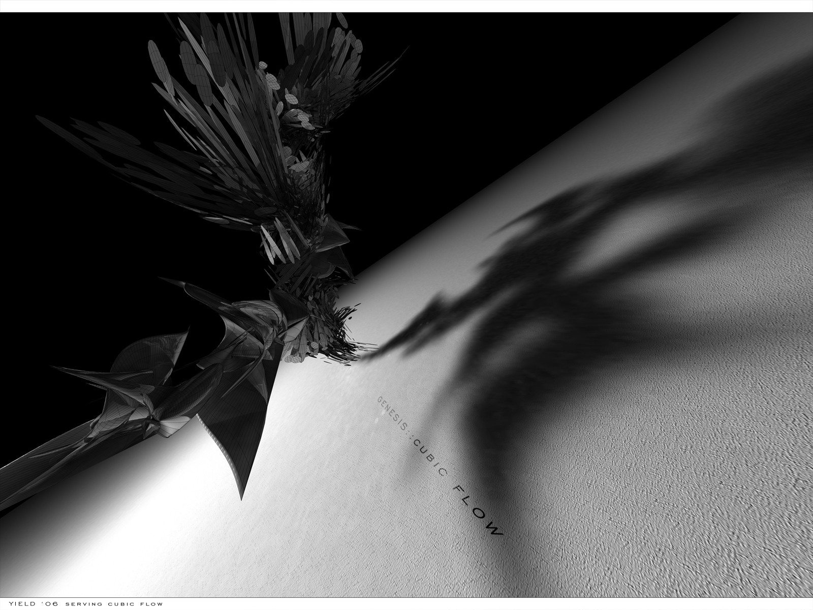
this is my submission for Cubic Flow . Its for their first pack GENESIS98% Cinema 4D (render, floor, shadows)
2% Photoshop (border and typo)
Related content


Comments: 30

 (Smile)")

wow great scene placement, really make's the render come out amazingly
👍: 0 ⏩: 0

what kind of lightning did you use with this one? 'cause i really like that part in it
👍: 0 ⏩: 1

I think I used one light object with soft shadows
👍: 0 ⏩: 1
oww, soft shadow ofcourse, thx
👍: 0 ⏩: 0


hmm I like it... but some parts of it are too ordered and regular.. like the spirals.. I was thinking a more random thing you know for genesis..
but yea u never fail to make awesome compositions
👍: 0 ⏩: 0


dont understand, can we post our sumbissions in devart now ?
but realy nice
👍: 0 ⏩: 0

a very smooth looking render and iam lliking the ground as well good job
👍: 0 ⏩: 0


Man, you never fail to amaze me! How do you even begin to make stuff like that? hehe, anyway, great work.
👍: 0 ⏩: 0


quite nice. I think it wuold have been better if it was reflected with the stock somewhere else. the way it's composed it seems like the shadow itself is the main object. it would look much hotter if you blured the render so the focal point was the center near the stock.
👍: 0 ⏩: 0

You secksy beast your in cubicflow ")
👍: 0 ⏩: 0

I love the angle of the picture. It adds an edge to it.
👍: 0 ⏩: 0


Looks awesome, love the shadow, althought the type looks abit off perspective.
👍: 0 ⏩: 1
I tried to make it look like it was on the wall. Thanks though!
👍: 0 ⏩: 0

nice textures and shadows etc. the floor ends kinda abruptly though, id like it better if it faded out a little.
good job
👍: 0 ⏩: 1
yeah I tried to make it fade in photoshop but it just made it look worse so I left it as it is.
Thanks for the comment!
👍: 0 ⏩: 0

thanks much man! Its really appreciated!
👍: 0 ⏩: 0

thanks so much! I appreciate it!
👍: 0 ⏩: 0