HOME | DD
 Uplinkmaster — one drop down
Published: 2004-08-21 09:17:28 +0000 UTC; Views: 2231; Favourites: 54; Downloads: 405
Redirect to original
Description
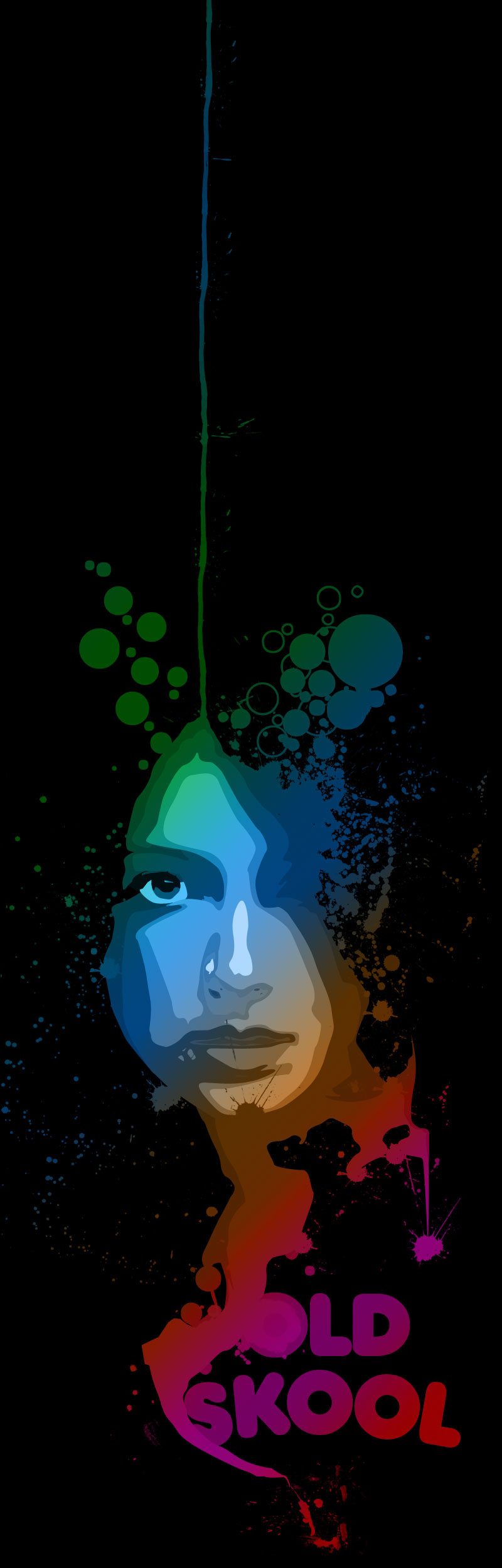
did this after i came home from france") i like it...
i like it...stock is from ~liquid-venus-stock
and mostly inspired by ~dOmme-zEbra
ty both
edit_//
lost some of the text cause people requested that and i got to admit it looks better that way
Related content


Comments: 129


hehe thx ^^
well euhm i know WoW... World OF Warcraft... thats why im not on Da for some time... damn that game! why does it have to be so goood?
lolz ^^ thx anyway m8
")
 (Smile)")
👍: 0 ⏩: 1

LOL! Good point, but that was not it.
WOW, I'm really impressed. Great piece!
👍: 0 ⏩: 1

I really dig this piece. The use of negative space, and just the right color scheme, the face staring back at the viewer. Everything seems pretty well done here.
It would make a lovely poster.

👍: 0 ⏩: 1
well euhm thx
and a poster... iff you would give me a print account etc. then u could get a print
👍: 0 ⏩: 1
Wish I could. Currently broke.
👍: 0 ⏩: 1
lol
i don't think my paarents will allow me...
👍: 0 ⏩: 0


geprutst?
amai, zo wil k wel meer prutsen
die bellen, hoe doe je die? en die kleur?
👍: 0 ⏩: 0
euhm ik was wa aant prutse, dus op ne foto ne vector aant maken en dan ging er iets mis en wa verder geprutst. dit is het resulaat
👍: 0 ⏩: 0


this is probably the coolest thing ive ever seen. haha awsome
👍: 0 ⏩: 1

i would actually like to see a version without the "old school" text!
👍: 0 ⏩: 1
but iff i get rid of the "old skool" it get's soooooooo empty
👍: 0 ⏩: 1
no not at all!! maybe put a heart in there or some other object! hmmmm...
👍: 0 ⏩: 1
sjeah that might be a good IDea
👍: 0 ⏩: 1
well let me know if you change it, i think it would look pretty slick.
👍: 0 ⏩: 1
hehe iff i change it ")
👍: 0 ⏩: 1

That is some awesome vector art man! Great colors, and indeed, quite old school  (Wink)")
👍: 0 ⏩: 1


Nice, I like the style of this. All the colours and whatnot. Not really sure why it says "old skool", but it looks cool.
👍: 0 ⏩: 0


Again a damn fine piece bro!!! :wOOt:
You keep doin' it!!!
👍: 0 ⏩: 1


awsome style. awsome gradient of colors, awsome piece, awsome +fav

👍: 0 ⏩: 1
")

| Next =>