HOME | DD
 Uriak — Speed paint : elven sentry
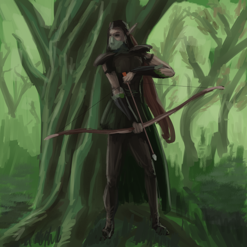
#archer #elf #speedpainting #tree #woodelf
Published: 2017-06-12 22:04:01 +0000 UTC; Views: 792; Favourites: 10; Downloads: 2
Redirect to original
Description
It was quite too much to do in speed paint fashion, I'll stay clear of full characters while I'm training the basicsRelated content


Comments: 9

Not bad,  (Smile)")
Do mind if I give a bit of a critique on it?
👍: 0 ⏩: 1

You can go on, I think many parts are quite horrible XD, and I don't know exactly, but it wasn't very long, yes.
👍: 0 ⏩: 1
Never think it's horrible, just think of it as practice  (Wink)")
for composition I the archer needs to be to the right a bit more to center the in the tree will make it look bit more centered in the tree, and off to the side a bit more giving a nice negative space to the left. You want to give it that negative space to make it look like they walked in there or that something else can move into that space, give it a sense of story.
And you got nice Background, and your main piece in the mid-ground, but there is no fore-ground makes it look a bit flat.
Luckily this is an easy fix, you can do a black silhouette of a bush or a tree, giving some depth it can also help with the framing of the shot
I remember you saying you had some problems with values, if you add a red color to where you want darker area it will help give you more value, and to make something look lighter add cooler colors like blue.
You do have a light source, it would be better then instead of an encompassing one, make it strongly come in from the right side, can help make it feel more dramatic.
also your brush storks can look a bit scribble in some areas, I know that is tempting to do when your speed painting, but the direction of your brush strokes can really help, for trees they grow up, so you want the direction of your brushes to do that to, even when doing the branches they go up and out.
It is also best to do long brush strokes, instead of many little ones, it will look much better.
The color palate is has a nice very forest feel to it, the archer is well done, the anatomy of it is pretty spot on. my only issue is with the feet the don't seen to grounded.
I like that the feather of the arrow is a orange color it helps draw my eye into the center of the piece, but you need to have the color repeated somewhere else in the piece, as it the lone color stands out to much and that can make it look a bit odd, but the pop of color is still nice.
Overall it's a nice piece, would consider it a work in progress. But it is great to practice, and remember these notes are here to help you make your good art, great art ")
Take what you want form my thoughts, you don't have to do everything or anything I said
👍: 0 ⏩: 1
Thanks for your opinion. To be honest I've kinda neglected the whole construction of the piece because I wanted to see whether I could quickly sketch a full character. For a real piece, I would ditch the square canvas and push things to the side, etc. This is the reason for the absence of a real foreground, since it would either stand in one of the corners, or I could have chosen to hide the bottom of the figure. I agree with your statement about the light.
Yeah, my brush work was quite primitive for the background, usually my main method for this is to do "placeholders" strockes, especially for thin vegetation. Since they aren't something I can really build upon, i just put it there to get the values, then later on, I erase and draw them from scratch with small brushstrokes. But if I don't do this, the results stays a mess, same for the bushes and grass, I ought to work with the general mass, instead of doing a few strokes. Another issue is I think I didn't vary my brush size enough in this one. Going for smaller early one would have avoided that.
I've felt the same with the feet, I think it may have been a mix of subtle hints in the legs, or the lack of shadow/feature indicating the contact with the ground. Maybe having him stading on some of the roots would have been better.
What I find weird is how sometimes I just have the right feeling for the proportions of a character, and sometimes I have to tweak quite a lot. Some of my past piece have decent characters, but it was through a long iteration. This is why I wanted to try my hand at speedpainting, to force myself into aiming for the good shapes and values earllier in the process. I'm definitely more at ease with a dark to light construction, but paintings with strong rimlights and silhouettes while looking cool can be a way to avoid more difficult tasks.
I think I'll try some new forest speedpainting, with the specific aim of getting a good early feeling of the flora instead of my usual placeholders. I like this kind of settings but shouldn't feel too comfortable with what I did.
While I like this illustration
, I think I ought to do way better as far as details go.
👍: 0 ⏩: 1
Ya, if your doing something with landscape best not to do a square canvas.
Even with "placeholder" brush storks, take a slightly big brush and still do the storks upwards, then come back with a smaller brush and do those nice detailed blades of grass in a lighter tone. It will give you some depth in the grass, and help save some time.
Don't do small right away it will take you a lot longer to do the grass, you don't have to paint every blade of grass, you just have to make it look like you did
Ya some shading would help ground the character, in any BG really, roots are nice but when you stand on roots your weight shifts different then when your on flat ground, so keep that in mind if you want to do that.
Proportions are tricky, and you have to know your anatomy to get it right and then once you get it right you can start to deform the anatomy to make it look dynamic and cool.
Best thing to help with that
LIFE DRAWING, drawing from an actual model will help you improve so much, because you are seeing the human form in 3D and understand how the weight is disrupted and how things bend.
life drawing from photo can help, but they just aren't as good with helping you understand anatomy
not sure if you are aware these two place have some good photos for life drawing practice,
senshistock.deviantart.com/
line-of-action.com/
but if you really want to get better at drawing humans pay to attend live life drawing, even sitting down in a cafe drawing from real life will help you understand human form better
There is also a book by Samantha Youssef "movement and form"
good book to help with anatomy and understanding line of action
Also look at artist you admire, often a lot of them do tutorials, and offer suggestion on what makes a good piece.
Even practicing copying their work (just don't post it and claim it as your own) can help you improve, a lot of people take inspiration from old renaissance masters, it helps to mimic others at the start and then really develop your own style and look
Almost every artist started out by copying others, then moved on to their own works
You seem really into fantasy,
not sure if you are aware of these guys, I would recommend looking them up
Frank Frazetta
Dan Scott
Brian Fourd (he's my fav fantasy artist, he also did some marvel comics)
👍: 0 ⏩: 1
Thanks for the advice.
Well when I meant small, I meant made for twigs and branches, I was doing too rough.
I'm currently learning anatomy, I'm starting to feel knowledgable though this isn't experienced. I know life drawing egg is the best way, but I draw as a side thing after my job, so it's a bit difficult to harness this kind time, similar to a full fledged drawing course. Anyway, I wanted to draw a bit more often, but after a few intense weeks drawing I feel a bit drained right now. My last attemps have been a bit sobering, because I felt more confident this past days, especially after some photo studies. ^^
👍: 0 ⏩: 1
No problem
Ah got ya.
That's good, study everything you can it will help your drawings
Ya I feel, working full time and keeping up with drawing is really hard. specially when you need sleep to function, could get so much more done if I didn't need sleep :/
Best of luck with future drawings, hope you can find the time to keep at it, lot of your work is nice and I see great potential in it
👍: 0 ⏩: 1
aw you're really nice ^^
I just need to do a couple pieces to rebuild my confidence ^^
👍: 0 ⏩: 1
When you feel a piece is bad, just tell your self it's practice
and look over and make a mental note of what to improve next time
will help you learn and I find it hurts my confidence a lot less
👍: 0 ⏩: 0