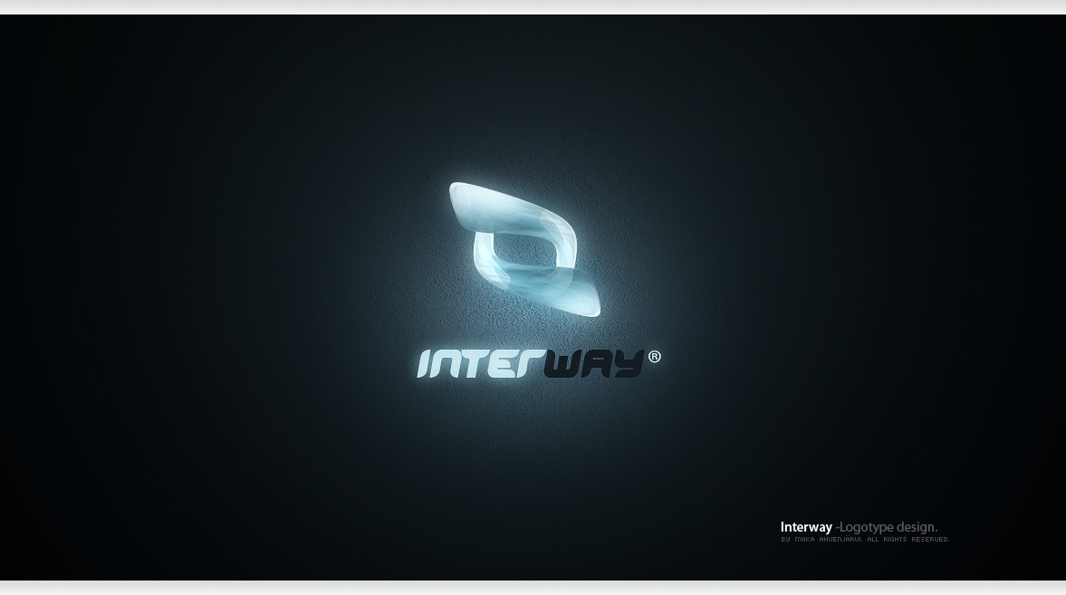
HOME | DD

Uribaani β€” Interway -Logotype design.

Published: 2008-04-13 15:49:54 +0000 UTC; Views: 32623; Favourites: 182; Downloads: 2399
Redirect to original
Description Interway -Logotype design.

Program: Adobe Photoshop CS3
Time: About 30 Minutes.
Copyright Β©2008 Miika AhvenjΓ€rvi. All rights reserved.
Related content
Comments: 59

Creuna [2011-06-07 10:50:44 +0000 UTC]

Looks quite great

πŸ‘: 0 ⏩: 0

DJBull3Tv2 [2011-05-17 01:57:42 +0000 UTC]

Very cool. Nice job.

πŸ‘: 0 ⏩: 0

laxi123 [2011-03-05 09:19:16 +0000 UTC]

what is a fonts?

πŸ‘: 0 ⏩: 0

goiabarea [2010-08-13 18:52:00 +0000 UTC]

wow

πŸ‘: 0 ⏩: 0

deathscore1 [2009-05-15 02:24:34 +0000 UTC]

thats cool that would be epic if he could make a logo for me

πŸ‘: 0 ⏩: 0

lunaticz0r [2009-03-14 00:50:30 +0000 UTC]

what texture is used here? aaamaazzziinnggg

πŸ‘: 0 ⏩: 0

mclaranium [2009-01-16 01:37:09 +0000 UTC]

do you really need my comments?
evertything is said: excellent, quality, ellegant, modern, fantastic illumination effects

πŸ‘: 0 ⏩: 0

das3d [2008-09-11 04:10:34 +0000 UTC]

great man

πŸ‘: 0 ⏩: 0

owsian [2008-07-11 13:57:19 +0000 UTC]

Featured on: [link]

πŸ‘: 0 ⏩: 0

DjEnhancer [2008-06-09 06:59:08 +0000 UTC]

pretty one too i love glowy thingies ...

πŸ‘: 0 ⏩: 0

The1Blur [2008-05-27 04:54:17 +0000 UTC]

neat

πŸ‘: 0 ⏩: 0

karsten [2008-04-21 23:48:36 +0000 UTC]

great logo miika, i like the glass effect you got on it and the overall shape of it. Whos it for?

πŸ‘: 0 ⏩: 0

elusive [2008-04-20 15:01:18 +0000 UTC]

That's cool. You have a real gift with Photoshop. Reminds me somewhat of a Microsoft Office icon.

πŸ‘: 0 ⏩: 0

EmpireFX [2008-04-18 20:20:43 +0000 UTC]

Loos very nice

πŸ‘: 0 ⏩: 0

gntSTUDIO [2008-04-15 11:39:54 +0000 UTC]

looks like a blue crystal. powerful logo

πŸ‘: 0 ⏩: 0

qdstudios [2008-04-15 10:11:17 +0000 UTC]

now thats what i call a powerful logo

πŸ‘: 0 ⏩: 0

YoungDag [2008-04-15 03:48:43 +0000 UTC]

Nice Design

πŸ‘: 0 ⏩: 0

pienose [2008-04-14 18:11:16 +0000 UTC]

wow, really, really good

πŸ‘: 0 ⏩: 0

necrophagous [2008-04-14 17:26:37 +0000 UTC]

Very nice, i wonder how it would do on a print though...

πŸ‘: 0 ⏩: 2

necrophagous In reply to necrophagous [2008-04-14 19:08:07 +0000 UTC]

Tell me, when you make logos in photoshop. What is your way to make them printable up to big formats? (sucky inglizh)
I tend to use illustrator.

πŸ‘: 0 ⏩: 1

Uribaani In reply to necrophagous [2008-06-08 08:53:18 +0000 UTC]

300DPI around 1000x1000px / 3000x3000px, depends.

πŸ‘: 0 ⏩: 1

necrophagous In reply to Uribaani [2008-06-08 15:29:29 +0000 UTC]

I c, i c! Well, thanks for the info

πŸ‘: 0 ⏩: 0

Uribaani In reply to necrophagous [2008-04-14 18:21:48 +0000 UTC]

It fits fine, trust me, hehe.

πŸ‘: 0 ⏩: 0

radiitz [2008-04-14 15:53:35 +0000 UTC]

Looks kinda like the logos of MS Office '08 for Mac...

πŸ‘: 0 ⏩: 0

Elgaris [2008-04-14 15:25:20 +0000 UTC]

Cool

πŸ‘: 0 ⏩: 0

SeoxyS [2008-04-14 14:35:20 +0000 UTC]

it's really cool, especially that wall texture. however, you need to make sure you can simplify it to a simple vector shape.

πŸ‘: 0 ⏩: 0

crezo [2008-04-14 12:15:34 +0000 UTC]

sweet!! Looks awesome. I think the flat base of the T looks out of place though, you should round off as on all the other letters.

Wicked stuff!

πŸ‘: 0 ⏩: 0

VirtualRabbit [2008-04-14 12:00:15 +0000 UTC]

Nice work man... lets see more of this sort of thing going. keep it up.

πŸ‘: 0 ⏩: 0

zee7 [2008-04-14 11:28:02 +0000 UTC]

wOOOoo crystal

πŸ‘: 0 ⏩: 0

Piotr18Wch [2008-04-14 10:56:34 +0000 UTC]

looks nice ;D

πŸ‘: 0 ⏩: 0

un-non [2008-04-14 04:20:06 +0000 UTC]

its ok...

πŸ‘: 0 ⏩: 0

sam1985 [2008-04-14 04:12:29 +0000 UTC]

you photoshopper guys are always genius..
keep it up man..
keep it up...

πŸ‘: 0 ⏩: 0

mercury-yume [2008-04-14 03:22:51 +0000 UTC]

brilliant work as always. How much would it cost to commission you for a simple 2D most likely single colour logo design? Just been on my mind and then I saw this and remembered how much you rock so I'm curious about what could happen.

πŸ‘: 0 ⏩: 0

krazytim [2008-04-14 00:36:18 +0000 UTC]

Beautiful effects on this one! +fav

πŸ‘: 0 ⏩: 0

LongyZ [2008-04-13 21:54:02 +0000 UTC]

Nice!

πŸ‘: 0 ⏩: 0

AndrewMiguelez [2008-04-13 20:48:07 +0000 UTC]

Definitely cool. Might be hard to scale down, but for this size it looks really good.

πŸ‘: 0 ⏩: 0

AJid2020 [2008-04-13 20:10:41 +0000 UTC]

really nice!! love the glow!!

πŸ‘: 0 ⏩: 0

cardinale-c [2008-04-13 19:27:19 +0000 UTC]

nice logotype, great colors. gz

πŸ‘: 0 ⏩: 0

al-roo7 [2008-04-13 19:05:36 +0000 UTC]

so nice.
i love it

πŸ‘: 0 ⏩: 0

screamoXcore [2008-04-13 18:15:25 +0000 UTC]

Real nice work bro. Keep it up.

πŸ‘: 0 ⏩: 0

Gmarconato [2008-04-13 18:00:32 +0000 UTC]

Nice work, dude!

πŸ‘: 0 ⏩: 0

Shaipen [2008-04-13 17:40:33 +0000 UTC]

i love O.O

πŸ‘: 0 ⏩: 0

SaimonSharif [2008-04-13 17:34:51 +0000 UTC]

wow, amazing. The texture is so awesome. You could have added it to the text, but it become too overwhelming.

πŸ‘: 0 ⏩: 0

LudoCore [2008-04-13 17:15:31 +0000 UTC]

Great work ! I like the texture and the logo. You are one of best

πŸ‘: 0 ⏩: 0

aliather [2008-04-13 17:09:07 +0000 UTC]

Superb

πŸ‘: 0 ⏩: 0

MReiser [2008-04-13 16:55:52 +0000 UTC]

nice logo really awesome

πŸ‘: 0 ⏩: 0

Kocsmy [2008-04-13 16:30:31 +0000 UTC]

awesome.!!

πŸ‘: 0 ⏩: 0

petercui [2008-04-13 16:12:48 +0000 UTC]

is this a freelance project?

πŸ‘: 0 ⏩: 1

Uribaani In reply to petercui [2008-04-21 12:59:53 +0000 UTC]

Nope, just personal training. I had not enough time to do vector version of it in that time, so it isnt commercial.

πŸ‘: 0 ⏩: 1

petercui In reply to Uribaani [2008-04-21 13:55:17 +0000 UTC]

All the best my friend, you are a very talented designer.

πŸ‘: 0 ⏩: 0


| Next =>